High school and elementary school websites are complex because they cater to a variety of audiences. Students, families, teachers, staff, and the broader community all rely on K-12 websites to navigate their experiences both within and around the school.
But knowing when, where and how to reach these diverse audiences is often a challenge. Today’s digital landscape provides plenty of tools for schools but knowing how to lasso them into a strategic communication plan sometimes can be difficult.
That is why we have created our K-12 Website Guide. In this exhaustive resource, we provide a comprehensive look at the key variables that schools need to consider when mapping out their website and digital presence. After all, CampusPress works with hundreds of schools like yours, and the information provided here is based on our experience and expertise in this arena.
In this guide, we cover detailed information that every school developer, designer, content creator, and site owner need to know. There is a lot to cover, so feel free to use the table of contents below to navigate through all the chapters.
What Is In This School Websites Guide?
Chapter 1
10 Reasons To Use WordPress For School Websites
So why should you use WordPress for school websites? It’s a fair question. There are other content management system (CMS) options out there, but none quite as ubiquitous. In fact, over 43% of all websites – according to multiple sources – are powered by WordPress.
And that’s by no accident. This CMS provides ease-of-use, allows you to run multiple websites from one dashboard, and is customizable. But there are so many other reasons to make this your CMS of choice as well. Read our top 10 in the blog post below.
Most Popular
As we mentioned, WordPress is the most predominant CMS on the market today. No other platform comes close to matching the number of websites powered by it. And it’s held these large margins for years with no decline in sight. So, it’s obvious WordPress is doing something right.
For example, WordPress constantly improves the user and editor experience on a regular basis and provides updates that make it work more seamlessly. On top of that, websites created using WordPress are more Google friendly since the CMS follows best practices and is considered the premiere CMS on the web today. Who doesn’t want their school website to be in Google’s good graces?
And it’s been around a while! WordPress is just about 18 years old and continues to be a trusted name throughout the web development industry while other CMS platforms come and go. Lastly, there is plenty of support. WordPress offers its own services, but there are plenty of third-party developers out there that live and breathe WordPress – not surprising considering the enormous web presence this CMS possesses.
Accessibility
If it isn’t already, your school website should be accessible to all users (students, parents, staff and community members) who visit and attempt to consume your content. Not only because it’s good for you and your users, but also because it is a best practice in web development and can potentially prevent possible lawsuits against you.
For instance, the Americans with Disabilities Act (ADA) updated its guidelines in 2017 to include mandated school website accessibility standards. Users who rely on accessible websites include those who are visually impaired, colorblind, English language learners, those with limited motor control, the elderly, deaf individuals, and those with learning disabilities such as dyslexia.
As the leading CMS on the web today, WordPress makes accessibility simple. In fact, there are WordPress plugins (more on this below) that identify potential accessibility issues before the website or web pages are published – not after. Additionally, these plugins provide information on how to properly fix these accessibility issues so it’s not a guessing game.
Plugins
So, speaking of plugins— what are they exactly? In short, plugins are additional software that provide extended functionalities to your website that you wouldn’t otherwise have out-of-the-box. They are easy to install, are available through WordPress or third parties and can be easily updated when new versions are available.
Would you like to filter out inappropriate words from your discussion boards or comments section? There is a Banned Words plugin for that. How about some assistance in optimizing your website for Google Search? The SmartCrawl plugin is a quick and easy tool for building a solid foundation for an SEO-friendly website. How about an integrated calendar on your school website that lets your audience know about upcoming events? You guessed it.
There are more than 50,000 WordPress plugins in total. And if you need something for your website, there is probably a plugin that will provide it for you.

Themes
One of the most important considerations when developing your WordPress online presence is the “look and feel” of the design. Quite often, “themes” are chosen for school websites to match a certain aesthetic that is trying to be achieved. Themes can be installed easily and come with preset layouts, fonts, colors, formatting, and other design elements.
Found a theme you like but would like to make some alterations? WordPress beginners can easily make basic changes to fit the look that your school is trying to achieve. Themes are particularly important for K-12 schools that want a website that reflects their values, academic rigor, school colors, community, and other attributes.
Themes are also important if schools are trying to engage a certain age demographic. Think elementary vs. high school – two different age groups where the design may resonate differently.
Customizable
Maybe one of the most important WordPress features is that it’s totally customizable. That’s right. You can make your school website look exactly the way you want it. Like we mentioned, themes are available and easy to install and use. And even themes can be customized to meet your website needs.
But if you are looking for something completely unique and require additional functionality and design elements not available in themes, then a developer or third-party company can create the exact website you are looking for through custom coding and design. It’s kind of like creating your own theme.
This may cost extra if you don’t have an in-house development team. But just remember that a school website reflects the school itself. What do you want your website to say about your school?
Ease Of Use
Using and updating your WordPress school website is easy once it is designed and ready for content insertion. Are you a social media user or do you frequently copy and paste text and photos into a Word document? It’s pretty much the same exercise once you learn where the pages and content areas are located within WordPress.
Additionally, text formatting is simple and practically mirrors the Word experience. You can bold, italicize, change the size, and format the copy the way you want through the text editing functionality.
Lastly, WordPress accepts a variety of media types including jpg, gif, png, doc, xls, ppt, pdf, wav, mp3 and mp4, to name a few. Some other file formats may not be accepted by WordPress by default. But by using (you guessed it) a plugin, you can instruct WordPress to allow additional media types.
Blogs, ePortfolios, Websites And more!
Is WordPress a blogging platform? Is it for websites? Can you use it for student ePortfolios? A calendar? Discussion boards? Simply put – YES! It is the answer to all your online presence needs – another reason why WordPress is the CMS of choice for so many school websites.
Teachers, staff, and students can use it to update academic, event, athletic and general information regarding your school. They can also use WordPress for blogging, whether it’s for public facing information or in-class only assignment projects. Plugins make event dissemination simple and allow for integration with your Google calendar.
And teachers can help students with future endeavors by creating ePortfolios that showcase their work, thoughts, assignments and ideas. Lastly, if you have any other website information/content needs, WordPress most likely can provide a solution (hooray for plugins!).
Multisite Use
It’s quite possible that you need more than just one school website. In other words, your school may need hundreds and possibly thousands of separate websites (think academics, about us, library, athletics, school news, events, clubs) that are updated and operated by numerous staff members, students, and potential community members.
Creating and updating separate websites for each – possibly on different CMS platforms with different themes and designs – would quickly turn into a logistical disaster. Luckily, WordPress Multisite allows you to manage a large network of school websites with a single installation and from a single dashboard.
And whether you have one or 100 users, each website can receive the same updates, security enhancements and aesthetic changes simultaneously.
Access Levels
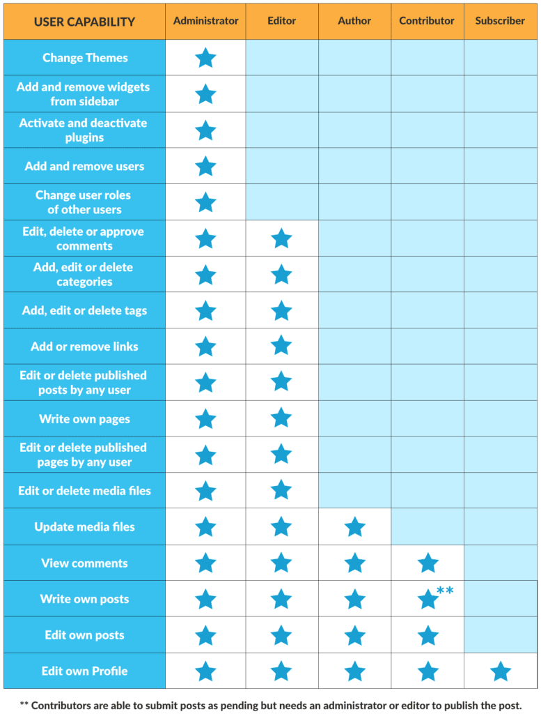
As mentioned above, your school may literally require hundreds if not thousands of websites. That is a lot of information that needs to be created, curated, edited and eventually uploaded. So, for the sake of accuracy, grammar, approval processes and security, WordPress allows you to assign a variety of access levels to those who update your school websites.
These access levels include super administrator, administrator, editor, author, contributor, and subscriber. Each role has different permission settings that enable or restrict them from certain tasks. For example, super administrators can pretty much do anything with your website. Whereas a contributor can write and upload content but can’t publish it. But an administrator can publish the contributor’s post or page once it has been reviewed and is ready to go live.
There are six levels in all (super administrator, administrator, author, contributor and subscriber), all with different access that determine their role within the website network ecology.
Security
WordPress is built with security in mind. Whether you work with an in-house team or a third party, you can make your school websites highly secure by following some recommended protocols. For example, security measures that can be taken include:
- Nightly Security Scans – Check all plugins and themes for any known vulnerabilities.
- Code Review – Check all plugins/themes for best practices to minimize potential exploits.
- SSO /Authentication – Configure all major methods of authenticating users, including 2FA.
- Audit Logging – Detailed logs of user actions that are kept for 30 days.
- Security Patches – Any known vulnerability will be patched in less than 24 hours.
- Firewalls – Implement brute force and DDoS protection, with all traffic monitored.
- Backups – Ensure encrypted backups are taken nightly.
Chapter 2
10 Great School Websites Built With WordPress
While a school website may have once been a source of static information merely used for marketing purposes, it is now becoming integral to every school’s daily operation.
There are many reasons for schools to have a website. Some of these include:
- Sharing information with families and the community. Office staff and teachers can avoid fielding repetitive phone calls and emails asking about upcoming events and school policies etc.
- Promoting the school to prospective families. You can showcase what makes your school special and encourage future enrollments.
- Providing an online hub. Your website can be your school’s virtual home that links to all your other online spaces such as social media accounts and learning management systems. It can also include platforms where educators, students and even families or community members can share their work, information and ideas. The lines between blogs and websites are blurring and merging.
- Offering the potential for collaboration. Schools can benefit greatly from collaboration, whether it is sharing units of work with teachers down the road, or collaborating globally on class projects. Having an online space via a school website is essential to be found and contactable. It can also provide an online home for your collaborations.
What Makes A Great School Website?
It is becoming increasingly rare for schools to not have a website at all. The biggest variable is often now the quality of the website and how dynamic it is.
You want your school website to reflect and showcase your school’s strengths while enhancing the teaching and learning process.
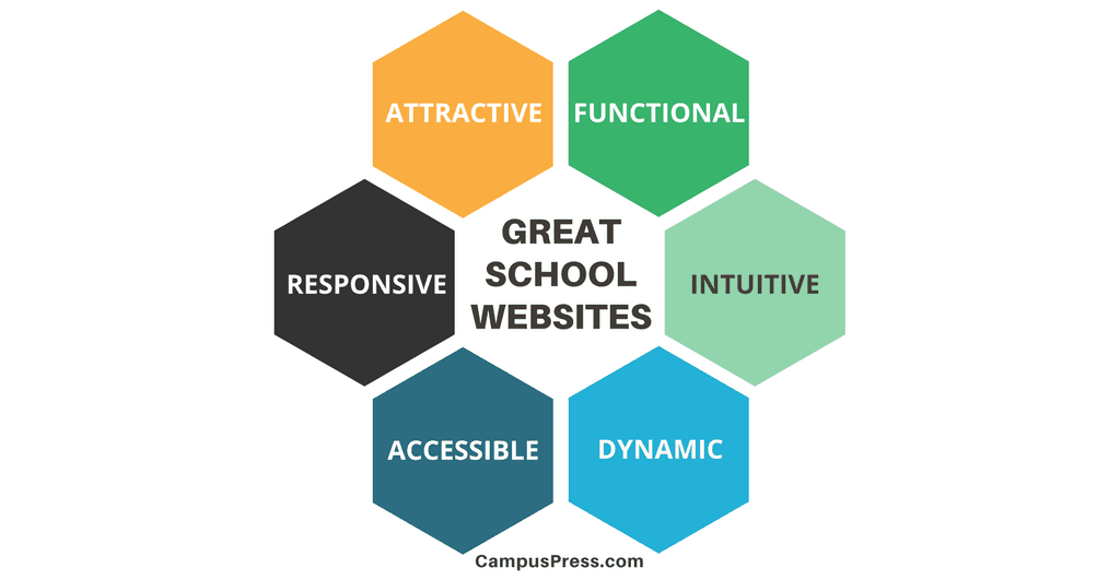
It is certainly worth aspiring to have a website that is:
- Attractive: First impressions count. Is your website visually appealing and a clear representation of your school?
- Functional: How easy is it for users to navigate the website, find what they’re looking for and interact as necessary? You want the user experience to be good on both mobile devices and desktop computers.
- Accessible: A previously overlooked concept, it is now considered essential to make sure your website is accessible to all users, including those with disabilities.
- Dynamic: How is your website moving beyond the static space of old? What measures are put in place to ensure it is updated regularly? How is the website a hub for not just information, but interaction and publication by multiple authors?
In an effort to inspire you with what’s possible when designing a school website, we are showcasing 10 great school websites built with WordPress.
Looking for more tips on how to use your school website to improve school/home communication, check out this post here.
Why WordPress?
By far the most popular content management system out there, WordPress powers over 35 percent of the entire web. Yep, you read that right. More than a third of websites worldwide are built with WordPress.
WordPress is behind everything from Vogue to Mercedes Benz, The New York Times, Sony and Time magazine. And of course, thousands of school websites! So why wouldn’t you want your site joining these lofty ranks?
The popularity of WordPress means that there is a huge worldwide community that contributes to the growth and ongoing improvement of the platform. It is open-source, which means it is often more affordable than proprietary options. Sites are mobile-friendly and meet important accessibility requirements.
One reason people love WordPress is that it is highly customizable, yet it is easy to use. You really don’t need to be too tech-savvy to contribute to a WordPress site.
The other good news is you don’t need to do any of the design or technical work in setting up or hosting your school website. With our school and district sites here at CampusPress, it is easy to create and customize a school website that meets your precise needs.
Best School Websites Of 2020
Onto our showcase of ten inspiring school websites, all powered by WordPress.
These represent just a tiny fraction of the high-quality school websites out there, so we encourage you to reach out with your contributions!
1) Melbourne Girls Grammar
The website of this private girls’ high school based in Melbourne, Australia, certainly makes a powerful first impression.
Why this is a great website:
- Visitors get an instant insight into the school through high quality sliding photography. Without even reading any of the content on the site, you start to understand what facilities and activities this school can offer.
- The homepage design is clutter-free, primarily inviting you to either book a tour or use the menu to find further information.
- Scrolling further down the page you are directed to important information about the school’s philosophies while being presented with the latest news from school blogs.
2) Round Rock
The Round Rock Independent School District in Texas, USA, has an impressive collection of school websites.
For ease of use and consistency, they have a set-up where all their school websites are a similar design, yet are customized to reflect the individuality of each school.
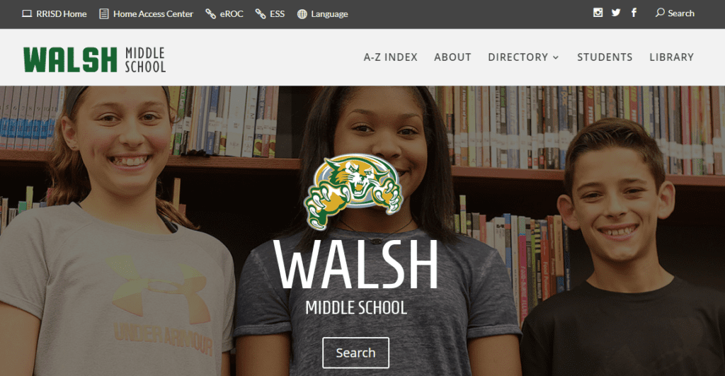
One example of this format from the Round Rock District is Walsh Middle School.
Why this is a great website:
- The clear formatting ensures visitors know exactly where to search or browse for the information they’re after.
- The addition of a Google calendar makes it easy for schools and families to have a shared understanding of what’s happening on a daily basis.
- An impressive feature is the addition of a school news report presented by students and embedded on the homepage.
The Round Rock school district uses content syndication tools to post news and announcements across multiple school and district sites all at once.
3) High Tech High
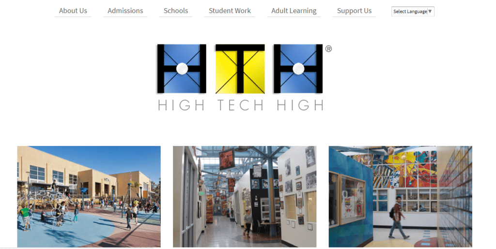
This network of 13 schools is based in the San Diego area of California, USA. They are well known for their authentic and innovative work. The High Tech High website reflects their modern views on education.
Why this is a great website:
- A minimalist design makes it intuitive for users to navigate the homepage and find the individual school or information they’re after.
- A key feature of both the district homepage and individual school pages is the showcasing of student projects. This school is known for its innovative projects and the rich documentation on their websites adds to the user experience.
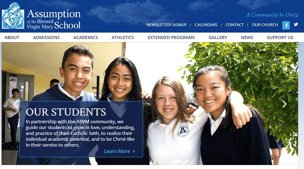
4) Assumption of the Blessed Virgin Mary School
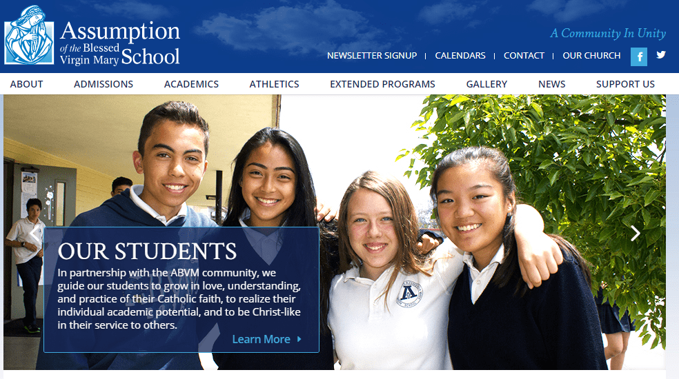
This PK-8 Catholic school in California, USA, has a strong relationship with their community which is reflected in their school website.
Why this is a great website:
- Striking sliding photography gives a snapshot of the friendly and welcoming school culture.
- Clear menu headings guide visitors to browse for the information they’re after.
- Regularly updated news and events make this website useful for all members of the school community.
- There are links to sites for families to make further connections, such as the school’s social media accounts and Google Drive folders of student images and work.
5) Worawa Aboriginal College
This unique school is located in Victoria, Australia. It is for Aboriginal girls in years 7-10 from remote and regional Australia.
Why this is a great website
- The unique indigenous culture of this school community is reflected in color choices and imagery.
- Large visual boxes and traditional menu headings are used to direct visitors to explore the website.
- There are links to connect further with the school community such as through their popular Facebook page.
6) St John’s College, Cardiff
This K-12 independent school in Wales presents a well-maintained and informative website for all members of the school community.
Why this is a great website
- Like many of our top choices, high-quality photography on a backdrop of school colors really unites both the virtual and physical impressions of the school.
- Visitors can either use traditional drop-down menus to find the information they’re after or scroll down for a principal’s welcome message and key news.
- The recent news from different areas of the school is updated regularly with everything from cake stall information to student projects.
7) Phoenix Modern
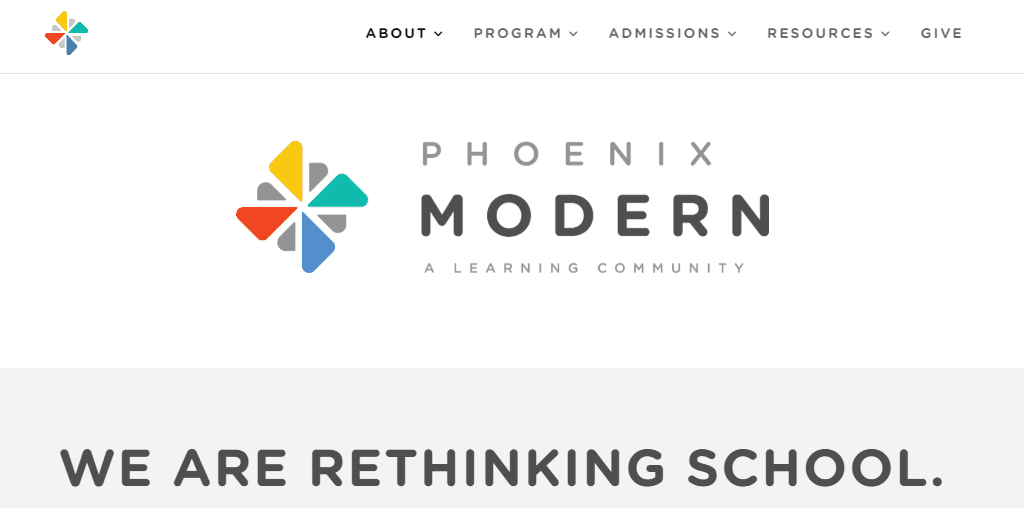
This is a free public school in Phoenix, Arizona for grades K-6.
Why this is a great website
- A clean and simple style that uses colors and animations to highlight the younger grades that make up this school.
- The minimal number of menu choices make it easy for visitors to find the information they are looking for and highlights the school’s fundraising and student recruitment efforts.
8) Suffern Central
Located in New York, this school district website acts as a hub for individual school websites, similar to the Round Rock example above.
This sort of format is easy to set up with CampusPress if you have multiple schools as part of your campus or district.
Why this is a great website
- The scrolling photographic display gives a glimpse of daily life within the school district.
- A regularly updated Twitter feed, school news and calendar makes this a dynamic and useful website for all visitors.
- The websites of the seven schools this district oversees can easily be accessed through a prominent link at the top of the page.
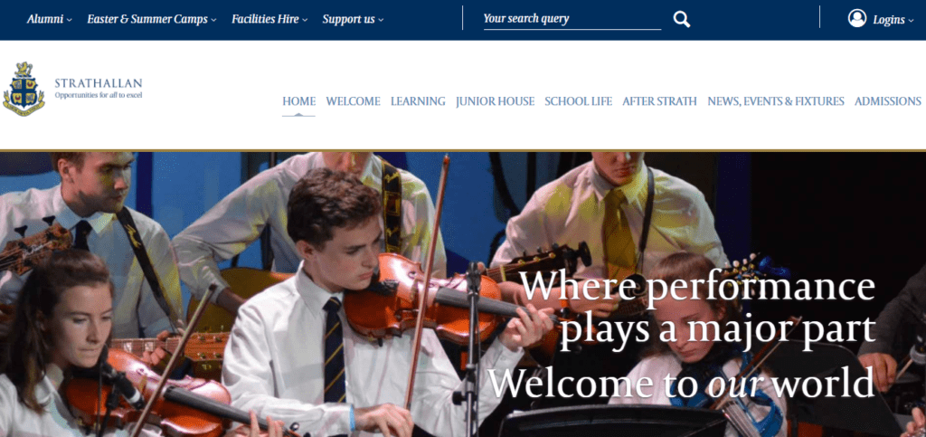
9) Strathallan
Rural Scotland is home to this prestigious school for students aged 9-18. Strathallan’s website makes a strong first impression.
Why this is a great website
- Slogans on the sliding imagery (…welcome to our world) are a clever way to present the culture and philosophy of the school.
- An impressive promotional video of the school takes center place when scrolling further down the homepage.
- The overall layout of this site is nicely uncluttered with large text and links invitingly displayed in image boxes.
10) Woodstock School
Set in the Himalayan foothills, this Indian international school has a rich history that is showcased in their exceptional website.
Why this is a great website
- Breathtaking imagery doesn’t need to be cluttered with excess words. This school sells itself by featuring full-width photographs of its stunning location.
- Beyond the homepage is a well-maintained blog with information about school events.
- The website truly caters to staff, students, parents, and alumni with links to resources and private portals.
Final Thoughts
A high-quality school website can make a strong first impression for all members of the community. Once you have your school website set up you can put strategies in place to ensure it is well maintained and used effectively.
Parent education and encouragement is imperative. You might consider avenues you could use to teach parents about how to get the most out of the school website. These could include newsletter articles, open nights or family classroom activities.
When visitors are arriving at your virtual front door do they feel welcomed, informed and part of your school community? Don’t miss the chance to nail your first impression.
Chapter 3
How To Engage Visitors With Your High School Website
As we know, K-12 students come in all shapes and sizes – and ages and maturity levels. So why should the websites that serve them be any different? In fact, when creating K-12 websites, schools should take an in-depth look at what each age group – elementary, middle school and high school – needs and wants from their digital presence online.
And that doesn’t even take into consideration other constituent groups such as parents, faculty/staff, prospective students and community members. Below, we outline the most important considerations to make with your high school website in order to speak to this wide array of audience members.
Easy Navigation
This should be an essential feature on ALL websites. Simply put: visitors will not return to your website if they can’t find what they want. And why should they? However, planning out a thoughtful website architecture will allow you to direct visitors to the places they need to go.
One common mistake that is often made is the impulse to put everything on the homepage or in dropdowns in the main navigation. Granted, the homepage is the entry point into your website and the most important page to consider. However, it should serve as a gateway and supply an initial path to the rest of your website.
Slider images with recent photos that link out to current/important pages? Sure. An events calendar? That makes sense. A link farm with a hundred pages to visit that only discourages visitors from engaging with your website? Let’s stop there.
Yes, all your pages are important. But providing a main navigation with major “subsites” such as academics, student life, athletics, faculty/staff and about us, allows you to direct visitors to major hubways that will get them to the information they need.
Take the next step and divide up information by visitor type. This could include students, prospective students, community members, staff and alumni. Provide relevant information to these groups on each of these pages and visitors will know exactly where to go.
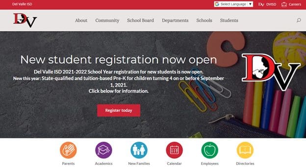
A perfect example is below. Del Valle ISD has a prominent main navigation, but a smaller secondary nav highlighted by icons that drives visitors to other portions of the site:
Appropriate Design And Language
Have you ever been to a shopping website (clothes, appliances, etc.) and immediately said “oh no, this is not for me”? School websites can create a similar disdain. That’s why it is important to make sure that high school websites speak to their audiences. The design shouldn’t be overly cartoonish in any sense and the photos should be a true representation of the age group that goes to the high school. The language should be light and consumable and be written for the appropriate age level.
In a nutshell, the design and language should speak to an age group that is moving toward graduation and into their adult life, while maintaining a young and fresh aesthetic that allows them to remain in the moment.
This approach also allows you to appeal to prospective students and families – and community members, faculty and staff – as well. Think of your website as a rallying point or epicenter of everything that is associated with your school.
Lastly, this is the perfect way to show off your school spirit! Use your school colors and logo. Show students and community members wearing your school merch. Your website allows you to scream your school pride loud and proud. Make the most of it.
Accessibility
Speaking of your audiences: are you sure you are reaching them all with your website? Accessibility is no longer considered an afterthought. It is considered a priority. Ensuring ALL your users can access your website and consume your information should be a top priority on your web development list. There are many beneficiaries of accessible websites, including:
- Deaf individuals
- Vision-impaired visitors
- The elderly
- Those with learning disabilities such as dyslexia
- Colorblind users
- English language learners
- People with limited motor control
These visitors are part of every group that frequent your website, including students, parents, faculty/staff and community members (not to mention prospective students who may judge a school by its accessibility standards).
Making your website accessibility compliant may also keep you out of legal trouble. The Americans with Disabilities Act (ADA) updated its guidelines in 2017 to include mandated school website accessibility standards. Failure to comply with these rules could result in an investigation by the U.S. Department of Education’s Office of Civil Rights, loss of funding, or even a lawsuit.
Mobile Friendly
These days, having a mobile-friendly website is becoming less and less of an option and more of a necessity. It’s true that smart phones and tablets are not new inventions. But the expectation for websites to provide a premium user experience on these devices has never been higher.
With that in mind, schools must provide a digital experience that is easily consumable regardless of how your website is being viewed. Most content management systems allow you to pick templates (but you can use custom coding) that automatically format your website correctly when it recognizes the device a visitor is using. It’s called responsive design, and it allows you to update your website once and properly formats it everywhere it is seen.
So, whether your site is being viewed on a handheld device or a huge iMac monitor, visitors will get a user experience that allows them to efficiently consume the information they are looking for.
Tell Your Story
In the long run, your school is more than your curriculum. Granted, that is an extremely important part of your school and what you want the world to know about it. But does your curriculum tell your story? Does it tell visitors what you want them to know about your school?
One way to tell your story is to include icons or graphics on your homepage (see Del Valle ISD image above) and throughout your website. Accompany these images with value propositions, recognitions, a mission statement or other achievements and you will be supplying highly digestible content that says a lot about your school.
But don’t stop there! There are more stories to tell. Other great ways to tell your school’s story include:
- Quotes from successful alumni
- Quotes from parents and community members
- Feature stories on students, faculty/staff
- Images that are rotated on a frequent basis to reflect recent events
- School fundraising efforts
- Featured community outreach efforts
Remember: prospective students are students, too. And don’t forget their parents, alums and community members. Storytelling like this not only brings out a sense of pride among current students but also creates a sense of community among all who are associated with the school. These additional features help tell the broader story about your school and illustrates what a vibrant and personal place it can be.
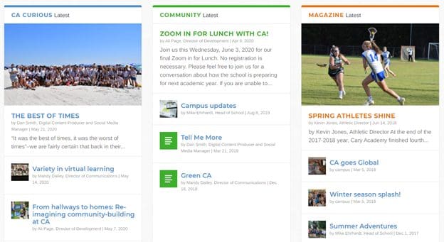
In the image below, check out the middle section of the Cary Academy homepage. There are three news columns, including community features and articles from the school magazine:
Make It Social
Social media is ubiquitous these days and schools have an opportunity to spread their message far and wide by making website content sharable. Allow students and community members to share your information to Facebook, Twitter and other platforms.
What kind of content is most likely to be shared?
- School events and calendar items
- Student profiles and achievements
- Photo galleries of student activities such as drama and sports
- Faculty and staff spotlights
- Fundraising and PTO events
This is not only a great public service and recruitment tool, but it also ensures that users will return if they know that there is content of interest that they would like to share. It’s a great way to create a community with your website. Easy-to-install plugins make sharing simple.
Update Your Website Often
In today’s world, you can’t let your website become stale. And why would you? You have invested time, effort and money into your digital presence. So, it only makes sense to update it often and ensure that visitors return time and time again.
And it doesn’t take that much effort. It can be as easy as updating photos on main pages and using a calendar plugin that is updated automatically wherever you want it. Additionally, it doesn’t have to fall on one person. Assign multiple users to your content management system and the task will seem relatively easy. What content items can be updated frequently? Here are a few:
- Events – Use a website plugin and you can update your calendar once and it will show new events wherever you want them.
- In the news – Have an important announcement? Create a post and assign it to the homepage and other relevant places on your website.
- New academic guidelines – These important announcements can be updated whenever new and relevant information is available.
- Make it seasonal – Whether it is Spring or Winter, give your website a seasonal look (photos in particular) that shows the website is fresh and relevant.
- Deadlines – Make sure users get important dates and deadlines by placing them prominently on the homepage and other relevant pages.
- New at our school – If you have something new at your school that many would find interesting, post it to the homepage to ensure they see it.
- How to tips – Ask faculty and staff to lend their expertise and create how-tos for the most in demand and used processes.
- Photos – Create a slider on the homepage, then create calendar items every week to remind you to update these with fresh and relevant photos.
Choose a content management system that makes these tasks easy, and they will become second nature. Assign accountability to other users and you will have a web team before you know it!
Chapter 4
How To Create An Engaging Elementary School Website
Is your elementary school website doing its job in serving all its audiences with the variety of information they are looking for? If not, you may be missing engagement opportunities that could have a positive impact on enrollment, fundraising, parent involvement, event attendance, crisis communications and other areas of school operations. However, by following best practices in web engagement, you can easily supply information to those who need and want it the most.
A Reflection Of Your School
First impressions are extremely important when it comes to websites. Today’s average web user is savvy when it comes to user experience. In short, that means they know a well-organized, thoughtfully planned out web presence with clear communications when they see one.
That makes it imperative that you develop a website that is easy to navigate, has an aesthetically pleasing design and uses imagery that reflects an elementary school opposed to middle or high school. Ask yourself, is it modern in appearance and in experience? Does it have a logical site architecture? Or does it yell the year 1998?
A website reflects your school and the values that it embraces. It is often a visitor’s first engagement with your school. With that in mind, how do you want your school to be represented online?
Current Vs. Prospective Students
The two most important audiences that your website will speak to are current and prospective students and their families. That’s why it is important that your school website markets your school to those who may attend, while also providing important information to those that already do.
For example, potential student families most likely will be interested in academic rigor, health services, curriculum, school philosophy, among additional information that they want to know before enrollment. Current student families may want easy access to a parent portal, bullying procedures, academic resources, events, library information and other web pages that are particularly useful to those already enrolled.
Granted, there is an overlap regarding what is of interest to potential vs. current students. What’s important is that there is a balance of information that speaks to both audiences and that all resources are easy to find and digest.
Curriculum
Perhaps the most important information that people want to know about your school is regarding curriculum. That’s no surprise. However, ensuring the information is thorough and easy to find is the key to engaging potential students and families in particular.
The page should be in the main navigation and answer questions such as:
- Do you offer advanced coursework?
- What are the arts and drama programs like?
- Can you explain your special education approach and 504 implementations?
- What will teachers focus on at each grade level?
- What sets your curriculum apart from other schools? In other words, what makes it better?
Yes, you should take a holistic approach to your website ecology and ensure all pages are robust. But just remember that your curriculum page is likely the most important page on your website (aside from the homepage). If any place, this is where you should place your bets.
Staff Information
Giving your web visitors information about your school’s staff is a common presence on most primary school websites. However, the amount of information provided can vary greatly. For example, some schools may only list teacher and staff names with job titles and contact information, which is handy to have.
However, to truly be effective online and humanize your brand, schools should take the opportunity to post additional information that better serves visitors. For example:
- Your second-grade teacher is bilingual in English and Spanish
- The principal won a national award for achievements in education
- A fourth-grade teacher attended a prestigious university and made the dean’s list
- The secretary has been with the district for 30 years and was recently recognized for her commitment to students and parents
- Include short bios for ALL of your school staff members
Everyone has a story. And you can tell your school’s collective story by sharing information that gives web visitors a more in-depth look at who students will be spending time with in and out of the classroom.
School Events
What if you had an event and no one showed up? That’s highly unlikely to happen at school events where students, families and staff alike have an interest in a variety of happenings. But having an events calendar (on the homepage!) on your school website will help you engage not only those currently associated with the school, but also the community at large. Make these events shareable on social media and you can reach an even larger audience than expected.
Conducting school functions can be time-intensive, and you need to do whatever it takes to maximize attendance. They are also a great marketing tool. Prospective families can judge a school by the number and kind of events that it conducts. They see these events not only as opportunities for community involvement, but also a look at what kind of events their children can participate in.
Extra-Curricular Activities
Does your school offer athletics? A variety of clubs and organizations that students can join? Theatre, stage, and musical opportunities? The arts? Gaming? Health and fitness? If you do, you are probably already highlighting these on your school website. If not, you are missing out on a great communication and marketing tool for current and potential students.
You can also take it a step further and dedicate a webpage for each club and organization. Here you can update content and information on a regular basis, including new photos and events with the dates listed. This lets web visitors know that learning occurs outside of the classroom, and your clubs and organizations are currently active and available for students to join.
Fundraising
Gathering donations from parents, family, friends, and the community is a pretty typical activity for schools. Whether it is for trips, events, clubs or other activities, schools find themselves in fundraising efforts pretty much throughout the entire school year.
That’s quite a time investment, especially if your school is relying on fairs and sponsored walks that require high attendance levels. However, websites can make these efforts easier. Schools can post fundraisers online through a content management system or third-party platform and integrate them with their websites. These fundraising efforts can also be posted on event calendars and shared out through social media.
This kind of website fundraising effort offers an opportunity to create ongoing campaigns that can attract a wider audience and more donations.
PTO
Does your school have a Parent Teacher Organization (PTO)? Most likely it does. There is no better way to inform the community about your PTO efforts than by providing the organization its own website/webpage.
You can list upcoming events and post imagery of parents, teachers, staff, and students working together to make your school the best it can possibly be. Give your PTO leadership access to the webpage and they can make updates themselves when necessary. Lastly, make it shareable and inform the public about your latest news and events.
Easy To Update
At first, it may not seem like an important part of your website engagement strategy. But how you update the site is an especially important consideration in your website’s effectiveness.
After all, you want an efficient and easy way to present information to the public without having to code or start a second career as a web developer (maybe you do!).
WordPress is a great option for a primary school website. It’s easy to use, and if you can post to a social media channel or copy and paste into a Word document, then you most likely will find WordPress a painless exercise.
Remember this: you may have a beautiful website, but if it’s difficult and cumbersome to update, then most likely it will grow stale and outdated. And if anything is true about websites, it’s that visitors will not return to them if they get the same information time after time and month after month with no updates.
Multisite, Multiuser
Another great WordPress feature allows you to manage multiple websites from one dashboard. For example, you may want to have separate and distinct websites for academics, athletics, about us, events calendar, student and teacher blogs, and classroom pages. This is called a “multisite network.”
Additionally, you may want to have numerous “editors” or “administrators” who update these separate pages while maintaining a consistent look and feel, design and navigation as the rest of the website. This ensures that not all website updates are the responsibility of one individual. Taking this route will result in websites being updated more often and users getting the most up-to-date information.
Accessibility
School’s should make it a priority to create websites that are accessible to all users who visit. While those who rely on the use of screen readers are often the most commonly referenced beneficiaries, there are many other users who rely on these services as well, including:
- Colorblind users
- English language learners
- People with limited motor control
- The elderly
- Deaf individuals
- Those with learning disabilities such as dyslexia
This includes students, parents, the community AND staff. Everyone deserves to be able to consume your information. Not only is it a best practice to engage your entire community, making your website accessible can also keep you out of legal trouble.
For instance, the Americans with Disabilities Act (ADA) updated its guidelines in 2017 to include mandated school website accessibility standards. Failure to comply with these rules could result in an investigation by the U.S. Department of Education’s Office of Civil Rights, loss of funding, or even a lawsuit.
Crisis Communications
Websites are a perfect tool for schools that need to send out crisis communications. This includes late buses, school closures, emergencies, updates, and other information that needs to be communicated to the public quickly. With some CMS platforms, you can add a module to the homepage especially for these times. You can also create a scrolling banner or a popup window that will surely grab users’ attention and immediately give them the information they are looking for.
There are also RSS tools that can be integrated with other communication channels so you can update once and publish everywhere efficiently, including email alerts.
Mobile Friendly
It’s no secret: look around and everyone is on their phones. It’s nothing new and phones continue to be the go-to device for information gathering on the web. That’s why it is imperative that your elementary school website is mobile-friendly – meaning that it looks good on all devices including desktop, tablets or smartphones.
When you use WordPress for your content management solution, you can choose “themes” or “templates” that give you this functionality (called responsive design) without any additional work. Yes, that means you update information in one place, and it looks good everywhere.
Sign Up Forms
Are you still asking users to download a PDF, print it out, sign it, scan it and email/mail it back to you? We all know that this is a sometimes-necessary exercise, but a drag, nonetheless. However, creating an online form is easy! Using a CMS like WordPress allows you to produce them either by using templates or creating custom forms yourself.
Choose an email recipient for notifications and an alert is sent out each time someone fills one out. Forms are perfect for events, volunteer signups, requests, or any other situation where schools need user information.
Student Success Blog
Is there a better way to show off student achievement other than a student success blog? Blogs can be incorporated into your website and give you the opportunity to show off achievements in academics, athletics, volunteering and other areas.
These kinds of blogs will appeal to prospective students and families and are a great way to keep current ones coming back to your website. Upload photos, videos, pdfs, copy and other media types to tell the story properly. Make it shareable on social media and spread the message far and wide!
Alumni Spotlights
Another great way to showcase achievements is alumni profiles and testimonials. People love a good story. And what better way to showcase the continuous success of your students than to tell stories about the great things they went on to do after they graduated from your school?
These could be in the form of blog posts or a running list on a web page. Make sure to include quotes from students and their families regarding the great things they experienced while at your school. You can pull these quotes out and use them throughout your website, including your homepage!
Message From The Principal/Superintendent
A message from the principal or superintendent allows you to humanize your school and give leadership a face and voice. This also gives leadership the chance to tell prospective students and parents about him/herself and provide additional information regarding the school and its educational mission and values.
However, it shouldn’t be just a one-time static message. Update the page multiple times throughout the year and give leadership the opportunity to address timely issues and let the community know about important news and events.
Chapter 5
4 Benefits Of WordPress Accessibility For Your School Website
Today, when designing your WordPress school website, it is imperative that it is accessible by all visitors who use and consume its content. Thankfully, WordPress makes this relatively easy for you and your team. So, don’t think of it as “extra” work. Think of it as giving all visitors equal access to information regarding your school.
An Introduction To Accessibility For School Websites
At its core, having an accessible website means that anyone can use it, regardless of their ability. While those who rely on the use of screen readers are often the most commonly referenced beneficiaries, there are many other users who rely on these services as well, including:
- Colorblind users
- English language learners
- People with limited motor control
- The elderly
- Deaf individuals
- Those with learning disabilities such as dyslexia
There are several web design techniques and best practices that contribute to website accessibility, including:
- Using alternative (‘alt’) text so screen readers can describe images to visually impaired visitors
- Incorporating color contrast so users who are colorblind or have limited visibility can better see your content
- Selecting a large, legible font so your text is readable to both those with limited visibility, and visitors with learning disabilities such as dyslexia
- Writing page titles and headings to improve screen reader navigation
- Including video captions or transcriptions for deaf visitors
- Enabling keyboard and voice navigation options for those with limited motor control who may not be able to use a mouse or trackpad
Without an accessible site, you could inadvertently exclude students, faculty, and even parents and guardians from your school site. By modifying your design and content creation practices, you can avoid accidental discrimination while also improving usability for all your online visitors.
Luckily, if you use WordPress to power your school site, you have many tools at your disposal to assist you in making appropriate changes. These include several plugins, such as the aptly named Accessibility, and plenty of themes that incorporate relevant design best practices.
4 Benefits Of WordPress Accessibility For Your School Website
It may seem like revamping your website to make it accessible will require significant time and resources. That may be true depending on the extent of the website design. However, the benefits of doing so will outweigh any effort you allocate toward this project. Here are four key examples.
1. Your Institution Will Adhere To Anti-Discrimination Legislation
Every country has different regulations when it comes to accessibility. So, it’s prudent to be aware of what that means for your school. While most legislation revolves around physical accommodations (such as ramps at building entrances), it’s just as important to consider your digital space.
For instance, the Americans with Disabilities Act (ADA) updated its guidelines in 2017 to include mandated school website accessibility standards. Failure to comply with these rules could result in an investigation by the U.S. Department of Education’s Office of Civil Rights, loss of funding, or even a lawsuit.
Similar laws exist around the world, including:
- The Australian Disability Discrimination Act
- The United Kingdom’s Equality Act and eAccessibility Action Plan
- The Riga Declaration for the European Union (EU)
All of these regions understand the importance of making sure everyone has access to the educational tools they need, including those that are based online. Designing for people of all abilities provides a quality learning experience for each of your students, and also ensures your school is compliant.
It’s important to note that many of these pieces of legislation also specify that students must be able to complete all assignments with the tools provided by your school. This means that other digital platforms you may be using – such as e-portfolios or class blogs – must be accessible as well.
Finally, you have your faculty to consider, too. Just as students have the right to all the resources they need to complete their education, your instructors should have all the tools they require to do their jobs. If you can’t accommodate teachers with disabilities, you may be creating an atmosphere of employee discrimination.
2. All Students, Parents, And Faculty Will Be Able To Access Your Site
This benefit may seem rather obvious, considering the goal of school site accessibility is to ensure students with disabilities can use online resources. However, you may be surprised by how many individuals benefit from website design best practices.
This includes people from rural areas, those who are older, or anyone who may not be fluent in computer usage. Simplifying navigation and clearly labeling features such as links can help inform those who may have less access to technology education.
Plus, there are many temporary situations in where accommodations such as video transcription, keyboard navigation, and legible fonts can prove helpful. Consider those using mobile devices, someone with a broken arm or wrist, or people visiting your site in public who can’t use sound.
Website accessibility improves your site’s User Experience (UX) not just for those with disabilities, but for all your online visitors. The result is clearer communication with students, parents and faculty.
By providing key resources, you can help students boost their academic performance, too. This in turn will reflect well on your school and could help you secure funding and improve your rankings.
3. It May Increase Enrollment At Your Private School or University
If your school relies on private enrollment, then you cannot afford to ignore accessibility. After all, about one in five people who go online are disabled. That doesn’t take into account the elderly, temporarily impaired, or other individuals visiting your site who might also benefit from accessible features.
Typically, websites that are difficult to use are at risk of losing traffic when frustrated visitors leave to look elsewhere for the information they need. A lack of accessibility may quickly have this effect on anyone attempting to navigate your site.
This, in turn, creates a situation where you run the risk of losing out on potential students. Parents looking to enroll their children who see that your website doesn’t meet their needs may assume that your school won’t accommodate in general. The same goes for those seeking a college or university-level education.
Plus, sites with strong UX tend to have higher conversion rates – which in this case means an increase in applications or enrollment. When it’s easier for visitors to find key information such as your admissions materials, you should naturally see more activity on your website.
Additionally, many accessibility best practices overlap with Search Engine Optimization (SEO) techniques. Greater visibility means more potential students. Learn more about SEO below.
4. Accessibility Can Improve Your School Site’s SEO
SEO is the process of improving your website in ways that will boost your rankings on Search Engine Results Pages (SERPs). This means finding ways to show these platforms (Google, Bing, etc.) that your site is relevant and trustworthy.
Most private schools, universities, and colleges likely rely on SEO to find prospective students. Parents as well as those who are looking to pursue higher education use search engines to find institutions located in certain regions as well as ones that have specific programs or areas of study.
As we mentioned in the previous section, there are many best practices of accessible web design that overlap with SEO, such as logical and clearly labeled navigation. Breadcrumbs, for instance, make it easy for both visitors and search engines to find their way around your site in search of relevant information.
Other practices that benefit both accessibility and SEO include:
- Using subheadings – Breaking up your site’s content into distinct sections makes it easier to read. Heading tags also highlight important information on your pages so your site can be more accurately indexed by search engines.
- Adding alt text to images – Alt-text is a short description of an image that is displayed if a visitor’s browser is unable to load the photo or graphic. It can also be interpreted by screen readers for visually impaired users.
- Providing video transcripts – More written content on your website means additional opportunities to utilize keywords so search engines know your site covers topics potential students may be interested in. It also enables deaf visitors to better understand your videos.
Strategically, best practices in both SEO and accessibility help ensure your site’s content is clear and easy to understand.
Conclusion
There is no denying the importance of making your school WordPress website accessible. Not only does it help your students, their families, and your faculty, but it may also boost enrollment and add to your institution’s revenue and reputation.
In this post, we examined four key reasons why you should make your school website accessible:
- Your institution will adhere to anti-discrimination legislation.
- All students, parents, and faculty will be able to access your site.
- It may increase enrollment at your private school or university.
- Accessibility can improve your site’s SEO.
Chapter 6
5 Tips For A Multicultural School Site
Is your school website a reflection of your student body, and does it celebrate the diversity within it as well as throughout the surrounding community? If not, you may be disregarding a large portion of your web audience.
Granted, creating a multicultural school website can seem like a daunting task. Fortunately, there are some simple, actionable steps to achieving this goal. It’s a shared effort that can be a lot of fun as well as a learning experience for everyone involved. Here are five tips.
Why Having A Multicultural School Website Is Important
Multiculturalism in education comes down to respect and understanding for other cultures. It enables each student to contribute to their learning environment through their own traditions, and should be present and exemplified in every school, regardless of its demographics.
While a significant part of the push towards multiculturalism will occur in classrooms, your school website can take these efforts a step further and reinforce them. There are also practical reasons for taking different backgrounds into consideration when building your online platform, such as ensuring equal access to information for all students and families.
However, there’s no reason to stop there. Along with classroom practices, your website can foster understanding and appreciation of different cultures. This can contribute to all students feeling represented and accepted, regardless of their traditions or what language they speak.
Your school’s website isn’t just for your students, either. Anyone – from community members to parents or prospective pupils – can access it. This is an opportunity to demonstrate your school’s commitment to multiculturalism and inclusivity.
5 Tips For A Multicultural School Website
Building a multicultural website your school can be proud of won’t happen overnight. However, there are small yet impactful actions you can take to get started. It’s important to remember that this isn’t a one-person job. It should be an effort involving administrators, teachers, students, and their families.
1. Understand The Diversity Within Your School
To create a more welcoming online environment for your school, you’ll first want to understand where your current website stands. A smart place to start is by reaching out to students, staff, and families about their thoughts on the state of your web content via a survey.
This will ensure you address relevant concerns when making changes. It’s also an excellent opportunity to discover how people feel about the current state of multiculturalism in your school as a whole.
Crowdsignal Polls & Ratings is a plugin that will make this task a lot easier. It enables you to create polls and display them on your school website:
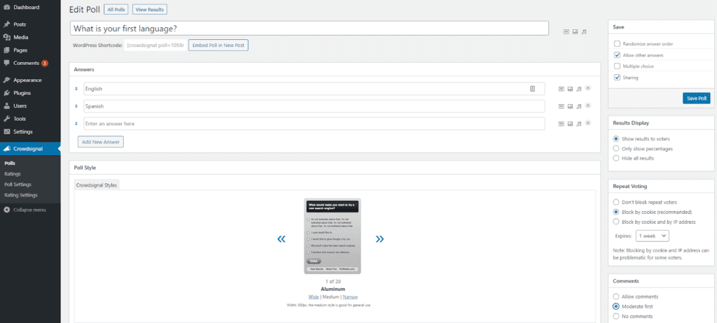
Find out from your school community what changes they would like to see on the website. You can also show ratings on your published content, to help get a sense of how readers feel about your existing site.
If your school isn’t inherently diverse, not to worry. You may need to get a bit creative, but it’s no reason not to embrace multiculturalism on your website. In fact, it may be even more vital that you do so, since students are less likely to be exposed to different traditions and practices in their day-to-day lives.
Another method you could try is doing research to see what celebrations or events are happening in your local community. These could serve as indicators of the most prevalent traditions in students’ lives outside of school.
2. Use A Translation Plugin To Share Content In Multiple Languages
Translating your school website is a crucial part of making it accessible and useful to everyone who visits it. If your community has a significant non-English speaking population, a site that’s only in English creates a barrier to participation for many parents.
Also, remember that even when someone can speak English, they’re likely more comfortable with their first language. Respecting this can help increase parent engagement.
If you’re currently relying on Google Translate or another automated translation tool, we’d recommend using a multilingual plugin instead. Automated translation options are undoubtedly fast and easy to use. However, they usually rely on machine translations and aren’t always accurate.
The Polylang plugin is an excellent option for translating your school website:
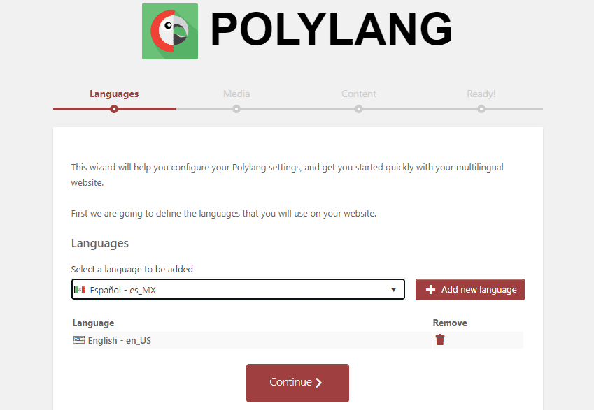
This plugin offers an extensive list of languages to translate your site into. Polylang is easy to set up and use. Simply input your site’s default language and select the ones you plan to translate it into.
You (or a translator) will then need to translate each post and page into your desired language(s). You’ll also convert the titles, categories, and tags. Polylang makes it easy for you to see which content has been translated into which languages from your WordPress dashboard:
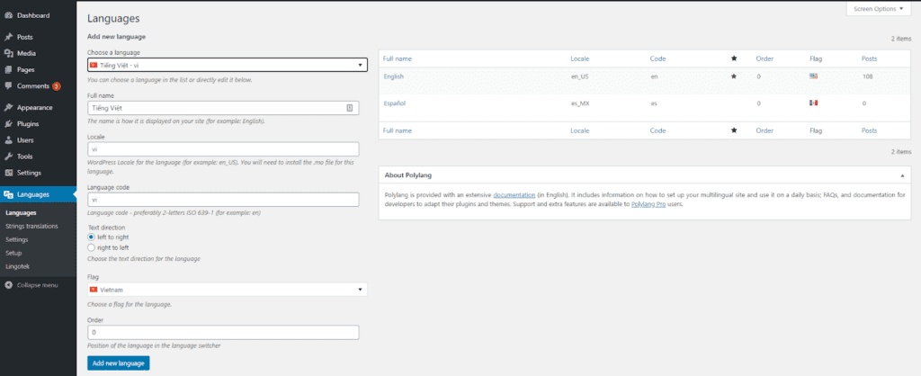
The Polylang Language Switcher Widget will enable your website’s users to view your content in the language they prefer. It’s added to your sidebar, and you can customize its appearance and behavior. If you’d prefer not to use the widget, you can add a language switcher to a custom menu instead.
Once your site is translated, you’ll want inform your multilingual families. Send out an email with a brief video tutorial demonstrating how to use the new function. Invite them to reach out with any questions or issues they may encounter.
3. Highlight Multicultural Events On Your School Calendar
You may want to put your website’s calendar to work as you build your multicultural school website. Of course, you can add any events that your school might host, but don’t forget about your surrounding community. Use your research from our first tip to further populate your school’s calendar. You can ask staff and students to suggest events they may know about as well.
Students can further participate in highlighting these events by contributing articles about them to your school blog. This not only deepens their understanding of other cultures but will also let them practice writing for the web. Encourage budding photojournalists to submit photographs to complement the articles as well.
The Co-Authors Plus plugin makes it easy to give credit to each student who pitches in. You can create profiles for them and add their names to the final post:
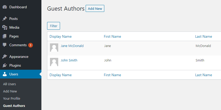
Even just including multicultural days of interest on your school calendar can spark curiosity in students. These may include religious observances, but you can also add holidays, such as Jewish American Heritage Month. You may even wish to include the birthdays of international leaders.
Again, teachers can encourage students to dig deeper into the topics that interest them and develop content around these topics. You’ll have a full editorial calendar in no time!
4. Feature Multicultural Classroom Experiences
Teachers can bring multicultural efforts into their classrooms by encouraging students to learn more about their classmates’ cultural backgrounds. This could be in the form of video interviews that are shared on your school website or a class blog. Such a project could also make a strong addition to students’ digital portfolios.
Another classroom activity to try is sharing foods from different cultures. Researching and cooking recipes for a multicultural classroom celebration might be fun for students. Teachers can use your school calendar to select dishes relevant to the time of year or choose to align the cuisine with their curriculum.
After the festivities, favorite dishes can be shared on the school website using a recipe plugin such as WP Recipe Maker:
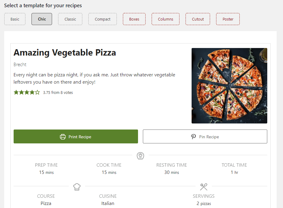
With this plugin, you can create beautiful recipes to incorporate into a blog post or to share on their own. There are multiple templates to choose from and students can print the pages out to recreate the dishes at home for their families.
5. Showcase Multicultural Art and Literature
Art, music, and literature can all be used to explore different cultures. Work with your school’s librarian to curate a collection of books to feature on your school’s website. Teachers can employ this list in their classrooms, but it’s also an opportunity to involve parents.
Reading together is an effective way for families to learn more about another culture, or even deepen their understanding of and connection to their own traditions. It’s also a chance to encourage parents to participate in their children’s education at home.
You can employ a similar approach with music. Enlist your music department for help putting together a playlist of songs for students to explore. If possible, include sheet music or lyrics with translations to deepen their participation.
If your community has a lively music scene, you can also reach out to local multicultural artists who might be willing to come in and share their music with your school. You may even want to include some performance dates on your website calendar.
Another strategy is to use a digital gallery to display visual art. With the Jetpack plugin’s carousel module activated, your school site’s users can zoom in to see the work’s details without navigating away from the page they’re on:
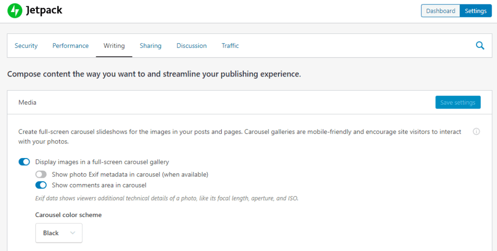
If you’re lucky enough to have an art gallery or museum in your community, you can also feature pieces from their collections.
Conclusion
It’s essential that your school website be an accurate representation of your student body and the surrounding community. You want it to be every bit as welcoming to people of all cultures as your school itself is. It’s a perfect project for involving the entire community in a shared learning experience.
In this article, we looked at five ways you can update and add to your school website to make it more multicultural:
- Understand the diversity within your school.
- Use a translation plugin to share content in multiple languages.
- Highlight multicultural events on your school calendar.
- Feature multicultural classroom experiences.
- Showcase multicultural art and literature.
Chapter 7
7 Examples Of WordPress Multisite In Education
Universities and K-12 schools often need many websites. Perhaps even hundreds or thousands to cater to all their different departments, staff and students. Managing a large number of sites in separate, isolated environments is inefficient.
WordPress Multisite is a popular choice for educational institutions looking to simplify the management of their online spaces. Multisite is a type of WordPress installation that lets you create a network of websites and maintain them from a single installation and dashboard. This enables you to easily make changes and keep track of all your websites in one place.
An Introduction To WordPress Multisite
WordPress Multisite is a feature built into the core of the content management system (CMS) that lets you create a network of websites. You can create and run virtually unlimited numbers of individual websites under the umbrella of a single WordPress installation. These ‘sub-sites’ typically use variations of one domain and share a database and file system.
The two types of sub-sites you can create with WordPress Multisite are ‘subdomains’ and ‘subdirectories’. A URL for the former would look something like subsite.domain.com, whereas the latter would use a backslash, as in domain.com/subdirectory.
It’s possible to manage an exceptionally large number of websites this way, all from one WordPress dashboard. Take our own Edublogs.org, for example. This Multisite network hosts content for over four million sites:
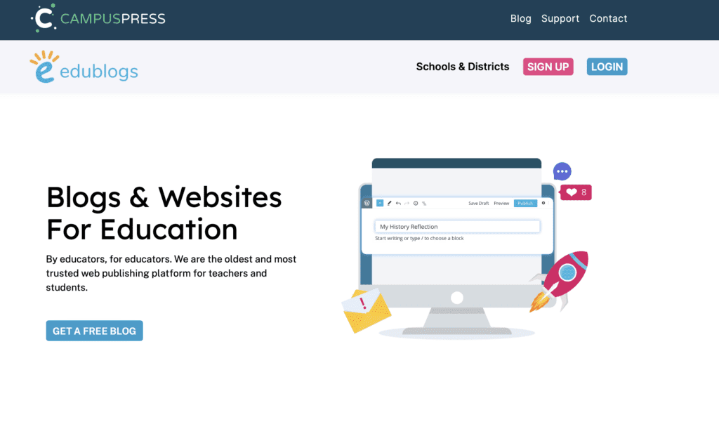
One ‘Super Admin’ controls the Multisite settings and grants different permissions to other users. Although each individual sub-site in the network will also have its own Admin, this person can only access and make changes to their own website.
If you want to activate Multisite, you can switch the feature ‘on’ to use it. However, this setting is not readily available from the WordPress dashboard or default settings. To turn enable it, you’ll need to edit your installation’s wp-config.php file. We’ll show you how to do that later on.
WordPress Multisite is beneficial for users who want to have different branches of their main website, each with their own subdomain, settings, and content. This can make it easier to establish consistent branding across sites and streamline maintenance tasks since you can update all plugins, themes, and systems simultaneously.
Finally, a huge benefit of Multisite is that it’s easy to use. It has a similar interface and functionality as a singular WordPress installation, so users familiar with the platform won’t need to deal with a major learning curve.
3 Uses Of WordPress Multisite In Education
WordPress Multisite has a wide variety of uses. It can be particularly helpful for universities, colleges, schools, and even online learning platforms. Let’s take a look at three applications of WordPress Multisite in education.
1. Build a Network of Sub-Sites With Varying Access Levels
Educational institutions such as colleges and universities need their websites to fulfill a wide range of functions. Faculty, current students, and those going through the admissions process all need access to different information, resources, and tools.
Separate pages usually aren’t extensive enough to cover these needs, while having several sites is difficult for administration to deal with. WordPress Multisite enables you to resolve these issues by creating sub-sites to serve various purposes and provide different levels of access.
Providence College’s website offers an example of this setup in action:
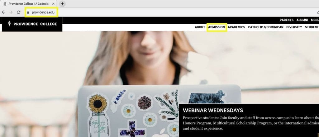
From the primary website, visitors can click on the Admissions tab, which then redirects them to a sub-site:

Here prospective students can fill out their applications and learn more about the school. You’ll notice there are also sub-sites for Parents and Alumni, which contain information pertinent to those groups.
Multisite makes it easier not only to target multiple audiences, but also to grant varying levels of access and customize controls for users. An example of this can be seen in John Carroll University’s Multisite network.
The administration wanted to limit the number of plugins installed on the network and prevent departments from changing their sites’ styling in order to maintain brand consistency. To accomplish this, users are assigned to Editor roles instead of Admin roles. This prevents them from installing plugins and modifying themes.
Another example of this comes from the University of California, Irvine (UCI). The university started using WordPress Multisite a decade ago and has since added over 300 sites annually.
The UCI network allows faculty members and graduate students to create their own sub-sites, but limits media uploads and theme and plugin installations to keep the network secure. Undergraduates can’t launch their own sub-sites. However, they can be added as users on existing ones managed by professors.
2. Offer an On-Demand, Self-Service Site Creation Platform
Another popular use of WordPress Multisite in education is to provide an on-demand, self-service platform for site creation. As we mentioned previously, UCI provides this functionality to faculty members and graduate students.
The university adopted this practice after realizing there was an increased demand among professors and students for the ability to create their own full-fledged websites, not just simple blogs. They found users preferred the sites.uci.edu domain structure over blogs.uci.edu:
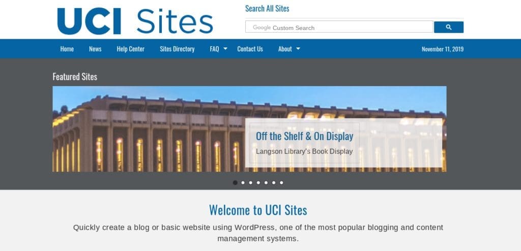
The platform uses a custom plugin to verify users’ university login credentials. They can then create as many sites as they want, choosing between a blog template and a simple website template (both with campus branding). This has minimized UCI’s support calls for common requests, too.
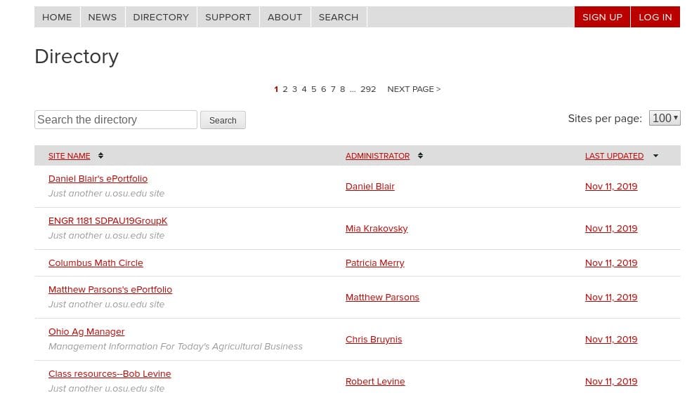
Another example of an educational institution using WordPress Multisite to enable student site creation is Ohio State University (OSU):
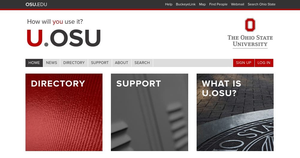
U.OSU, which is hosted by CampusPress, lets faculty, staff, and students share work, host course assignments, and showcase projects and portfolios. These self-created sites can incorporate both static pages and chronological blog posts:
Sites at Dartmouth also provides a self-service website creation system:
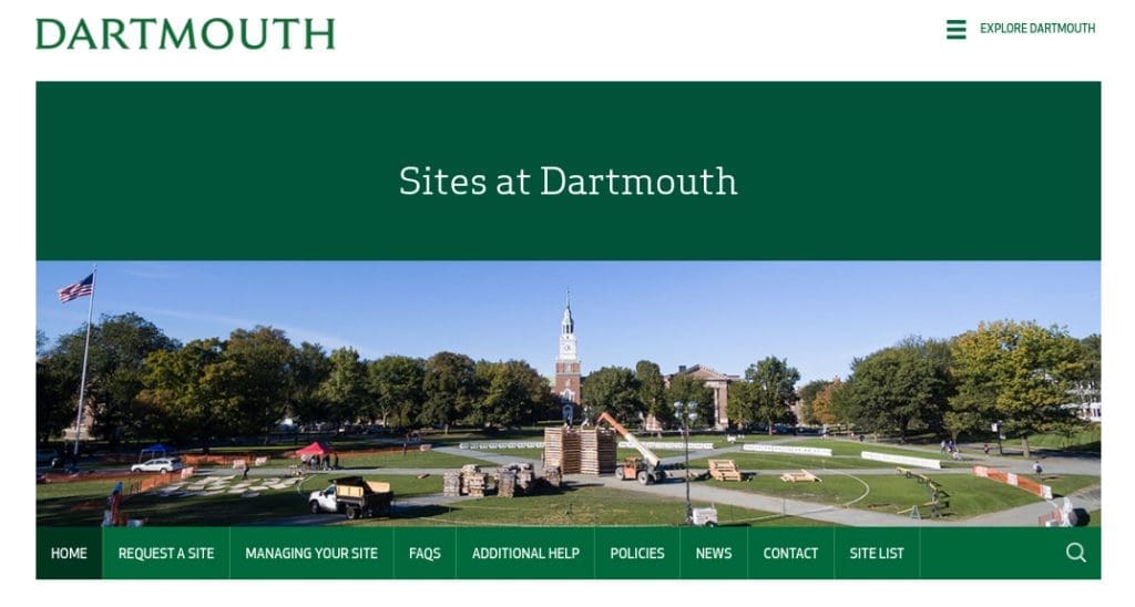
This platform lets professors and students request sites for research groups, faculty labs, or extracurricular organizations. The university has a separate platform, Journeys at Dartmouth, for teaching and learning initiatives:
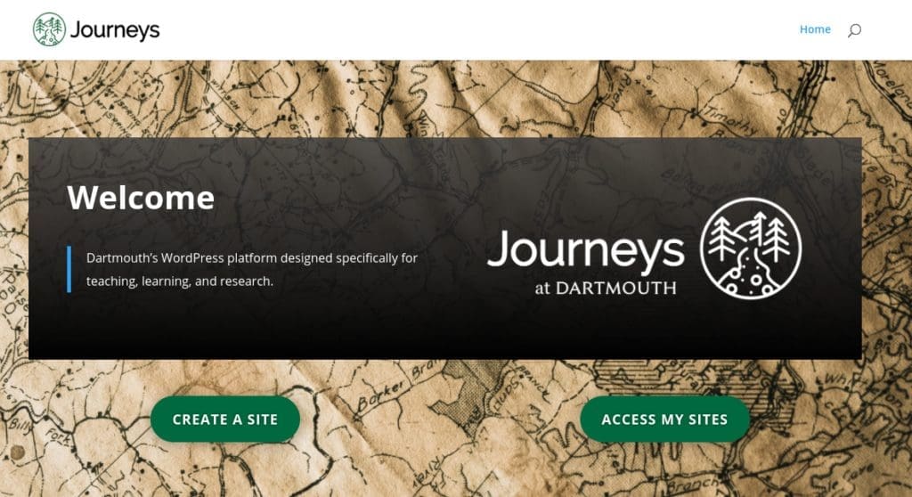
This self-service sub-site is for creating websites related to learning and academic work specifically. Users can launch a blog, portfolio, online journal, and more.
Sharing work online is a valuable opportunity for students and faculty alike. This use of Multisite can help your school’s attendees prepare for their careers or further education, while also creating free exposure for your institution.
3. Create a Blog for Each Department or Course
A third popular way Multisite is used in education is to create a blog or general website for individual departments or courses. With a dedicated sub-site for each class, it becomes easier for teachers to share materials and content relevant to their students.
Similarly, department blogs facilitate an organized method of sharing key information and resources for students and staff. Each sub-site can use its blog to establish an online hub for discussions and creating a sense of community.
Columbia University’s EdBlogs, hosted by CampusPress, is a prime example of this:
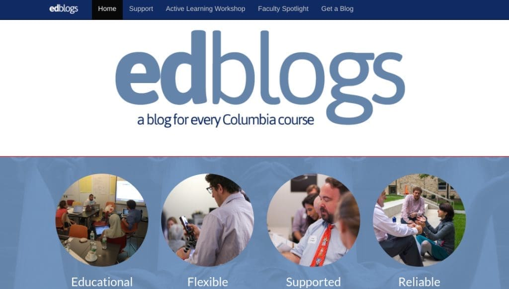
Each course at CU has its own blog, and any course instructor can request one. Students can then access it by registering with their University Network ID (UNI).
Instructors can use their course blog to offer students writing opportunities, as well as to share news and updates. In some cases, such as with EdBlogs, course-related content can be made public to those outside the Learning Management System (LMS).
Department and course blogs can also be used as part of self-service creation platforms, as we discussed earlier. For example, instructors can use sub-sites to let students publish portfolio work and assignments.
This could even be applied to online education platforms. If you offer virtual courses, you may want to think about converting to a Multisite network. This would enable you to set up sub-sites where students could discuss class material with one another, replicating an in-person learning experience.
How To Get Started With WordPress Multisite
To enable a Multisite network in WordPress, you’ll need to edit your wp-config.php file via your hosting account’s file manager, or with a File Transfer Protocol (FTP) client such as FileZilla. Before the line that reads “That’s all, stop editing! Happy publishing.” add the following code:
/*Multisite*/
define( ‘WP_ALLOW_MULTISITE’, true );
Save the file and reupload it to your server, then log in to your WordPress dashboard. Navigate to Tools > Network Setup in your sidebar:
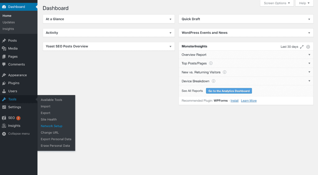
From this screen, you’ll need to decide whether you want your sub-sites to be subdomains or subdirectories. Each option has a specific set of instructions to follow. It’s important to note that, if you’re turning an existing installation into a network, you’ll have to use subdomains:

Click on the Install button to finish setting up WordPress Multisite. You can then start adding sub-sites and Admins to your network.
Multisite can be more complicated than single WordPress sites. If you need help managing your educational institution’s Multisite network, you may want to consider checking out our CampusPress hosting and support services.

We have helped universities, colleges, and K–12 schools power their WordPress Multisite networks since 2005. Our solutions support a wide range of educational sites, including U.OSU and the Cornell University Blogs. Contact us for a quote or more information.
Conclusion
The digital ecosystem of many educational websites is incredibly complex. Managing multiple sites can be complicated, tedious, and time-consuming. A more effective method is to use WordPress Multisite to control your entire network from one dashboard.
Chapter 8
An In-Depth Look At School Fundraising Websites And Giving Opportunities
We know that raising money for your school is vital. Events such as fairs and sponsored walks can help but require high attendance levels. Fundraising sites offer an opportunity to create ongoing campaigns that can attract a wider audience of donors.
Fortunately, there are a lot of giving and fundraising platforms you can choose from. These websites make your campaign more accessible to the community and are easy to use. You can also keep them active for weeks at a time to increase exposure.
In this article, we’ll go over the basics of fundraising websites and why your school may want to consider using one. We’ll then look at the key features yours should include.
Understanding The Basics Of Fundraising Sites
Fundraising websites are hubs for campaigns to raise money for your school. These platforms provide all the tools you need to set up an online donation portal and fundraising target. They also take care of the financial aspects such as accepting donations and sending them to your school.
While these features are the basis of all fundraising websites, some are better than others when it comes to school fundraisers. As you may already know, there are two primary ways schools raise money:
- Donation-based campaigns. Focus on asking for small amounts of money from a large number of people.
- Reward-based campaigns. Offer some kind of incentive for people to donate. For example, donors may receive ‘free’ T-shirts, or you could offer a prize to the top three contributors.
A fundraising platform that is ideal for schools will focus on these models.

DonorsChoose is for teachers who are looking to collect supplies or raise money for their schools. Fundly is also geared towards non-profits, schools, and similar organizations. It enables you to create fundraising campaigns without startup fees.

All three provide a range of campaigns focused on helping schools with supplies and other needs.
We’ll share more details on what to look for in a school fundraising website later in this article. Once you select a platform, you’ll need to set up your campaign, including your goals as well as a description of what you plan to use the money for tol encourage people to donate.
Once your campaign is live, you should promote it throughout your school and on social media. The right platform will be able to help with this. You can also track the progress of your fundraiser and thank all your donors for their contributions.
The Benefits Of Using A Fundraising Site For Your School
All schools need to raise additional funds from time to time. You might need to pay for an educational trip, for a school club to attend a competition, or to decorate for a student event. Traditional, in-person fundraisers can help, but online campaigns have a greater reach.
The online nature of fundraising websites also enables you to take advantage of social media to spread the word about your campaign. This takes your message beyond the confines of your school or local community. The amount of publicity your campaign generates will depend on how you share it.
Online fundraising campaigns can also last longer than traditional fundraising events. While in-person fundraising relies on students, parents, and community members being able to attend your event at a specific time, they can donate online whenever it’s convenient for them.
Finally, online fundraising platforms can make collecting donations much easier. You don’t have to worry about setting up your own system. You also won’t have to worry about being able to accept multiple types of payments. Your fundraising campaign can be up and running within minutes instead of days or weeks.
6 Key Features Of School Giving And Fundraising Sites
Knowing what features to look for in a school fundraising website can help you choose the right platform to host your campaign. Here are six to keep an eye out for.
1. Easy Donation Campaign Creation
To attract donors for your school’s online fundraiser, you need to plan and execute a campaign. There are several elements you’ll need to account for in this process, including:
- Setting up an online donation form and payment system
- Writing a clear description of your fundraiser and what you hope to achieve
- Promoting your campaign on social media and other channels
School fundraising websites include tools designed to make it easy to create your campaign. By walking you through the process, these platforms can help you avoid forgetting any elements you need to make your fundraiser successful.
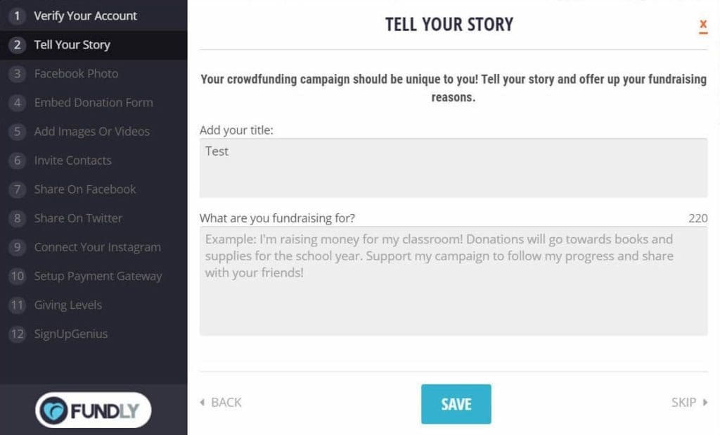
Additionally, many fundraising websites will enable you to easily create your donation form without having to deal with code or other technical aspects. They can also streamline the process of connecting popular payment gateways such as Stripe and PayPal with your account so that you can accept donations.
Fundraising websites can also link your campaign to social media by providing sharing buttons for your campaign page. This enables you to promote your campaign, and for students, parents, faculty, and others to spread the word on their own profiles, too:

Finally, many fundraising websites also enable anonymous donations. There are many reasons why someone might choose to donate this way, and facilitating the process can increase your campaign’s overall success.
2. Multiple Donation Methods
If you host an in-person fundraising event, you are generally limited when it comes to donation methods. Taking cash contributions is simple, but setting up other payment options can be a challenge. This is where online fundraising can make your job easier.
Fundraising websites typically enable you to provide many ways for people to donate. You can take credit cards, use online payment services, and more.
Providing multiple donation methods enables people to contribute in the ways they feel most comfortable doing so. This might increase the number of donations you receive:
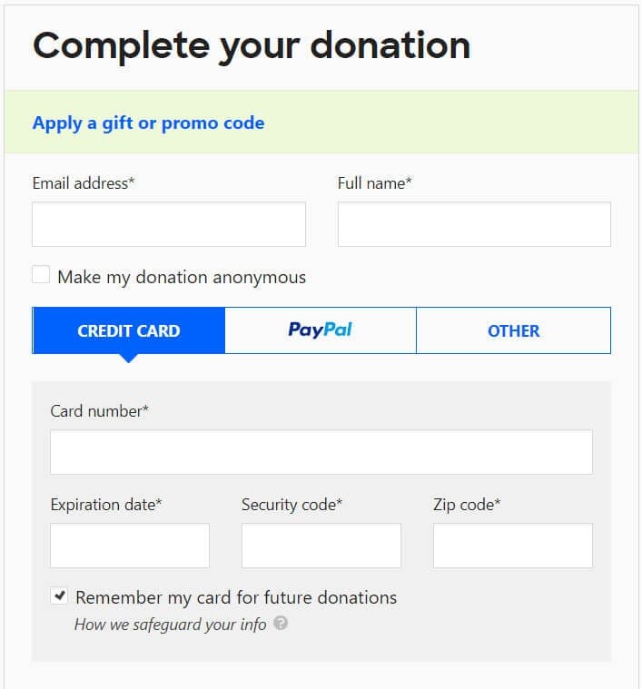
When looking at donation options, you might also want to consider alternatives to monetary contributions. “In-kind donations” of physical items to your school can be just as helpful but are often harder to get.
Most fundraising websites don’t offer an option for in-kind donations, which is why you might want to look into a specialized service such as Donation Match.

This platform enables you to apply for donations from corporations. If you’re accepted, you’ll fill out details about your school’s needs. Companies can then choose to contribute to your campaign.
If you’re using a different platform, you can share details on your campaign page about how you plan to use the money you raise.

Alternatively, you could mention in your campaign’s story section that you’re also accepting in-kind donations at your school. Just make sure to check the terms and conditions of your platform to ensure it allows this first.
3. Clear And Comprehensive Fundraising Reports
Reports are a particularly important part of fundraising. They let you know how your campaign is doing and your average donation amount. You can also see how many people have donated and who your donors are.
All fundraising websites provide basic reports via your campaign dashboard:
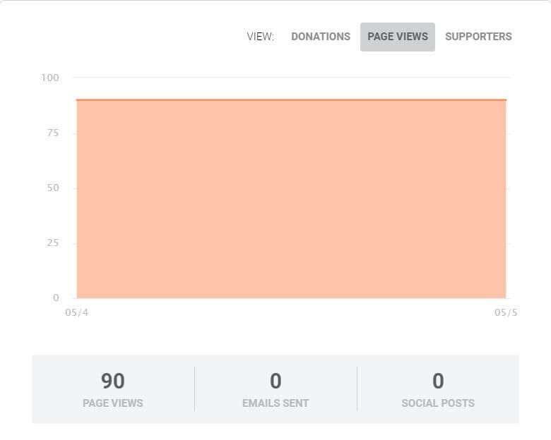
The best thing about this feature is that you do not have to take any extra steps. Reports are automatically generated, and many provide real-time data.
You can also list your fundraiser’s statistics on your campaign page where students, faculty, and donors can see them. For example, displaying your progress can help encourage more donations to help you reach your goal.
Generally speaking, fundraising websites will enable you to choose which metrics to share publicly so you can display the information you think will be most effective with your audience.
4. Shareable Fundraising Campaigns
One of the key features of fundraising websites is the ability to create shareable campaigns. Being able to easily promote your fundraiser on social media can lead to more donations if done correctly.
Many fundraising platforms enable you to embed social sharing buttons on your campaign page. These buttons allow visitors to share your fundraiser with others on Facebook, Twitter, and other networks.
However, this is not the only way you can promote your campaign. You might also publicize it on your website using buttons or other features provided by your fundraising platform.
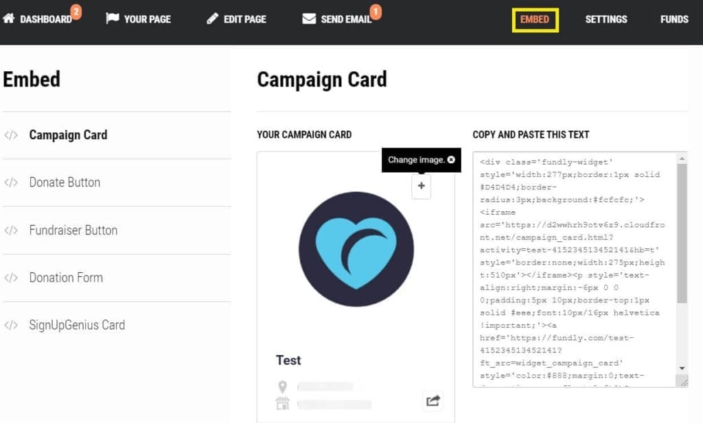
Most fundraising websites allow you to embed a campaign card, a donate button, or a donation form on your own site by copying and pasting a bit of code.
It’s also smart to utilize email to promote your fundraising campaign. Some platforms will enable donors to sign up to receive updates on your efforts.
This can lead to repeat donations and further sharing via email.
5. The Ability To Showcase Results On Your Website
Online fundraising campaigns often last much longer than offline ones, and it can be hard to keep people motivated and invested in helping you reach your goal. Real-time showcasing of your results on your website is one way to help maintain interest.
This is something that school fundraising websites can usually help with. We already discussed how you can display reports and progress on your campaign page. Using your platform’s embed feature, you can also show that data on your school website.
To add this real-time information to your website, you will need to copy and paste the proper embed code provided by your fundraising platform. If you’re using WordPress, you can then navigate to Appearance > Widgets in your dashboard and paste this code into a Custom HTML widget.
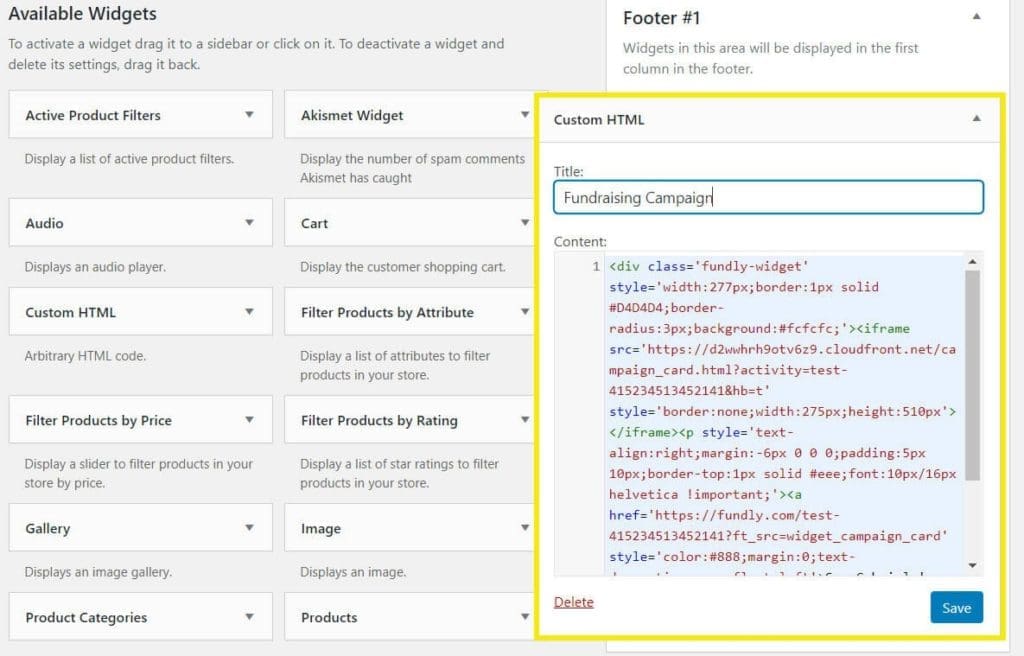
This will enable you to display your campaign’s progress throughout your site in your sidebar or another widget area. Once you save your widget, your campaign progress meter should appear on your website and update automatically as donations come in.
6. Low Fundraising Fees
It can be easy to overlook the fees fundraising websites charge. All websites will charge a fee, but some are lower than others. It’s important to pay attention to those of the platform you’re using, and to account for them when setting your fundraising goals.
The types of fees charged will vary depending on the website. Popular school fundraising websites such as DonorsChoose and Edco charge fees per donation. This covers their costs for processing payments through third-party systems such as PayPal and Stripe.

Other websites may charge a fee for creating a new campaign.
Ideally, you should try to find the platform that offers the lowest possible fees while still providing the other key features you need. DonorsChoose is a solid option as it charges just 1.5 percent of each of your donations.
Fundly is also a relatively affordable option. It has no startup fees but deducts 4.9 percent of each donation and has an additional three percent fee for credit card payments. However, there are discounts available for larger campaigns.
Conclusion
Raising money for your school can be a challenge. However, school fundraising websites can make it easier by helping you to promote your cause, collect donations through multiple digital channels, then share the results with the generous people who have given to your school.
In this blog post, we have provided six key features that school fundraising websites can provide to boost your donation efforts, while increasing efficiencies for all of those involved. To recap, fundraising websites can:
- Help you create campaigns quickly and ensure your fundraiser is launched with all the necessary elements.
- Provide multiple donation methods so people can use their preferred option to contribute.
- Produce clear fundraising reports so you can stay up to date on your campaign progress.
- Allow you to share campaigns to help promote your goals.
- Give you the ability to showcase your results on your website and keep people invested in your campaign.
- Cost less than traditional fundraising by providing fees that keep your campaign affordable.
Chapter 9
4 Post-Pandemic K-12 Education Website Trends To Watch For
The pandemic that the world is awaking from has touched every single part of our lives. Schools are no exception. COVID-19 stressed the foundation of our educational institutions and everything we knew prior to the virus spreading havoc around the globe.
As we slowly creep our way out of this unprecedented time, we must ask ourselves “what lessons have we learned and what current trends will we see implemented once we are out of the pandemic?” Below we list four website considerations, trends, and opportunities that schools must embrace and implement as they navigate this new challenge.
1. The New Normal
Websites have long been staples for schools wishing to engage students, families, and the community. However, schools went into digital hyperdrive upon the arrival of COVID-19. As a reaction to the virus, educational institutions offered fully remote or hybrid options in anticipation of a vaccine from governments and the healthcare community.
While there was an outcry from many who questioned the effectiveness of online learning, one thing remains clear: your school website is more important now than ever, and families will continue to use it as a vital tool long after in-person courses resume. How does this breakdown look?
- Education Hub – Yes, school websites have long been vital tools for families, but in the post-pandemic world websites should provide more information and access to critical transactions that help both schools and families as they administer student experience.
- Attendance – While in-person engagement is still critical, a healthy online presence will allow families to engage more frequently through the use of online tools such as forms, chats, signups, and Zoom calls. This will also allow students to attend classes virtually on sick days and allow teachers to conduct coursework when schools close due to weather.
- Digital Prowess – Teachers and staff will adopt a more holistic educational approach that will include a healthy dose of online learning and community engagement. To do so, they will need to continue to learn and incorporate digital educational strategies that will help all parties navigate this new normal – for the long term.
- The Buy-In – It is still undetermined just exactly how online education will affect K-12 learning. However, AT&T’s Future of School report found that “94% of teachers are open to the idea of hybrid learning with the proper resources, curriculum and support,” while “84% of parents support virtual tutoring or enrichment programs.” With this kind of buy in from both sides, it’s safe to say that online education will long play an integral part in our schools.
- Educational Opportunities – It has also been recognized that online education is a skill unto itself. For example, in the past year we have seen an unprecedented number of jobs go fully remote. Some companies have incorporated strategies to continue this trend to reduce overhead and attract talent regardless of location. With online communication skills in hand, students will be equipped to navigate this new workplace world.
2. Your Website Has To Rock
Now that we have covered the “why,” it is essential to examine the “what” when looking at the future of school websites and online education. In particular, families and school staff must have a digital experience that mirrors those they receive from banks, progressive e-commerce companies and other website destinations. This is notably important in the areas of:
- Useability – Is your website easy to access and be found? Are there prompts that guide visitors through their experience? Are there online resources that help them navigate their time on the site? These are just a few questions school’s must consider as they create a seamless user experience for constituents searching for vital information.
- Accessibility – Another important consideration schools must examine is whether ALL visitors can consume online information and use their websites. This includes colorblind users; English language learners; people with limited motor control; the elderly; deaf individuals; and those with learning disabilities such as dyslexia. By doing so, schools can increase engagement and digital experiences for all audiences including families, staff and faculty.
- Design – As more and more people spend an increased amount of time on your website, it’s important that you create an aesthetically pleasing look and feel. Whether consciously or subconsciously, an attractive design will give your website a sense of legitimacy, care and warmth. Include your school colors and logos to create a sense of community with visitors. And add student photos that illustrate academic achievement and student life as a way to humanize your online presence.
- Architecture – As mentioned above, website design is paramount. But what good is an attractive website if your users can’t find what they need? By creating a logical website structure, you can quickly guide visitors to their desired destination. This includes points of entry in your main navigation and sub-navigation, plus prompts and calls-to-action on your homepage. Don’t forget your internal pages. Once they begin the navigation process, it’s important to keep your visitors engaged with information that is relevant to their search.
- Mobile Friendly – In today’s world school websites must look and perform well on all devices – phones, tablets and desktops. Accordingly, schools should seek out website options that provide cross-device functionality so visitors can conduct school business despite what device they are using. Responsive design is part of the solution. This concept identifies the device visitors are using and optimizes your website for full functionality and superlative user ease.
Below, the Assumption of the Blessed Virgin Mary website uses stunning visuals to invite visitors to its website.

3. Security Enhancements Are A Must
With this increase in online use by families and staff, schools must ensure communications by all parties are safe and secure. Student and family information can be extremely sensitive, and schools must protect all of those using their websites. Protocols to follow include:
- Automated Security Scans – Create processes that automatically check any plugins, code, templates, and themes for any known vulnerabilities.
- Code Review – Employ expertise that allows you to check your website and all its features for best practices to minimize potential exploits.
- User Authentication – Configure a safe way of authenticating users, including with two-factor authentication to ensure only those trusted and approved can edit your website.
- Security Patches – Repair any known vulnerabilities to the CMS or server in less than 24 hours.
- Firewalls – Protect sensitive information and attacks on your website with brute force and DDoS protection, with all traffic monitored.
- Audit Logging – Capture detailed logs of user actions in case information needs to be retrieved.
- Backups – Ensure encrypted backups are taken nightly and stored somewhere separate to your website in the case you experience website or server malfunction and test that the recovery process works regularly
4. Multisite Platforms
A school website is no longer a static place for general information. In fact, it is becoming the digital equivalent of a living, breathing organism where students, staff and families engage in a variety of communication methods. To meet this challenge, schools should consider a Multisite platform. This is a popular choice for those looking to simplify the management of online spaces. Features of Multisite include:
- Network of Sites – Multisite allows you to create a network of websites for your school or school district under one umbrella. That means only one download and one central location where all websites are administered.
- Access Levels – Multisite also allows you to assign various levels of access so you can recruit faculty and staff to update your website, while controlling who can actually make live changes, publish pages and alter the website’s look and feel.
- A Complete Digital Solution – Multisite networks are more than just your main website. In fact, you can have separate sites for academics, clubs, about us and even portal sites for parents, students, faculty and staff. Lastly, this option allows teachers to create their own classroom websites and gives students the opportunity to publish their own blog and e-portfolios.
- On-Demand Site Creation – Multisite also offers schools the opportunity to create as many websites as they wish. And they make it easy. Faculty, staff and others with the proper credentials can publish new websites quickly in an on-demand, real-time environment.
The WordPress Solution
Choosing the platform that is right for your school website can seem like a daunting task. However, WordPress can provide you with all the options you need to meet the ever-changing educational landscape. In fact, WordPress powers just about 40 percent of all websites in the world that use a content management system. This solution allows you to easily create and customize websites, and there is a myriad of hosting options, security solutions, plugins and themes to choose from.
- Accessibility – Choose WordPress and take advantage of accessibility plugins that ensure your website is compliant.
- Templates & Themes – Select from a variety of pre-developed designs to get your website up and running fast.
- Plugins – These additional pieces of software give you additional functionality for your website (calendars, countdown timers, SEO tools and more).
- Customizable – WordPress is easy to use and allows you to customize templates or create a look and feel on your own.
- Multipurpose – WordPress can be used as the content management system for your website, while also serving as a blogging and ePortfolio solution for your staff and students.
- Multisite – Administer and update multiple websites from one dashboard and one login.
- Access Levels – Assign access to multiple WordPress users and allow them to make updates to specific pages/sites.
Check out more reasons to use WordPress as your content management system platform for your school website.
Below, Del Valle ISD uses portals, plugins and strong calls-to-action to engage visitors to its website.

Chapter 10
9 Ways To Use Your WordPress Website For School Crisis Communications
The COVID-19 pandemic caused schools to move quickly and adjust their normal routine to create a stabilized learning environment for students. Part of the strategy for most schools was the use of crisis communications. In short, this method of communication is the way an organization communicates and disseminates information to constituents during events that pose a risk to its organizational structures and protocols.
As the virus wreaked havoc around the world, some schools had detailed crisis communication plans in place, while others struggled to adequately inform students, families, faculty and staff on the most up-to-date information regarding closures, remote learning and new cases of the virus.
One of the most useful tools that schools employed to disseminate information was their website. Below, we outline how your school can use WordPress to maximize reach and inform the community with your digital presence.
Kinds
Before we jump into how websites can be used during times of crisis communications, it’s important to list the kinds of crises a school may face. A few to note include:
- Extreme Weather
- Closing of School
- Bus Wrecks
- Bomb Threats
- Healthcare Emergencies
- Fires
- School Shootings
How To Use Your Website For School Crisis Communications
Since educational institutions adopted digital technologies decades ago, websites have become an essential hub for providing information. Fast forward to today and schools are using websites as a central location and delivery platform for crisis communications. Below we outline how they are using or can use websites in this regard:
1. Dedicated Page
Today, it’s common for schools to publish a page on their website that serves as a permanent location for when emergencies occur and crisis communication is vital. Even when there are no active crises, the page can prompt visitors to sign up to receive future communications and instructions on what actions to take when these situations do occur. These pages can have a location in the website architecture, then can be prominently displayed on the homepage and other locations. In short, your crisis communication page is your hub for information, no matter where and how it is disseminated.
2. Banners and Popup Boxes
Once you have created a dedicated crisis communications webpage, there are multiple ways to draw a visitor’s attention to it. One option, aside from a prominent navigation location, is the use of banners. These website elements give you the flexibility to display information in a way that is hard to miss. Options include a block at the top of your homepage that displays the latest information and link to your dedicated page. Text in these blocks is easily changed if you are using a content management system (CMS) like WordPress.
Another option is popup boxes. These are displayed on school websites and overlay webpages. They are particularly useful when the crisis communication to be disseminated is particularly urgent and the intent is for visitors to get that information above all other.
3. Email and SMS Alerts
Email and SMS alerts are vital ways to communicate to the public during times of crisis communication. This is especially true when schools wish to push information out to students, faculty, staff and families quickly, when information dissemination is critical.
Your audience members can simply sign up for these alerts on your website. Remind and Schoolmessenger are two example services that can integrate with school websites to manage email and SMS communication and push notifications when urgent news is published.
4. Calendar
Interactive calendars on the homepage and throughout your website can serve as a great place to highlight events, presentations, Zoom calls and other functions related to crises at your school. To make it even easier, WordPress plugins allow the community to add your school’s events to their personal Google Calendar or iCal as a reminder.
5. Videos
A video speech or presentation given by a school leader can serve as a great way to inform the public about the latest developments on your campus. With today’s technology and devices like smartphones, it doesn’t have to be a major burden or production to create.
In fact, a video shot on a smartphone can humanize the speaker and give viewers a sense of relatability. Simply shoot a video, upload it to YouTube or other video platform, grab the embed code and place it on the page where you want it to appear. This video can be repurposed for email, social media and other places where applicable to get maximize exposure.
6. Social Media
With the ubiquitous nature of social media these days, it’s important to have a presence on multiple platforms. Whether it’s Facebook, Instagram, LinkedIn, Twitter or others, schools have an opportunity to communicate with users who engage with these channels on a regular basis. To do so, schools can choose from multiple plugins that allow you to connect and directly share from your WordPress CMS to official school social accounts.
There is also a built-in WordPress option under the Tools section that allows schools to optimize and share posts/pages to social as well. Lastly, schools should add social “share” buttons on all pages where visitors can spread the news on their own networks.
7. Chats and Chat Bots
These two options allow visitors to gather information in an on-demand environment. In chats, visitors can ask questions regarding school crises and receive immediate responses. If a chat administrator is not immediately available, visitors can leave a message and email address, and their question or comment will be answered later.
A Chat Bot is a software application that uses artificial intelligence and gathers data from the users. Based upon the user’s question, Chat Bots then provide webpages and other information that are relevant to the user query.
Most live chat and chat bot services integrate easily with WordPress and can be added to sites with just a few clicks.
8. Help Desk
Finally, community members can gather crisis communication information through an online help desk or just a simple contact form. Schools can set up multiple pages and populate them with forms where users can ask questions or request information. It’s also wise to include a phone number on your help desk pages for those web visitors who simply prefer to give you a call.
9. The Team
Crisis communication teams will vary from school to school based upon size, the crisis at hand, available personnel and other factors. However, to maximize your crisis communications efforts, schools should take a couple of measures into consideration. They include, but are not limited to:
- Defining Goals – Schools should define what it is they want to accomplish with their website during these times. This includes crisis communication pages, emails, texts, social media and other platforms.
- Personnel – Schools should appoint multiple employees that have the digital skills to post information on your website and disseminate it through multiple routes. Having a crisis web team will allow you to communicate to the public in a 24/7 crisis environment.
- Chain of Command – Including web/communication specialists in your plan is essential. In fact, having a direct line between your web team and those accountable for approved messages is a must.
- Practice and Training – Schools should practice crisis communications to ensure they are ready when messages are necessary. This includes making sure your web team is prepared for these times and is familiar with the latest WordPress updates.
Chapter 11
How To Create A Class Newsletter Parents And Students Will Be Excited To Read
Sending a monthly or weekly email newsletter is a great way to communicate with parents. It’s effective, efficient, easy and can be delivered directly to their email inbox. However, if no one is reading your newsletter, you might not feel motivated to put in the necessary time and effort.
Fortunately, there are ways to make the process of writing and sending a newsletter less demanding. And if the content you create and curate resonates with families, the newsletter will quickly become a much-anticipated routine in your students’ homes.
To help you get started, we’ll share a bit about why having a classroom newsletter is important, as well as what you may want to include in it. Then we’ll guide you through the process of setting up Mailchimp, which can make designing and sending your newsletter a snap.
The Importance Of A Classroom Newsletter
A newsletter is a fast and convenient way to keep families up to date with what’s happening in your classroom. It’s also a powerful tool that not only informs parents but also helps them feel more involved with their children’s school lives.
Your newsletter is also the perfect place to let students show off their work. Taking this opportunity to highlight achievements can provide motivation to perform well in class. It might even get your pupils excited to share the newsletter with their parents.
Of course, your newsletter is useful for alerting families about course work and academics in the classroom. But busy parents will also likely appreciate receiving a heads up about upcoming class events, trips, and project due dates.
What To Include In Your Class Newsletter
Obviously, what you include in your newsletter is of the utmost importance. It’s the core of your communication and what will determine whether parents continue to open your messages. Consider the following content ideas and concepts:
- Infographics are a fun way to express statistics about your classroom. For example, if reading has been a primary focus lately, you can create an infographic that describes how many words students have read on average over the past month.
- You may already be sending home updates on what your students have been learning. Consider adding some discussion questions to go along with them. Parents can use these to help continue the learning at home and engage meaningfully with their children’s education.
- You might also let them know about community events related to what’s happening in the classroom. Shakespeare in the Park, a day at a museum or a festival can be a fun learning experience for the whole family.
- Running class events can be a lot of work, but some of your pupils’ parents might be willing to pitch in. Alert them to upcoming classroom happenings so they can join in on the fun and lend a helping hand.
- If your students contribute to a class blog, you’ll likely want to link to some of the latest content in the class newsletter. This may be especially interesting if your pupils are experimenting with video or photography on the blog.
- Finally, you’ll still want to include any essential information parents may need to know, such as important upcoming dates. It may not be the most exciting section of your newsletter, but most recipients will be grateful for the reminders. You might include a link to your school’s calendar as well.
How To Create A Class Newsletter Parents And Students Will Be Excited To Read (In 4 Steps)
So far, we’ve covered why having a newsletter is important, and given you many ideas for what to include. Now, we’ll show you how to make all these efforts manageable using Mailchimp.
Mailchimp is a Customer Relationship Management (CRM) platform commonly used for marketing. However, its wealth of email building and automation features can work just as well for your class newsletter.
Mailchimp offers several pricing tiers, but you’ll likely only need the free plan. This will enable you to have up to 2,000 contacts. It also grants you access to a few basic email templates. If you find you want to experiment with more layouts and features, you can always upgrade to a paid plan.
Step 1: Set Up Your Mailchimp Account
The first step is to get your Mailchimp account set up. You’ll start by providing some information about yourself. You will have to enter a physical mailing address to comply with anti-spam laws. Your school’s address will satisfy this requirement:

You’ll then answer some questions about whether you have any contacts to import and what sort of content you’ll offer. Based on your answers, Mailchimp will recommend which service tier may work best for you. However, you’re free to select whichever plan you like:
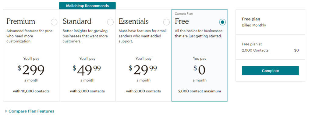
Make your selection, and you’ll be ready to move on to the next step.
Step 2: Design Your Email Template
Now it’s time to design the email template that you’ll use for your newsletter. Once you have it set up, you can simply add fresh content to it each time you’re ready to send a new issue out. Begin by going to Create > Email Template in your Mailchimp account dashboard:
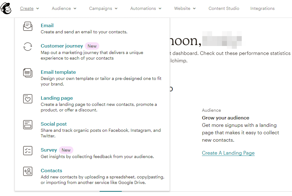
Select a plain layout or a theme. If you’ve opted for a paid plan, you’ll be able to access themes specifically designed for newsletters. However, don’t be intimidated by starting with a simple layout. You’ll only have to customize it once, and Mailchimp makes this simple.
To create your design, you’ll use content blocks. The process is quite similar to building a post with the WordPress Block Editor.
Drag and drop your desired elements wherever you’d like them to appear. You can add your content, then style each block to your liking. If you change your mind, you can always move the elements around, or delete ones that you no longer need:
The Image Card block is one that you might find especially useful. It enables you to add an image with a caption beneath it. This could be an ideal way to include an infographic, along with an explanation of what it’s showing.
You might also want to make use of the Share block. You can provide buttons for Facebook, Twitter, or email forwarding. This should make it a bit easier for parents to share what their children have been working on with extended family members and friends.
Not only can you customize individual blocks, but you can also change the look of the email itself. Click on the Style tab to add some color and specify fonts for your headings:
Once you’re satisfied with the framework you’ve created, click on Save and Exit. You’ll be prompted to enter a name for your template and click on the Save button. Once you’ve saved your work, you can find it under Saved Templates whenever you need it.
Step 3: Add Your Contacts
Next, you’ll want to import your contacts. From your dashboard, navigate to Create > Contacts. From here, you can either upload a CSV, or you can copy and paste parent email addresses from a spreadsheet:
Once your contacts are in Mailchimp, you’ll be able to organize them. Check that the Subscribed status is visible in the dropdown menu. Since you’re setting up Mailchimp for the first time, don’t worry about updating existing contacts:
You may want to add tags to these contacts for further organization. These could include the academic year or the name of the class:
Mailchimp will automatically match the columns in your uploaded file with the information it needs to build your audience. You can also choose to import additional columns. When you’re ready, click on Finalize Import to review your settings. If everything appears as it should, click on the Complete Import button:
As an alternative to importing contacts, you can ask parents to sign up for the email list themselves. If you have a class website, you can place a link there or include it in any parent information packs that go home at the start of the school year.
Step 4: Create and Send Your First Campaign
Now you should be ready to create your first campaign. Click on the Create Campaign button in your dashboard to get started:

Give your campaign a name, and you’ll be prompted to provide some additional information. Fill in your email address and your name so parents will recognize that the email is from you. You’ll also create a subject line for your email newsletter here:
Next, click on Design Email. You’ll be able to select and edit the saved template that you created earlier:
Now you can add all your fresh content to your template. Don’t worry if you don’t finish in one sitting. You can always save and return to your newsletter later. In fact, you may want to work on it a little bit at a time throughout the month or week.
If you chose one of the paid tiers, you’ll have the option to schedule your email. Otherwise, you’ll just need to send it manually whenever you’re ready. Click on Send to do so:
This will bring up one last preview box where you can look over your campaign details. When everything looks correct, click on the Send Now button:
Once you do, your newsletter will be on its way to your classroom families.
Conclusion
Consistently delivering a high-quality class newsletter is ambitious, but not impossible. It can be an effective way to help parents feel more involved in their children’s education and give them a glimpse into students’ lives at school.
In this article, we went over a few reasons why having a class newsletter is helpful and what content can make it more appealing. Then we showed you how to use MailChimp to streamline the process of building and sending your class updates.
Chapter 12
6 Tips For Facilitating Online Discussions With Students
Thanks to e-learning technologies, online education has made it easier for teachers and students to connect all around the globe. Although virtual classrooms certainly have their advantages, they aren’t without fault.
Fortunately, teaching your students through an online platform can be just as successful and engaging as if you were in a traditional classroom. The key is knowing the strategies you can use to spark discussions and promote an active educational environment.
In this post, we’ll discuss some of the challenges that come with online learning. Then we’ll provide six tips you can use to facilitate and encourage discussions both with and among your students. Let’s get started!
The Challenges Of Online Learning
There are many differences between traditional and online classrooms, both in terms of instruction and social interaction. Of course, the biggest variance is the availability of in-person exchanges.
Online learning environments can feel less personal. As an educator, you may not be able to make connections with your students as easily as you might if you were to physically see and talk to them regularly.
This can make evaluating their performance more difficult for you, but more importantly, it can be an isolating experience for your students. A lack of support and insight from classmates may make it harder for them to flourish.
Then there’s also the technological requirements needed for e-learning platforms. The productivity of your students is reliant upon having the proper tools and systems in place.
However, for each challenge that comes with online learning, there are also advantages. For example, students may be more likely to participate online than they would be in a classroom.
What’s more, virtual learning technologies such as class blogs and discussion forums can help mitigate some of the associated challenges. You can utilize online education tools to provide a more in-person feel and encourage students to interact with one another as well as the course material.
6 Tips For Facilitating Online Discussions With Students
Online discussions are similar to traditional ones in that they require proper planning and preparation to be as successful as possible. Let’s take a look at six tips you can use to facilitate them with students and, in turn, maximize their virtual learning experience.

1. Consider Offering An Asynchronous Discussion Format
Asynchronous learning lets students access course materials and tools at their own pace. It provides flexibility that isn’t always possible with synchronous learning formats, such as online courses with scheduled sessions.
There are a handful of advantages to offering asynchronous discussions. For example, students can post when it’s most convenient for them. They’ll be able to spend more time providing thoughtful answers, rather than feeling rushed to respond as quickly as possible.
This format is also an advantageous option for large classrooms. When you have a lot of students trying to discuss something all at once, such as through a live chat, it can quickly become overwhelming and confusing.
Asynchronous discussions offer breathing room for both you and your students. They will be able to take the time they need to craft insightful and well-thought-out responses. Plus, it will make it easier for you to assess their participation and answers for a more accurate evaluation.
2. Make Discussions Part Of The Course Grade
In a perfect world, your students would be eager and excited about participating in online discussions. Unfortunately, that isn’t always the case.
If you make discussion contributions optional, you run the risk of low engagement. As a result, you won’t get to learn as much about your students and their progress, and they won’t get as much out of the course as they otherwise could.
That’s why you may want to consider making online discussions part of the course grade. Students will be more likely to contribute meaningfully if they know it influences their score and ability to pass the class.
How much of the overall grade you think discussion participation should account for is, of course, up to you. However, somewhere between ten and 20 percent is enough to give some reluctant students the push they might need.

3. Provide Clear Guidelines, Expectations, And Instructions
Once you determine how online discussions will fit into course grading, it’s important to make sure your students are clear on it. For example, they’ll need to know if posts will be scored according to frequency, depth and quality, or a combination of these factors.
You may want to consider creating a discussion forum grading rubric so there’s no confusion about what the expectations are. The University of Central Florida offers some helpful examples. These can give you a solid starting point for how to structure yours:
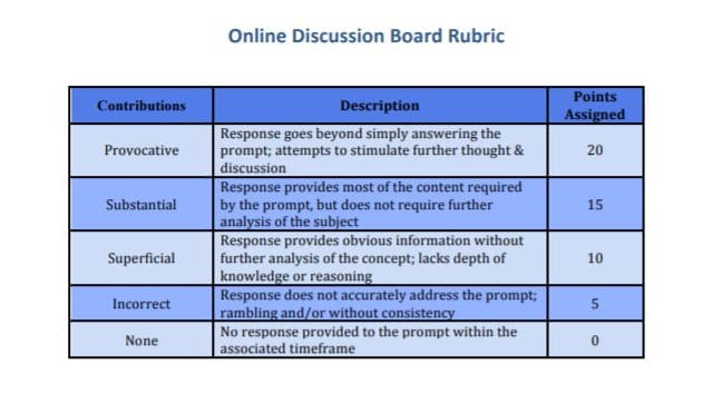
Being direct and specific from the start about discussion expectations can help prevent unnecessary confusion. It can also make grading easier for you.
Additionally, it’s a smart idea to craft instruction and guidelines for students to follow on how to comment and participate in discussions. For example, you might touch on points such as:
- How often students are expected to reply per week
- If participation is due by a certain date after the prompt is posted
- Whether there is a minimum number of posts students should reply to
To further clarify your expectations, you might consider including exemplary posts from past classes. This can help students align their participation with your discussion goals.
4. Present Opportunities For Students To Connect
When it comes to online discussion boards, it’s just as (if not more) important for students to interact with one another as with you. Remember, virtual learning environments can be isolating.
Therefore, it’s helpful to foster a sense of community where students feel comfortable exchanging ideas and collaborating with one another. An effective way to facilitate this is by creating a forum where students can talk amongst themselves.
Another strategy is to have students pose questions to one another. You could also have them critique or engage with each other’s responses. This can help make them more comfortable and eventually embrace and support one another throughout the course.
To provide more opportunities for students to connect through online discussions, it’s worth experimenting with different techniques. For example, The Teaching Professor outlines two popular and useful methods:
- Starter and Wrapper. This is when one student acts as the ‘starter’ by posing a question or comment about the material. Then other students serve as the ‘wrapper’ and provide answers and input.
- Save the Last Word for Me. This discussion structure is when half the students post something from the material they don’t understand and the other half offers their interpretations.
If you have a large class, it may be beneficial to break it up into smaller groups. Doing so can make it easier for students to make meaningful connections and engage in more in-depth discussions.

5. Craft Thought-Provoking Questions
At the end of the day, if you want your online discussions to be lively and engaging, you need to pose quality questions that warrant thoughtful responses. Making it a priority to structure prompts that go beyond basic, generic queries can help students produce better answers.
For example, rather than simple “yes or no” questions, aim to make them more open-ended. Consider asking students for their opinions, but require them to back their statements up with course concepts. This can make discussions feel less rigid and help students to open up and infuse some creativity and critical-thinking into their contributions.
You could also pose questions that foster debate. While you don’t want to be controversial, a healthy prompt that encourages multiple points of view can provide a valuable learning experience.
6. Play An Active Role In The Discussions
As the instructor, your role in online discussions is crucial. Responding to posts, asking follow-up questions, and requesting students clarify or elaborate on their answers can help keep them engaged. After all, it’s hard to fault those who don’t willingly participate if you’re not doing so yourself.
If they know the discussion board is monitored and frequently reviewed, students will also be more likely to be mindful of their participation. The earlier you start responding to posts, the better.
However, your presence is also a bit of a balancing act. You don’t want your role to be too dominant, as students may become focused on interacting only with you rather than each other.
As the discussion facilitator, you may want to redirect questions back to students when needed. Rather than agreeing or disagreeing with an answer, for example, you can respond in a way that spins the discussion back to others to stimulate debate.
Conclusion
Keeping students engaged and actively participating in discussions can be difficult for any educator. However, it’s particularly challenging when your class takes place online.
As we explored in this article, six tips you can use for facilitating online discussions with students include:
- Offering an asynchronous discussion format.
- Making discussions part of the final grade.
- Providing clear guidelines, expectations, and instructions.
- Presenting opportunities for students to connect.
- Crafting thought-provoking questions.
- Playing an active role in the discussions.
About Us
At CampusPress, we’re experts in bringing innovative web solutions to elementary schools through WordPress and our wide range of out-of-the-box and custom plugins and products. In fact, our services in accessibility, security, hosting, support, along with an extensive suite of other tools, power millions of education websites, blog networks and portfolios.
Learn more about our solutions for school district websites or request info today!

