
Web accessibility is a broad and often complex subject. Maybe you’re exploring it to avoid potential fines or lawsuits. Or, on a more positive note, perhaps you already recognize that accessibility is simply the right thing to do and want to improve your site. Whatever brings you here, we’re glad you’ve joined us.
Here’s the thing: when working toward accessibility, people often overlook the bigger picture. Without the right context, it’s easy to make avoidable mistakes or waste valuable time and resources. That’s why we’ll start by covering some essential background knowledge every developer, designer, content creator, and site owner should understand.
From there, we’ll move on to practical tips you can start using right away.
There’s plenty to dig into, so use the table of contents below to jump to the sections you need.
Let’s dive in!
What Is In This Guide?


Chapter 1
Introduction & Philosophy

It is ok to admit it. When it comes to accessibility, what most of us are really after is compliance. We want a certificate or a badge that we can proudly display after a job well done. Then, we want to be done and move on.
It’s all about covering your backside and perhaps a fair way of looking at it, but it can really miss the boat.
My first paid job on the web was while I was a university student where I worked at the school’s Accessibility Institute. I spent my time manually reviewing the university’s hundreds of department websites for accessibility issues and then I would send a report of needed improvements to the ‘webmaster’ of each site. Remember when we used to all be called webmasters? Ha! This was nearly 20 years ago!
And though the web has evolved considerably over the last two decades, the basic principles and guidelines of web accessibility are mostly the same.
It was here that I heard repeatedly that accessibility is a continuum. It should never be about compliance and it is never as simple as being accessible or not. No matter how accessible your site is, it can always be more accessible to more users. Just as it can always be faster, better designed, and optimized in countless other ways.
All I’m saying is that please don’t let compliance or some arbitrary score from an automated checker be your actual goal. Compliance is about assessing your site against standards at a single point in time. Accessibility is about the people visiting your site now and in the future.
Your goal should always be to provide the best possible site experience for all possible users. So as you work to improve your site’s accessibility, always keep the user in mind.
Accessibility Is For Everyone
Speaking of users, when we think about web accessibility, we often consider those with visual or hearing impairments first. Complete blindness, vision loss, or color blindness, and deaf or hard of hearing. Certainly, ensuring blind and deaf folks can easily navigate and use your site is a significant part of a site being accessible, but there is more.
Being accessible means those with cognitive disabilities and conditions need to be able to navigate successfully. Complex triple-drop-down mega-menus and sites with compact and confusing layouts are a no-no. Whitespace, fewer columns, and useful headings can make a huge difference.
Being accessible means those with physical disabilities and limitations need to be able to navigate successfully. Can you easily get around your site with just a keyboard or voice control? Are links and buttons big enough if someone has trouble keeping a mouse steady? Is it hard to manipulate multiple scroll bars with content inside a page? Will your auto-play animations potentially induce a seizure or an instant headache to some visitors?
Being accessible actually means everyone needs to be able to navigate successfully. On all types of devices, with all speeds of internet service, and everything in between.
It is worth repeating, so here goes again. Web accessibility includes accommodations for users who:
- Are visually impaired and rely on screen readers to navigate the web
- Can’t see color and need accessible design to ensure they can perceive all of your site’s content
- Have limited motor control and use alternative methods to get around the internet, such as keyboard or voice-activated navigation
- Deaf and hard of hearing visitors who may not be able to access audio or video content
- Visitors with learning disabilities such as dyslexia, who may have a harder time reading certain fonts
If your current layout is overly complex, your navigation system isn’t intuitive, or your design choices make your content hard to read, then you may be preventing visitors from finding the information they need.
Accessibility goes hand in hand with the design and user experience of a site. All of this means that the next time a client or site owner comes to you asking to cram one more link into an already crowded menu or to add another animated slider or pop-over to the homepage, use accessibility standards as a way of changing their mind.
This is a perfect segue too…
Good Design Is Accessible Design
Or is it accessible design is good design?
If you’ve ever been a part of a home remodel or renovation project, you’ll quickly find that costs are often higher and timelines are often longer than if you just started from scratch with a new house. Doing work like moving plumbing or taking down walls can be intense and expensive.
Just like a home, retrofitting an existing site to improve its accessibility may in some cases be more costly and time-consuming than just starting over and building new. Many of today’s WordPress sites are complex with a lot of moving parts like page builders with shortcodes and dozens of plugins that may output content too.
This just underscores the fact that you really must always design and develop for accessibility from the very beginning of any project or new site. You should be able to feel confident that your site will pass the standards before you ever run it through some site checker.
Chapter 2
The Quick Fix Options
(Psst. They don’t work.)

With the legal consequences of websites not being accessible making the news more and more, it is not surprising that we are seeing startups and app makers coming out with different solutions that in many cases sound too good to be true. There are WordPress plugins for this too.
These are buttons that you can add to your website that when clicked will pop up a sidebar widget with accessibility tools. Some of the tools often include items like increasing or changing fonts and alignments, changing colors, or contrasts.
Do they work? Eh.
I don’t want to link to them here (so as not to endorse them), but do a quick google search and you will quickly see what I’m talking about.
Sure, if compliance is all you are after, these tools may help you. But it should be a temporary band-aid while real accessibility fixes are put in place. These seem to focus almost exclusively on the visually impaired, which like discussed above, is only a subset of the ‘everyone’ approach accessibility is really meant for.
Many of the features of these tools are better handled by assistive technology or even the settings found in all major web browsers, not on the site itself. It can become unnecessary noise.
I also find these tools to be overwhelming and confusing to use, which definitely, for me, makes them a non-starter.
The same can be said for many of the growing number of WordPress Accessibility plugins out there. A kitchen sink approach rarely works. Your mileage may vary.
Here’s a screenshot of a popular one so you can get the idea. Notice that there are over two dozen clickable options before even scrolling and in such a small area. Ugh.
But hey, the website of this tool claims to guarantee compliance in under five minutes!
Here are a few additional resources that echo and elaborate our position on these sorts of solutions:
- Should I Use An Overlay? – A11Project.com
- Why Accessibility Overlay Solutions Fail to Protect or Serve – Accessibility.Works
Chapter 3
Is WordPress Accessible?
Great question!

The short answer: WordPress sites that follow best practices are accessible. From what I’ve seen and heard, the WordPress dashboard is among the most accessible web publishing tools available.
The long answer is a bit more complicated. Since March of 2016, WordPress core has had an official policy that all new or updated code released into core must conform with WCAG 2.0 guidelines at level AA. In practice, this may not have always been the case, but there has been increased awareness and education which is starting to pay off.
In the spirit of accessibility being a continuum, of course, it can always be improved. There are accessibility shortcomings in the WordPress backend, and it is easy for sites and themes to not meet compliance standards.
A big word of caution here, as a community, we do run the risk of people (and especially enterprise and public organizations) choosing less accessible technologies should WordPress get an inaccessible reputation. Deserved or not.
Backend Accessibility
I mention dashboard accessibility above, but when we discuss the accessibility of WordPress, we often are really only talking about the frontend output of content for site visitors. Backend accessibility, in the WordPress dashboard, is also important to ensure that everyone can manage and contribute content to sites.
There are two major players in backend accessibility. WordPress core itself is first – and as noted above, over the last few years, the dashboard experience has been greatly improved.
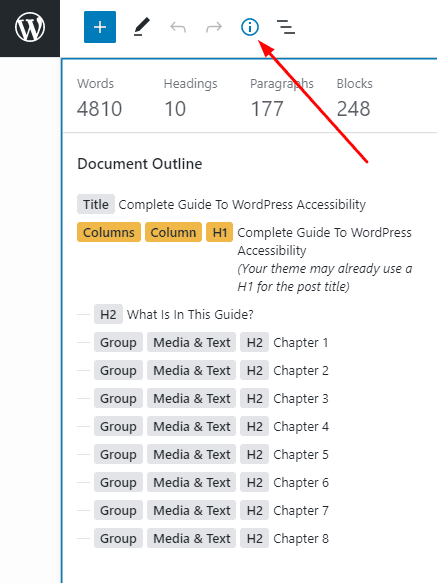
For example, an audit commissioned by WPCampus of Gutenberg found 90 issues in the block editor of which a significant majority have been closed.
There are some hidden gems related to accessibility in the WordPress dashboard too. For one, the Headings block hides the H1 tag as this is reserved exclusively for the page/post title) Then, should you still use H1, there are warnings that you will be shown too, for example:
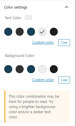
There are also warnings when you try and use a font that is too light to see on the background. Here is what that looks like:
Plugins are the other major player that can affect the dashboard. We dig into this more in Chapter 5 below, but the best advice for any plugin developer is to simply use WordPress core styling and UI for all settings and options in the dashboard. No need to reinvent the wheel, and then you will be well on your way to an accessible experience.
Frontend Accessibility
This is your site itself, and we’ll spend a lot of time here with tips and advice to ensure you have the most accessible site visitor experience possible.
Themes
If you choose the wrong theme, you won’t have any chance of having a compliant site. For years, there has been a growing list of ‘accessibility-ready’ themes that have been reviewed to meet these theme accessibility guidelines.
The theme is responsible for ensuring that the markup, layout, navigation, and design elements are accessible. We do occasionally come across themes labeled as ‘accessibility-ready’ that have accessibility issues. It’s painful to hear, but you still must test.
When it comes to themes, one of the biggest impacts they can have on accessibility is the navigation and menu structure. If the top navigation of a site can’t be navigated by keyboard easily or is not friendly to screen readers, you may as well not care about anything else on your site. This should be the first thing you check when installing a new theme.
Pro tip: The ‘Skip Nav’ link before the main menu of a site is one of the most basic accessibility features that all themes should include. The skip nav makes it easy for screen reader users to bypass the site’s navigation so that they don’t have to listen to it if they already know that they want to get right to the content of the page.
If you are testing a theme and it doesn’t have the skip nav, move on, find something else. You can do better, and chances are it will have more accessibility issues too.
Testing for ‘Skip Nav’ is easy. Open up the site and hit the ‘tab’ button one time. You should see a button or a link at the top of the page that says “skip to main content” or similar appear.
If you develop themes, check out this Guide To Creating Accessible WordPress Themes.
Plugins
You can also quickly make a site inaccessible with the addition of a bad plugin.
Culprits to look out for are any plugins that display content on the front-end like calendars, sliders, forms, page builders, or Gutenberg blocks.
Frustratingly, there is not a good way to know if a plugin produces accessible content without testing it. There is not a list or tag on WordPress.org for free plugins like with themes.
If you find an accessibility issue with a plugin, the best thing to do is to contact the plugin developer with as much information as possible. We’ve all come a long way in appreciating and understanding the need for accessibility, so most will be more than happy to work on improving it.
I’d also like to see plugin developers produce accessibility statements that publicly share with users where the plugin may potentially impact frontend content and note any known potential issues. This is probably a bigger undertaking than you might expect, but something we are actively working on here at CampusPress. We know that our own plugins and site are by no means perfect, but we are actively working hard on it.
Chapter 4
Accessible Content & Design

While having the right theme in place can help ensure your site starts off being accessible, anyone that add, edits, or publishes content on a site can quickly make a mess of it.
Luckily, the WordPress block editor helps by providing all of the tools needed for content creators. Here are the main ideas that everyone should be familiar with…
Images and Alt Text
By now, most of us have heard about ‘alternative text’, or ‘alt text’ for short.
Alternative (or ‘alt’) text is a written description attached to an image that is shown in the event a user’s browser isn’t able to load the file. However, it’s also very important to visually impaired visitors. Screen readers can interpret and relay it back to guests so they understand your content more completely.
This is one of the reasons that alt text is so important for accessibility. Everyone deserves the opportunity to have a similarly full experience when using your website, and that includes being able to perceive visual content such as images.
Alt text can also aid visitors who have slow internet connections, or who are otherwise unable to load images. Even if they can’t see your photos or graphics, they’ll be able to read what they contain.
Decorative Images
The main thing often misapplied here is that anything ‘decorative’ doesn’t require alt text. For example, background images don’t need alt text. Similarly, if the same content is presented in text near the image, there’s no reason to force someone using a screen reader to hear that information twice.
Another good example of ‘decorative’ images that DON’T need alt text are the chapter headers on this page. We purposely left the alt text blank so that they will be marked as decorative and ignored by screen readers.
While we tried to create images that made the post a bit more enjoyable to read, the actual purpose is just to break up the content visually. There’s no real value added to the content of this guide which means there’s not a good reason to force a screen reader visitor to have to listen to a description of them. Does that make sense?
A few common types of decorative images include:
- icons (especially when there is text that describes the icon right next to it)
- dividers, lines, and shapes that help break up content
- featured images of blog posts
- background images
That being said, when in doubt if something is decorative, best for everyone to just add a short descriptive text for the Alt Text field. I hate to be the one to tell you this, but you will often find two accessibility experts disagreeing about if an image is decorative and what the alt text should be. Choose to err on the side of caution and inclusion.
When Images Need Alt Text
Any image that is not decorative needs alt text. Period.
Alt text should not describe the image, it should describe the purpose of the image.
That’s actually kind of a big deal, but can be hard at first to get your head around.
Here are important things to remember when writing alt text:
- Keep it short and simple, no need for flowery descriptions.
- Don’t start with the words “Image of” or “Photo of” – it is redundant as screen readers already announce it as an image.
- Any image that is a link must have alt text and the text should tell the visitor where the link is taking them.
- If the image has text, the alt text should include the same text – unless that text can also be found on the page near the image already.
How To Add Alt Text
The process of adding alt text to images on your WordPress site is fairly intuitive. Simply click on an image block while editing a post or page, and then look at the Image Settings in the sidebar to the right of the editor.
Then, go to the field labeled Alt Text (Alternative Text):
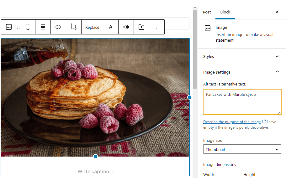
Just type your alt text in here. The most difficult part will be ensuring your description is clear, accurate, and easily understandable.
Learn more about writing great alt text and decorative images.
Acronyms, Abbreviations, and Shorthand
As you write content, make sure to spell out acronyms and shorthand.
For example, the accessibility community loves to use ‘a11y’ in place of spelling out accessibility. This comes from there being 11 letters between the ‘a’ and the ‘y’.
For those using screen readers, acronyms and shorthand can be particularly confusing, as they can be harder to understand when heard. In general, screen readers will typically spell out (or say each letter) of words using all uppercase.
You also alienate or confuse all readers that may not be familiar with the acronym.
Contact Forms
Forms are one of the most common items that automated accessibility checkers will “ding” on a site for having problems. Accessible forms is too complicated a topic to cover in detail here, but most major WordPress form plugins have come a long way in doing the bulk of the heavy lifting for you. The best source for more information on accessible forms is from the W3C.
From a site creator standpoint, the main things to keep in mind are to actually use all of the fields that the form tool provides, and to ensure that you label every field with something descriptive and helpful, as this is what screen readers will use.
We have also found that the default styling that comes with many form plugins don’t meet contrast requirements or use really small fonts. So you may need to use the custom styling tools to really get the form up to where it should be.
Links
I used to sit in an office where most of the people in the cubicles around me were using screen readers. It could be distracting, for sure, but fascinating (and perhaps good for eavesdropping). One thing that still sticks out to me is hearing the computerized voice say the word “link” over and over and over and over again. The screen readers were saying “link” out loud before reading the text of each link.
This is because those using screen readers use the ‘tab’ key to navigate around a site. This takes you from link to link around the page. This actually makes the links you have on a page the most important content when it comes to helping users navigate.
So, imagine if all you hear is: “link read more”, “link click here, “link next”, “link previous”.
All this to say, ensure that your links include text that has meaning when heard all by themselves.
The other big item when it comes to links is to ensure that you identify them with something more than just color. Otherwise, color-blind visitors may not be able to identify links on your site. The simple option is to underline links – this was once default behavior, but designers everywhere have decided something the cool kids don’t do, so it has fallen out of favor. You can also bold or signify a link using some other means (an icon, for example).
As we mentioned, there are many WordPress themes you can apply to your site that will automatically do some of the work for you. When previewing potential designs, look for links that are distinct in color and underlined for good measure.
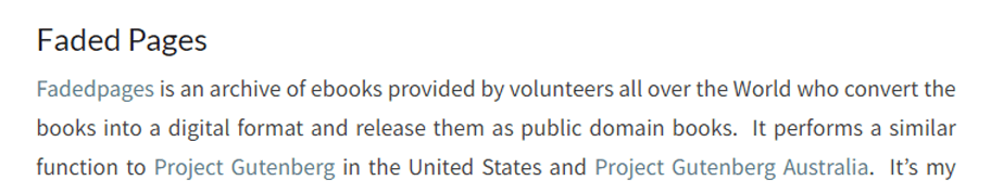
If you’re already using a WordPress theme that doesn’t incorporate these features, you may be able to make adjustments using the Customizer. Take the example below. Although the links are a different color from the main text, it’s missing the underlining that will make it even easier for users to find:
To change this, you can add a little custom CSS code. Navigate to Appearance > Customize:
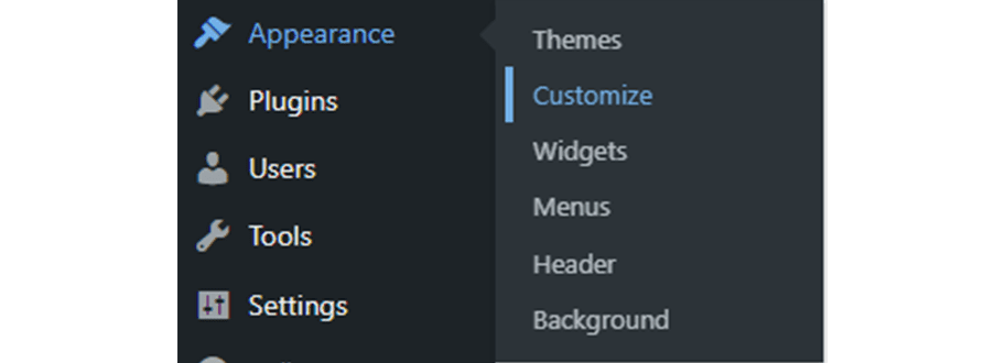
Then, scroll down to the section labeled Additional CSS. Here you can apply your own code to customize the appearance and layout of your site. To add an underline to your links, you can use this snippet:
a {
text-decoration: underline;
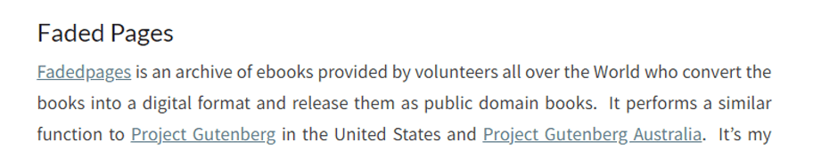
}As you can see, the links we showed earlier is now underlined:
The changes you make in the Customizer apply site-wide, so this should fix the issue across all your content.
Fonts and Text Size
Font legibility seems basic, but there are plenty of themes out there that use very small text or ornate scripts. Additionally, making your WordPress website accessible requires that your written content is not too bold or light, and can be resized.
The ability to resize text is particularly important. Many laws and regulations, such as the Americans with Disabilities Act (ADA), require that a website’s text be adjustable up to 200 pixels (px) larger than the original size without having to use assistive technology, resulting in the loss of functionality, or lowering the quality visually.
You can test this out on your site by hitting “ctrl” and “+” at the same time in your browser. The text should instantly get bigger! Users with limited vision, but who can still mostly see, will definitely know how to increase font size and will probably have default settings configured on their device or web browser.
The main benefits of this practice are that users can experience enhanced readability and adapt your website to their specific needs. Legible fonts can often be vital if your website is available across different platforms, such as mobile devices as well as desktops.
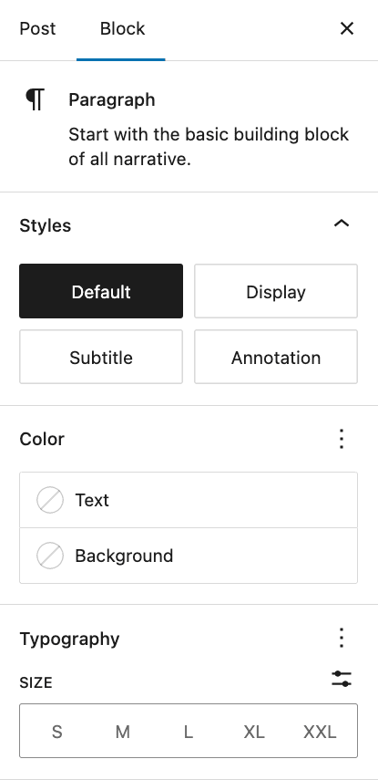
There are a few steps you can take to improve the legibility of your website’s text. First, if your theme uses a very small font size, you can increase it right from the Block editor.
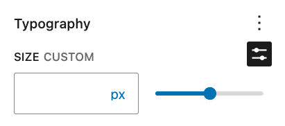
Select the text you want to adjust. In the block settings sidebar, open the Typography section and choose a Size that ensures readability on both mobile and desktop screens:
Alternatively, you can set a custom size by entering a specific value in the Custom field or by using the slider. For body text, it’s generally recommended to use at least 16 px.
Switching out fonts is a little trickier. Without a plugin, you’ll need to do some fairly extensive custom coding, which is difficult and risky if you don’t have much experience in that department. Use Any Font is a highly rated plugin that can help. It enables you to upload fonts to your site and apply them from the WordPress editor.
Chapter 5
Accessibility For Developers

For this chapter, we turned to Alex Stine, our inhouse developer extraordinaire who also happens to rely on a screen reader to navigate his computer.
Here are the main items that Alex suggests that all plugin and theme developers follow to help ensure accessible results:
1. Icons and images mean nothing to users that cannot see them. Always add descriptive screen reader text.
2. Use real HTML elements. If you want a table looking layout, use a table. If you want a link, use a link. If you want a button, use a button. Don’t use divs or spans however you see fit. It is not accessible as those are not what those elements are meant to be used for. We see poor use of divs and spans all the time.
3. Structure the page with the latest HTML5 tags. Add aria-labels if you have more than one of the same HTML5 elements such as multiple navigation menus.
4. Avoid external JS libraries such as chosen. Instead, use real elements such as combo boxes and not those fancy search selects. They do not work well and may not for the foreseeable future. We have to develop with what we have, not what we wish to have.
Beyond these, we always encourage developers to use the default WordPress tools and styles available whenever possible. For example, many plugin authors will completely reinvent the settings area in the WordPress dashboard with their own toggles, checkboxes, and other styles instead of just using the default WordPress options.
Similarly, theme authors like to create their own settings areas instead of just using the built-in WordPress customizer.
There are many reasons why sticking to default is preferred, especially when it comes to accessibility. First, you will automatically benefit from the accessibility markup and design of WordPress core itself. This helps with future-proofing your work too as new versions of WordPress are rolled out.
Second, your users will be instantly more familiar with how your plugin or theme should work given that the rest of WordPress works the same way. This is particularly important for users with all types of disabilities and special needs, as it reduces the amount of time and practice needed to familiarize themselves with the new feature.
We know, we know, adding your own personality or design preferences to your projects is tempting. And we are guilty of it ourselves. But we highly recommend not reinventing the wheel whenever possible.
Chapter 6
Evaluating Your Site

The best thing you could ever do to evaluate your site for accessibility is to turn off or unplug your mouse and then try and navigate around your site.
Even better, would be to do the same thing, but also use a screen-reader and a blindfold to try and get around without sight.
To be fair, navigating by keyboard, and especially listening to screen readers, are skills that can take a while to master, so you may have trouble even on a truly accessible site. But give it a go.
For a screen reader, try the free ChromeVox Chrome Extension or Narrator on Windows. Most visually impaired folks will use a premium or paid screen reader to best meet their needs, but these free options should do the trick for you.
Once you are prepared to test manually, you are ready to give an automated accessibility checker a try.
For content on pages and posts, we recommend our own Accessible Content plugin, which finds potential issues and gives you advice on how to fix them. You can download the Accessible Content plugin for free here on Github.
Beyond the content, to test your theme and other plugins you will need something more comprehensive. Our current favorites include:
It almost goes without saying – these tools can’t catch it all and they also may return false negatives. They will require manual testing and confirmation, which is why we suggest getting familiar with keyboard navigation and screen readers first. Some of the tools and checking may also require input or testing from a developer.
One more note on things to test. It is not just your website that needs to be accessible – your helpdesk and documentation, any mobile apps, social media content, and anything else a visitor or customer may encounter are included too. Yikes!
Chapter 7
Accessibility Statements

Accessibility is making the news more and more because there are more and more laws and legal consequences around accessible websites. In the United States, the courts are handing out more fines than ever and extending the scope of what must be accessible at a rapid pace. The European Union passed a Web Accessibility Directive that requires member states to pass and enforce legislation with a deadline for all sites to meet minimum standards by September of 2020.
One of the significant actions you can take to help comply with all of these new laws and regulations is to publish an Accessibility Statement on your website. This is much like the Privacy Policy we have all become familiar with and will soon be a ubiquitous link found in just about every footer on the web.
In general, an Accessibility Statement should include:
- A general statement confirming your commitment to accessibility and any standards you used in testing your site.
- A declaration of how you tested (self-assessments are fine, but also include any 3rd party tools or services used).
- A list of any known accessibility issues on your site. It can be ok to have areas that need improvement, it is just important to say so!
- A preferred way for anyone that finds accessibility issues to contact you.
Some countries may have specific language to be used or additional requirements to include.
We used the Accessibility Statement Generator by W3C to assist in creating our own statement and policies.
Here are a few examples of other Accessibility Statements in the wild:
WordPress VPAT
If you provide services to governments or enterprise customers, particularly in the US, you may get asked about a Voluntary Product Accessibility Template or VPAT.
This is a lengthy document that essentially lists accessibility standards and asks you to declare how well you meet the standard. Here is an example VPAT published by GitHub.
For those of us selling WordPress services (hosting, plugins, development, etc.), we can (and should) produce VPATs for individual products or plugins that we create. For example, we provide a VPAT to our customers that covers a base installation of our default theme.
However, we can’t really complete a VPAT for WordPress itself. This is because VPATs are designed to be completed by those that create the software or application. A VPAT is a contract and might include commitments to future improvement, neither of which any of us can guarantee on behalf of WordPress.
Chapter 8
More Resources

The above is really just the tip of the Guten iceberg when it comes to accessibility, but we hope you now have a better foundation on which to build going forward.
Let’s summarize with a complete list of links and resources for you to bookmark and keep referring back to…
WordPress and Accessibility
WordPress Accessibility Handbook – best practices for content, development, and design as curated and published by the WordPress community.
WordPress Accessibility Team Blog – where the contributors that work to improve the accessibility of WordPress publish updates and news. We encourage anyone interested to get involved!
‘Accessibility Ready’ WordPress Themes – free themes in the WordPress repository that have been reviewed for meeting many accessibility standards.
Tools and Resources
Accessible Content WordPress Plugin – gives content creators an easy way to check for potential issues when editing posts and pages.
Accessibility Statement Generator by W3C – makes it easy to create your own Accessibility Statement.
WebAim Contrast Checker – this is our favorite contrast evaluation tool because you can easily use the slider to find a color in the same family that has more contrast.
WAVE by WebAIM – the original automated accessibility checker and still one of the best.
axe by Deque – testing tools and a browser extension which is a favorite of our plugin development team.
Google Lighthouse Developer Tools – built into Chrome’s developer tools, it does a great job of pointing out the most common accessibility issues on a site.
Siteimprove Browser Extensions – along with its paid ongoing monitoring services, we have found Siteimprove’s tools to provide the most helpful and actionable advice.
Talks, Professional Development, and Trainings
WPCampus Library – videos of accessibility talks and presentations from WPCampus conferences.
WordPress.tv Talks – videos of accessibility talks and presentations from WordCamps.
Have a question or something to add?
If you’d like to discuss any of the above or reach out for help, please contact us. We’re happy to chat!