The 2020 pandemic underscored how recruitment and admissions have been evolving for decades.
With universities facing increased restrictions on hosting tours and open days, along with travel limitations for some prospective students, virtual tours, photos, videos, and online information have become more crucial than ever. This is especially true for recruiting applicants from other states and countries. Even before the pandemic, international students—who are often highly valued by universities—have typically relied entirely on the information available online.
In fact, research has shown that most applicants base their choice of school on the university’s website.
If you’re concerned that your university website may not be meeting expectations, don’t worry. Below are four effective strategies to enhance your site’s appeal to prospective students.
Continue reading, or jump ahead using these links:
Search Engine Optimization (SEO)
Make a Strong First Impression
Provide Accessible Information
Implement Mobile-Friendly Design
1. Search Engine Optimization (SEO)
Search Engine Optimization (SEO) is the process of attracting more visitors to your website by helping your site appear high on Search Engine Results Pages (SERPs), such as Google. You can improve your rankings with a few techniques.
One of the most effective ways of improving your SEO is by having updated and genuinely useful content on your website. When you publish credible articles or blog posts on topics that internet users are actually interested in, search engines like Google will notice and boost you up the ranks.
Keyword optimization is one of the most commonly cited SEO techniques. This involves using common search terms in your content to indicate that your article is relevant to that subject. But what keywords should you use? You can do research to find the most popular phrases users look for with tools such as Moz’s Keyword Explorer. That particular tool requires you to set up an account but if you’re looking for an alternative keyword research tool, check out this list from Ahrefs.
Interlinking related posts and pages on your site can also help boost your Google rankings too. This enables search engine crawlers to better understand the structure of your content and how different resources are related to one another. Your articles can also lend authority to one another to boost rankings.
Other steps like adding meta descriptions and optimizing your URL structure can also help, although to a lesser extent. Still, they can enable searchers (and therefore potential students) to find relevant information faster, so they’re worth addressing.
A final word of advice on SEO is to avoid tactics that can backfire and hurt your rankings instead of helping them. These include keyword stuffing and black-hat techniques such as using paid backlinks.
Google itself reminds us,
You should build a website to benefit your users, and any optimization should be geared toward making the user experience better.
2. Make a Strong First Impression
Visual design is about the tone and message your website conveys based on how it looks. An unwelcoming layout might be chaotic, overcrowded with images, or use massive walls of text that intimidate visitors.
Attractive landing pages, on the other hand, can hook visitors in. They encourage prospective students to stay on your website, and take their time looking around.
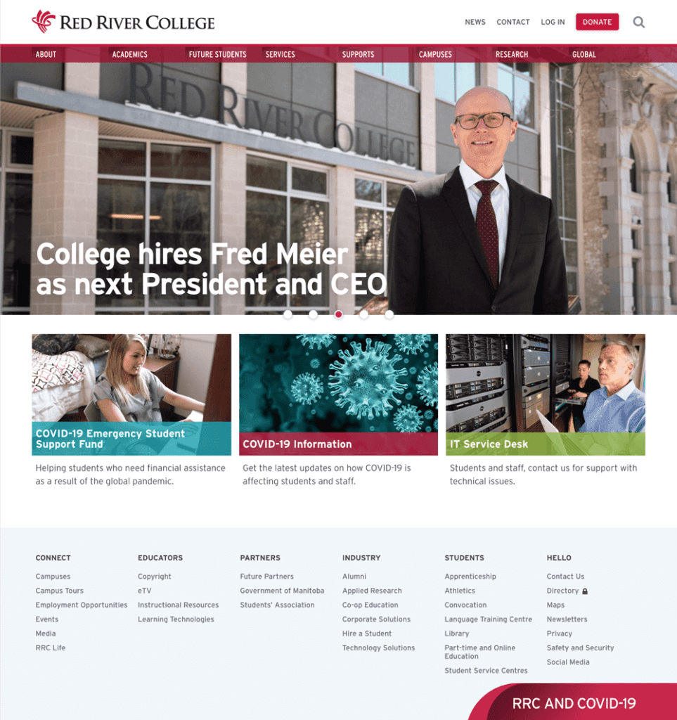
Look at this example from Red River College, hosted by CampusPress. There are minimal calls to action with the announcement of an Open House and clear navigation headings to dive deeper into site.
When designing your website, consider your navigation menu, page layouts, and even which typefaces you use. Color is another key factor, as it can affect our moods. For instance, orange is often seen as being friendly, while purple hints at luxury and yellow at optimism.
The University of Pikeville website gives a subtle nod to the idea of friendliness.
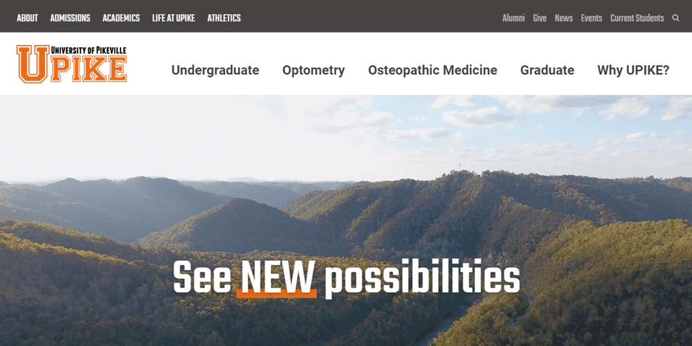
You also want your site’s color scheme to be consistent with your university’s brand. So you don’t want to rely solely on mood with color selection. While it may seem strange to think of your university in these terms, it’s important to maintain your institution’s identity by incorporating your school colors.
Font selection can be just as important for creating a welcoming atmosphere. It’s imperative that your content is legible, user-friendly, and web-safe, which means it can be viewed across different platforms.
Serif fonts are typically a safe choice, as they’re easy to read and look professional. Some examples include Playfair Display, Arvo, and Merriweather. Each is slightly different, but all are easy on the eyes.
If you’re a WordPress user, you’re in luck. You’ll have access to a wide selection of themes, which can be used as the base for your website’s page layouts and styling. Even better, some are designed specifically for educational institutions, such as CampusPress Flex.
CampusPress comes with educational themes and plugins pre-installed and ready for you to use. That way you won’t have to spend time hunting them down yourself.
3. Provide Accessible Information
As we mentioned, potential students aren’t very likely to reach out if they have questions. That’s why it’s prudent to make relevant information – such as tuition costs, course requirements, and admissions details – easy to find.
That goes for anyone who visits your site. Following best practices for web accessibility can help prospective students with disabilities navigate your content with ease and track down details relating to admissions and the accommodations your university provides.
Having an accessible website can increase your potential pool of students as well. Prospective applicants with disabilities should not be overlooked or discouraged from attending your university because your site doesn’t make key information easily available to them.
Tools such as screen readers are vital for many people with visual impairments and other conditions. When you format text, you should do so in a way that’s easy for screen readers to access. This means:
- Use short paragraphs
- Include bulleted lists
- Employ simple and clear language
Again, if you’re using WordPress or CampusPress, you can streamline this process with the Accessibile Content plugin. It will help content authors and editors ensure they follow best accessibility practices when it comes to alt-text, headings, video captions, color contrast, and more.
If accessibility is a topic that’s new to you, be sure to check out this Complete Guide to WordPress Accessibility. It’s like a mini-course that’s full of actionable tips and tricks.
4. Implement Mobile-Friendly Design
It’s worth repeating that 95 percent of teenagers have access to smartphones. Most of their browsing will be done from such devices, so it’s a wise idea to ensure that your website has a well-designed mobile version. Here’s an example from Providence College:
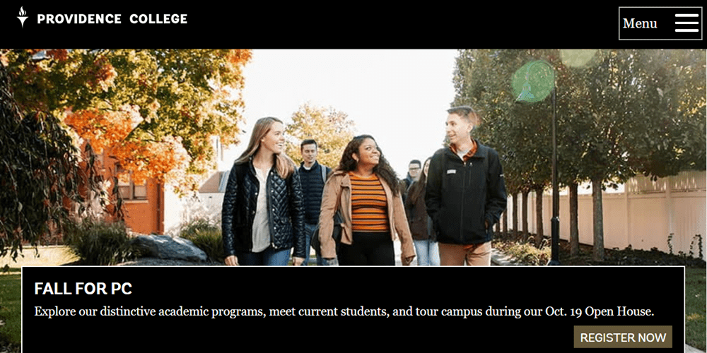
To increase your traffic, you can optimize your website for smartphones and tablets. This starts with responsive design, which simply means your website can shrink to fit smaller screens without requiring users to zoom in and out to view and navigate your content.
You can implement this feature by installing a mobile-friendly theme and plugins, minimizing text usage, and avoiding intense graphics that can increase site loading times. Browsers such as Firefox and Chrome enable you to test how your digital content looks and check for responsive design.
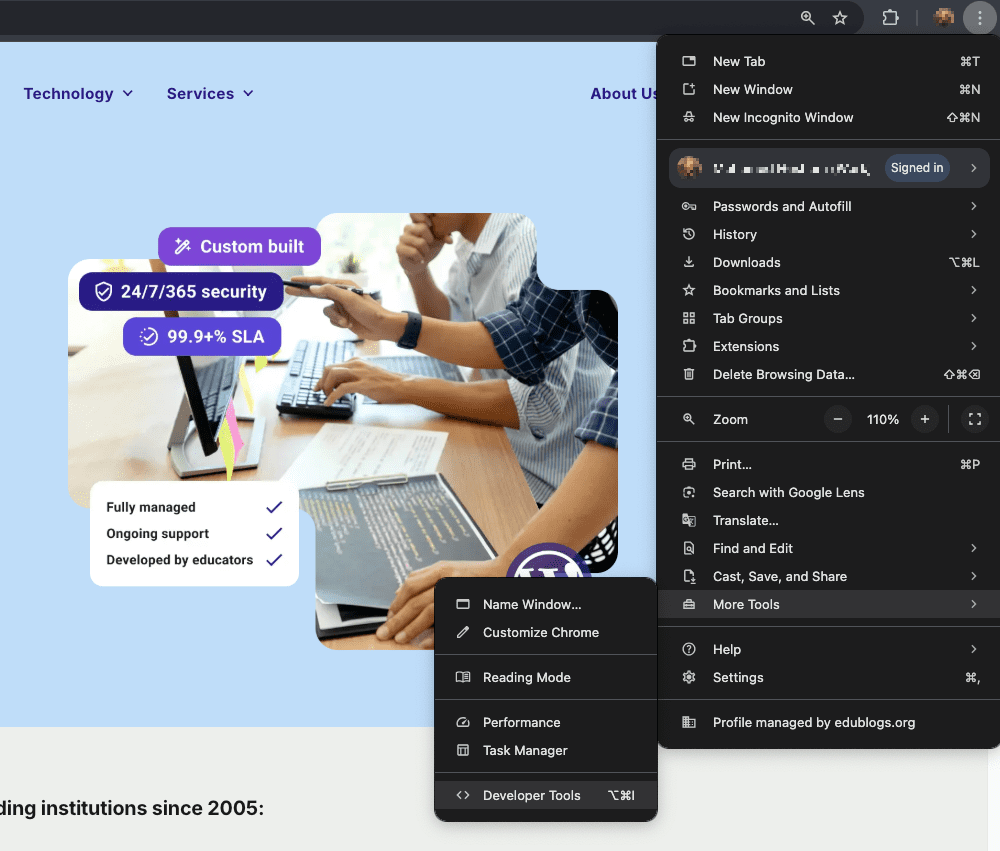
To access this feature in Chrome, click on the three-dot icon in the top right corner. Then click on More Tools > Developer Tools:
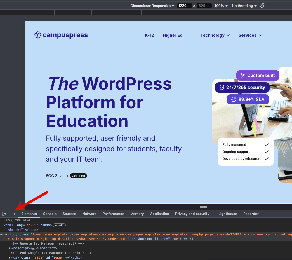
Next, open the Toggle Device Toolbar by clicking on the icon that looks like a tablet and smartphone stacked next to each other. This will allow you to view your website in different formats:
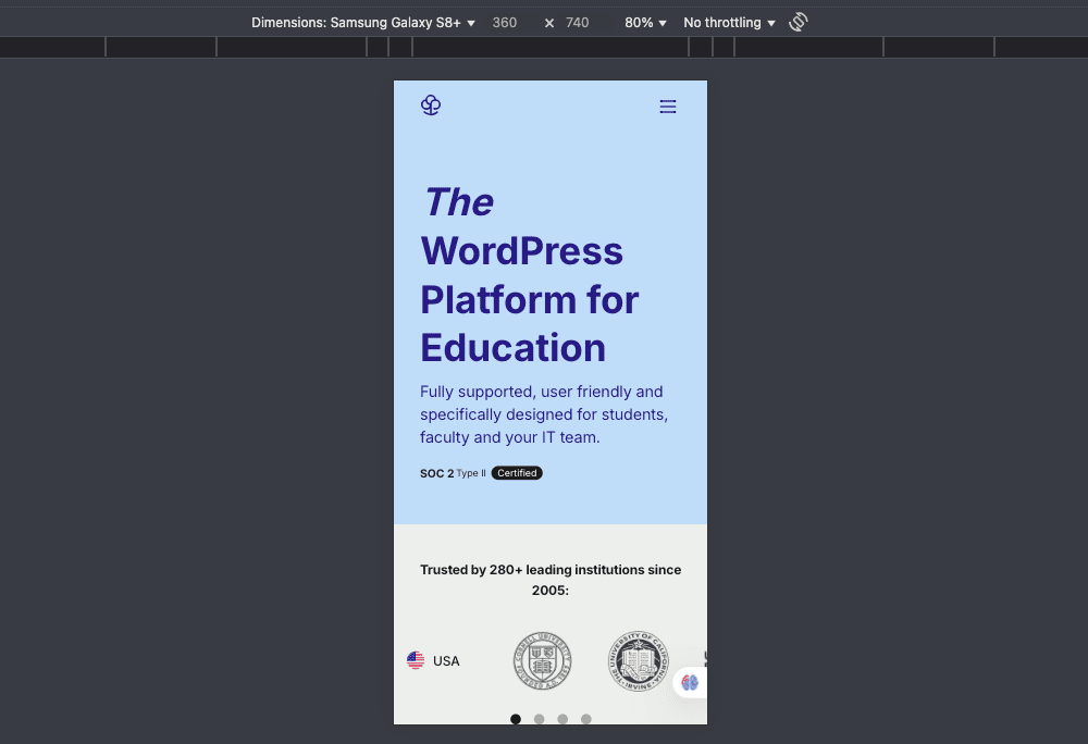
Using the Responsive dropdown menu, you can choose which device you want to simulate. Chrome includes Apple, Galaxy, and Pixel formats:
Lastly, responsive design requires fast loading times. A website that lags, especially on mobile devices, leads to high bounce rates. If someone visits one of your pages and it doesn’t appear quickly, they’ll likely click away instead of waiting for it.
You can use Google’s PageSpeed Insights to test the loading times of your mobile pages:
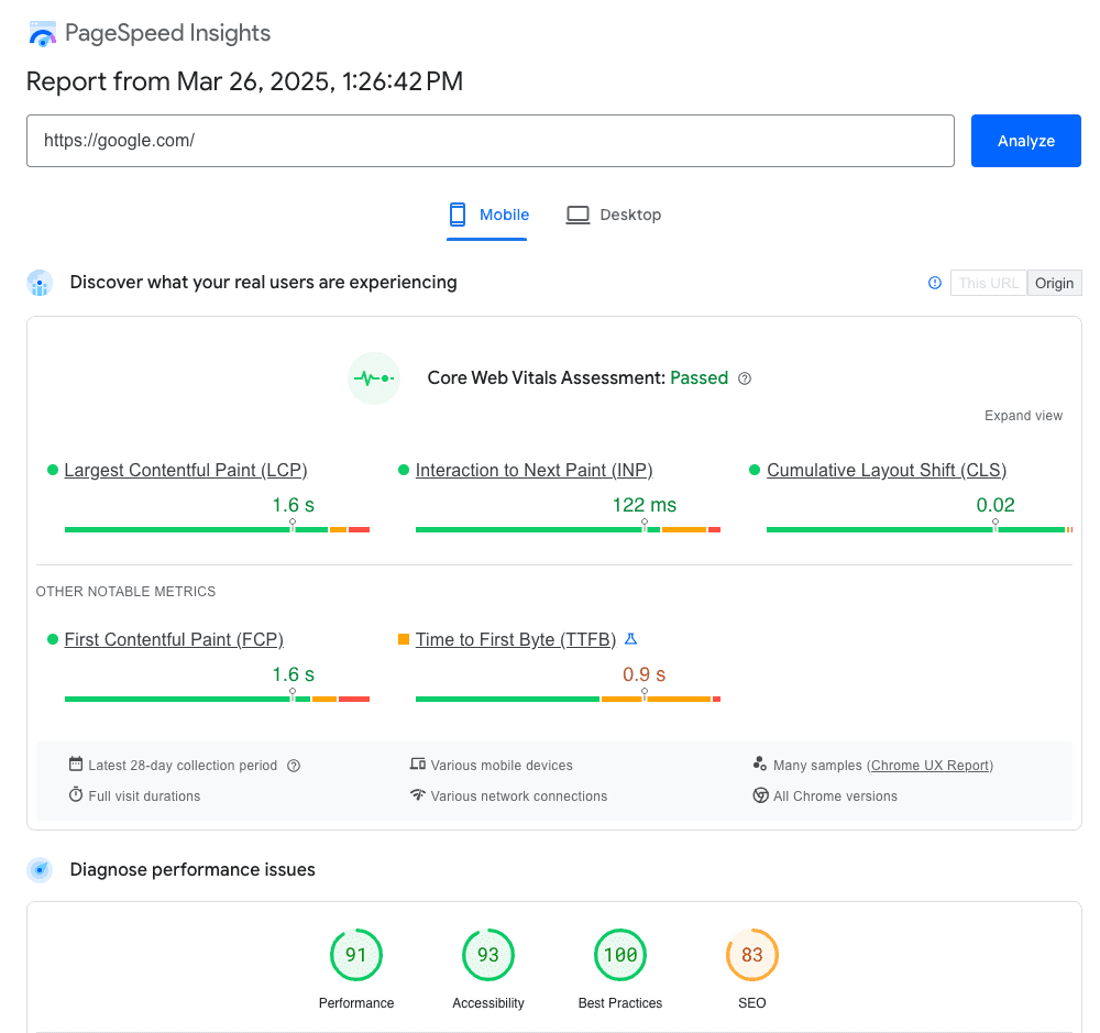
Google will detail how quickly your page loads, and give you some tips on how you can improve its speed.
Conclusion
A well-designed website can be your university’s ticket to attracting more students. If we take into account the ongoing pandemic restrictions and the increasing amount of time teenagers are spending online, a quality online platform is often a deciding factor in choosing a post-secondary educational institution.
Let’s recap some of the ways that you can use your university’s website to bring in new students:
- Improve your SEO to drive organic traffic.
- Focus on making your website visually appealing.
- Provide information in an accessible way.
- Ensure that your website is mobile-friendly.
Do you have questions about how you can use your website to attract new students? Get in touch! We’d be happy to help.
About Us
At CampusPress, we’re experts in bringing innovative web solutions to schools, school districts, colleges, and universities through WordPress and our wide range of out-of-the-box and custom plugins and products.
In fact, our services in accessibility, security, hosting, support, along with an extensive suite of other tools, power millions of education websites, blog networks and portfolios. Learn more about our school website services or request info today!