In the early days of the internet, school websites didn’t need to look particularly polished. Simply having one was impressive enough. Even as more schools began creating websites, it was still common—and perfectly acceptable—for them to look a little, well, amateurish.
In fact, we often wonder whether many school websites (particularly at the Elementary level) were designed to look as if they’d been built by the kids. With bright colours, mismatched text, garish images and lots of things flashing on and off. Not to mention judicious use of the designer’s least favorite font, Comic Sans.
The reality is, if you asked the kids to design the school website, they’d probably come up with something much slicker looking. The Code Club one of our authors runs at a local school had the chance to create their own sites last year and while one or two of the kids had fun designing something bright and garish, there was lots of tasteful looking design, like this ‘Moustaches’ blog (we’re still not sure why they chose that topic!):
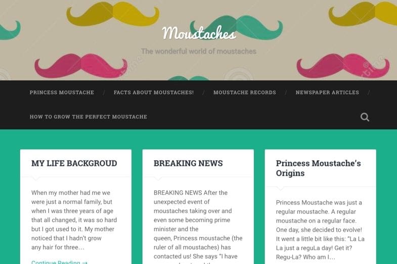
So in these days of professional web design and an audience that expects a lot from your website, how do you ensure your site projects the right image?
There’s more to it than just making sure the site looks nice, although that is important. In this post, we’ll look at other aspects of a professional school website, including:
- Tailoring it to your audience
- Reflecting the school’s values and culture
- Including lots of imagery
- Looking professional
- Being easy to navigate and interact with
- Showcasing your links to the community
- Being informative
So let’s start with your audience, and how you tailor your site to them.
Tailor Your School Website to Your Audience
Not all school websites should be the same. Not only would it make for a very dull online world, it would also ignore the fact that different schools have different audiences.
The biggest difference is in the age range your school serves. A nursery school or kindergarten will have a very different audience from a college, and so will elementary and high schools. If your school serves students with special needs or disabilities, there will also be differences. While there are definitely overlaps – parents, the local community, education professionals – the difference is with your students.
Your site’s design and content should reflect the community it represents. For instance, an elementary school might choose brighter colours and a more playful, visual layout than a college would. However, that doesn’t mean the design should feel unprofessional—serving young students doesn’t require an amateur look.
It’s not just about the visual design. The language used in your site is important, as well as its structure and navigation, and the actual content you include. Try to make your website accessible for your students as well as their parents and other adults: for an elementary school, use accessible language and straightforward navigation with lots of visual links, and for a school for students with learning disabilities, for example, you’ll need to tailor your language, visual design and navigation to meet their needs.
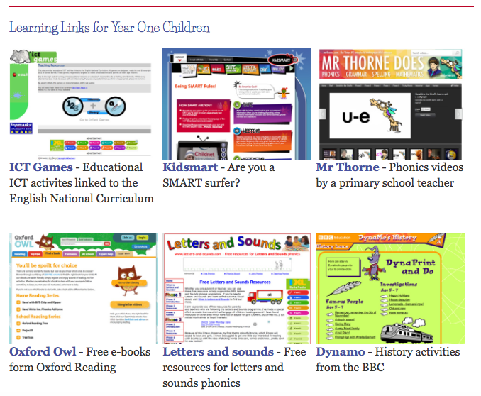
For example, in this website, screenshots of external links were deliberately added to help young, sometimes preliterate, children see what it is they’re clicking through to:
Reflect the School’s Ethos and Culture
You want people to come to your website and immediately know what your school is like, and what sort of ethos it has. This will be reflected in the content of your home page, the welcome message, and the images you use.
Think about the kinds of activities that go on in school. Are they accurately reflected on your website? If your students spend lots of time in interactive, active learning, do you have photos of this? If you’re proud of your Music provision, does your home page slideshow include a photo of your orchestra or of a music lesson? The same goes for sport. Or are your photos all of the students having fun with no emphasis on the more academic side of school life? You could correct this by including some photographs of students in class, maybe in group discussion or undertaking lab work.
If the wider community of stakeholders is an important part of what makes your school great, include them too. Make sure your PTA, school governors and any other groups are included in your site, and that photos of those people are on the site so visitors can see who’s involved in the school. Or if you have links with local businesses or volunteer organisations, make sure that’s reflected in your site too.
Anything which is important to your school, adds to the richness of your students’ education, and helps describe what makes your school unique should be on your website.
Include Lots of Images
Images will attract people to a website and pull them in. They’ll also speak volumes about your school and its activities and culture. A photo of your school sports day will tell people more in a split second than a list of the trophies you awarded on that day.
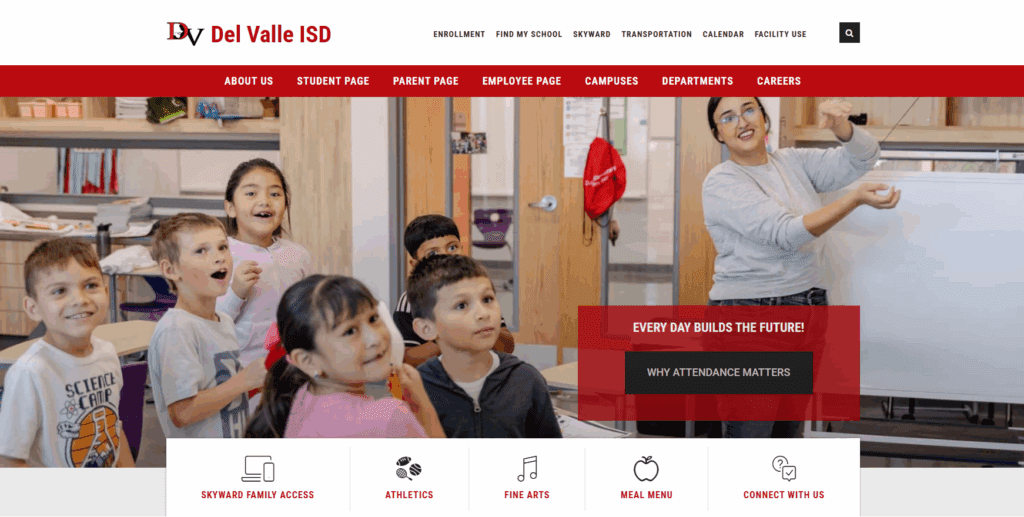
The Del Valle Independent School District site, built on CampusPress, is very visual, making it instantly appealing. It also has graphical links, making navigation easy for everyone:
Include a slideshow on your homepage (updated regularly) and add gallery pages to your site to showcase significant events, awards ceremonies, performances and more. Upload images of students’ work. Encourage students to take photos as part of their class work, and add these to the site.
Don’t forget video. Video of your school will bring your site to life, is very appealing to students, and can be used not only to supplement learning but to make people smile.
A good video that shows people what makes your school special could even go viral. This video from Alec Hunter Academy in the UK got over 120,000 YouTube views and made us crack a broad smile when we watched it.
Make it Look Professional
We think we’ve made this point quite clearly by now. People visiting your website are used to interacting with hundreds if not thousands of websites, and the vast majority of those look professional and are designed to be visually appealing and easy to browse.
Your site should be the same.
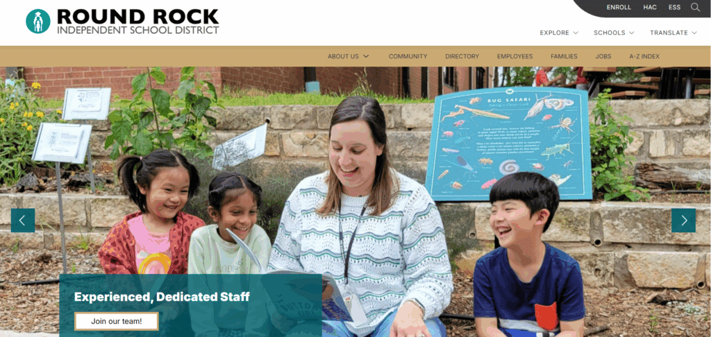
Don’t leave it to your Head of IT to design and build the site. Hire a professional web designer or even better, get one of our professionally designed school websites, which are tailored for the education sector. A good example is Round Rock Independent School District, which has a smart, full-width layout that’s bang up to date and makes the school district look modern and profesisonal:
There’s no excuse anymore for a school website that looks like it was built in a student’s bedroom using outdated technology, with no professional design input. You ensure your school buildings look smart, so why not the website?
Make it Easy to Navigate and Interact With
School websites aren’t just there to look good. They’ve got a serious job to do, which is to convey informaiotn, engage with stakeholders and give you a link to the outside world.
If it’s difficult for visitors to find what they’re looking for, that won’t reflect well on your school. If you’ve designed a gorgeous prospectus with lots of fantastic detail about how wonderful your school is but no-one can find it, than that’s a wasted opportunity. And if you want people to know what’s happening in your school on a day to day basis but your blog is impossible to navigate, then you’ll fail at the first hurdle.
Think about your audience and the different groups it comprises. Consider (or ask them) what they’re most likely to be looking for when visiting your website. Include the pages on your site that you want them to visit as well. And make sure all of that content is easy to find.
Navigation should come in more than one form, to reflect the fact that people interact with websites differently. A main menu is vital, sure, but so is a search box and links to important information, which you could put in your sidebar or footer. For more detail on how to get navigation right on your school website, see our post on school website structure.
And once they’ve found the page they came for, it has to be easy for people to interact with it. If that means consuming content, make sure your text is in a large enough font, with colours that are legible to the widest possible audience, and that you’ve included other accessibility features so as not to exclude anyone. If that means getting in touch, make sure your forms are accessible and easy to fill out on all devices.
Showcase Links to the Community
No school sits in isolation. You are part of your community and will no doubt have many links to external stakeholders, be they individuals, groups, orgisnations or businesses.
Make sure your school website reflects this. Include information on the organisations you work in partnership with, particulary if this enhances students’ education. Demonstrate that you see yourself as part of the local community, by showing examples of community involvement such as local litter picking by students, for example. Highlight clubs, parent groups, the PTA and any events organised by those groups. If you invite the wider comunity to events, make this explicit on your website.
The Assumption of the Blessed Virgin Mary School in Pasadena gives its athletics program high billing on its website, encouraging students to get involved:
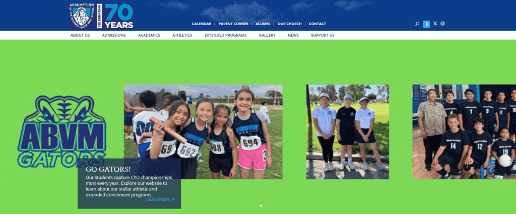
Schools can often look like imposing and inaccessible places: many of them have high fences and security systems at the gate. If your website can show that you don’t see your school as being a closed off island fortress, it will enhance your image locally.
Make It Informative
Your website will reflect well on your school if it provides visitors with the information they need.
This means all visitors: students, parents, prospective students and parents, staff, other professionals and members of the local community.
A well designed school website will take a lot of pressure off your school office: people won’t need to phone in for information but will be able to find it quickly and easily online.
In some areas, you may be required by your education authority to include specific information on your website, which you should ensure you adhere to. But it’s about more than ticking boxes and meeting legal requirements. If you aim to turn your school website into a truly useful and beneficial resource for everyone who comes to it, then it will reflect well on your school.
And when you do include information, make sure it’s well written and meets the needs of your stakeholders. If you live in the UK, you’ll know how complicated the examination and assessment system is. School websites have to include an explanation of that system that makes sense to parents and not just to politicians or teachers.
Get feedback on how your users interact with your site and what they find most useful, as well as their suggestions for what could be added or improved. You won’t necessarily do what they ask – if just one person asks for something it may not be worthwhile – but you may get some good ideas.
A Professional Website Will Reflect Well on Your School
We’re sure you’ll agree that the school website is an important tool when it comes to communicating with the outside world. As well as providing specific information, the website gives people an impression of your school, and what it’s like to study there.
If your site is professionally designed, easy to use and well thought through, it will help you to attract students and communicate effectively with all your stakeholders.
