
Most visitors come to a school website with a specific goal in mind—they want to find what they need quickly and move on. As the website manager, your priority is to help them do exactly that, while also encouraging them to explore and spend time with the great content you’ve carefully created.
So how do you reach a compromise? How do you ensure that your users are kept happy while also reaching the largest possible audience for your site content?
In this post, we’ll give you some tips on structuring your site to make it user-friendly for visitors, and make it possible for people to find new content that they might not otherwise have stumbled upon, without pushing that content down their throats.
We’re going to look at three key aspects of this:
- Considering the needs of your different user groups
- Adding navigation that’s structured logically and helpfully
- Making it easy to find the best and freshest content.
Let’s start with thinking about your different communities of users and how their needs might differ.
Continue reading, or jump ahead using these links:
- Considering Your Users
- Structuring Your Site’s Navigation
- Directing Users to New and Important Content
Considering Your Users
It may not have occurred to you that different users will have different needs when it comes to navigating around your site, but they will. Current students, for example, will be looking for very different content compared to prospective students or parents, or people looking for teaching vacancies.
Start by identifying the different groups of users that access your site. This will probably include, but not be limited to:
- Students
- Parents
- Prospective students and parents
- Job applicants
- School staff
- Community organizations and local businesses
- Other schools and education professionals
- Officials such as inspectors if your school is subject to inspection.
Now make a list of the pages in your site that each of those groups is likely to want to visit, then consider how easy it is for them to find them.
The pages each are looking for might be:
- Students – homework, information on timetable and extra-curricular activities
- Parents – information on school trips, other diary dates, homework, curriculum and contact details
- Prospective students and parents – admissions policies, results, curriculum, staffing
- Job applicants – vacancies, information on the school’s ethos and staff
- School staff – faculty news, diary dates
- Community organizations and local businesses – news about the school, contact details
- Schools and education professionals – data, curriculum, staffing, contact details
- Officials such as inspectors – curriculum, staffing, results.
That’s a lot of different content for different groups! Now consider what it might mean in terms of the way you structure your site.
It’s possible that you currently structure your site around topic-based headings such as news, curriculum, school information and other items. There’s nothing wrong with this – it’s how lots of people will expect to find information, especially if they want to find more than one page.
But you might also want to consider adding navigation that’s aimed at specific groups such as students, parents and the community. These would include the pages that those groups are most likely to access.
And if you’re not sure which pages those groups are accessing, try asking them! A simple survey of your school community will give you plenty of information about who uses what content in your website.
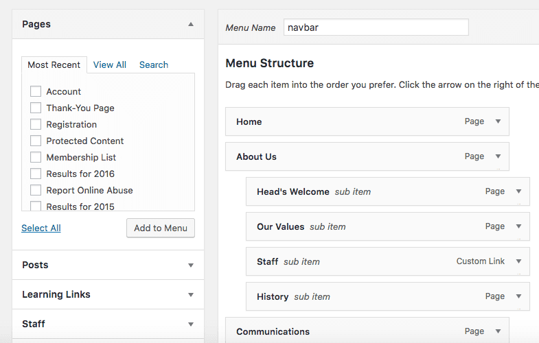
There’s nothing to stop you adding each page to your main navigation menu more than once: so a page on homework might be under the Students, Parents and Curriculum top level navigation items. I’ll show you how to do that shortly.
So now that you have got an idea of what your users are looking for, think about what you want them to see. Are there one or two key pages you want to ensure people have easy access to – a welcome page, for example, or the latest news item? Identify what these are and keep them to a minimum. We’ll look at how you can make it easy for people to find these shortly.
Structuring Your Site’s Navigation
Navigating around your website isn’t something visitors will do using just the main navigation menu, although that is an important part of it. You can also add other navigation methods to help people find their way around. Think about:
- The home page
- Main navigation
- Sidebar navigation if you have space for it
- Footer navigation
- Search boxes
- Buttons and prominent links such as graphics
Let’s take a look at each of these in turn and see how you might make them work.
The Home Page
The home page is where most visitors to your site will start their journey, so it needs to be appealing and very, very clearly laid out. Avoid the temptation to cram lots of information into your home page, or conversely to leave it empty without much in the way of useful content. I’ve seen plenty of school home pages that consist of nothing more than a twitter feed and a few links – what a waste!
If you have content you want everyone to have easy access to, this is where to put it. You don’t have to include all of the content here, but you might summarize it and add a link to a more detailed version. For example you could have a short paragraph or two from the Headteacher or Principal welcoming people to the site and the school, with a link to a longer welcome page. Or you could have an excerpt from your latest newsletter or update, or a banner with critical information such as school closures, where relevant.
But don’t get carried away – there should only be two or three pieces of content on the home page, and they should be short.
You can also use your home page to provide links to other content, such as the most recent newsletters, blog posts and/or galleries showcasing what’s been going on in your school. Make these obvious and easy to click on. Think about how they work on mobile devices too, and whether people can easily tap on each link on a touchscreen.
Another option, if you want to provide navigation based on your user groups, is to include links to key content for each group on your home page. You could have three columns side by side – one for students, one for parents and one for everyone else. This ‘everyone else’ heading might change over time, for example around school admissions time you might change that to ‘Prospective parents and students’ and include links to your prospectus, admissions policy and data.
Main Navigation
Your site should have a main navigation menu at the top of every page. CampusPress sites come with this built in, and you can add or remove items from this menu at any time.
Consider the top level items in your menu – these can be high-level topics such as curriculum, and/or user-based items such as ‘Parents’. If you do use user-based navigation it’s a good idea to include some items in more than one section, as more than one user group is likely to access it (homework, for example).
The great thing is that CampusPress makes it easy for you to do this – you can use the Menus screen to add specific pages to as many spots in your navigation as you want.
Try and keep your main navigation menu as tight as possible, without too many top level items – I’d recommend eight as an absolute maximum. Some pages will need to be a top level item all on their own, such as the home page and contact page, while others will sit beneath top level headings. Avoid putting everything at the top level as that will result in a very messy design.
Test your navigation menu with users – ask them to find content in your site and watch while they do it, getting their feedback on how easy it was afterwards. If you do this, I recommend a mix of user-led navigation, where they look for the items they’re most likely to be interested in, and navigation led by you, where you give them the name of some content and ask if they can find it.
Sidebar Navigation
Sidebars have been going out of fashion to some extent, with more and more sites featuring a full-width design with no sidebar content or links. But for a large, content-rich site like a school website, a sidebar can be a useful way to highlight key information and enhance navigation.
With CampusPress you can create unlimited extra menus as well as your main navigation menu, all via the same Menus screen in the admin area for your site. You can then add each of these to a widget and add that widget to any widget area in your site. If your site’s design includes sidebars, there’ll be one or more widget areas there to which you can add menus.
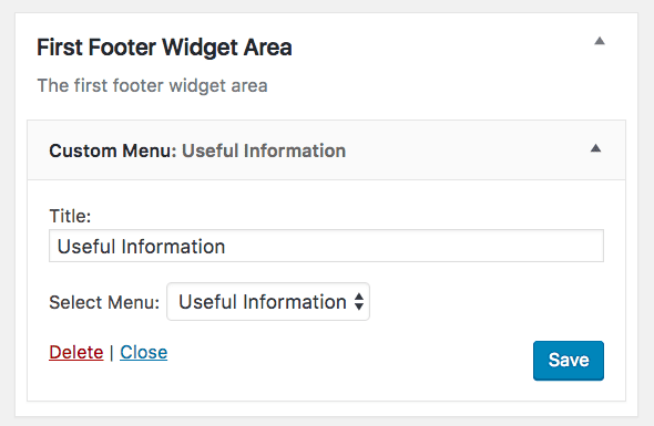
This means you can decide which content you want users to be able to access easily as they browse your site’s content, and make it available here as well as in the main navigation menu.
A more advanced option is to have sidebar menus that are specific to each section of the site. So if a visitor is in the Curriculum section, for example, a sidebar menu will be visible with links to all the pages in that section. If you want to add this to your site it can be added as part of a custom site build.
Footer Navigation
You can use footer navigation in the same way as sidebar navigation – use a widget to display any menu you want as a supplement to your main menu.
But there’s another use for footer navigation, especially on mobile devices, and that’s to enhance the user experience. Instead of making your users scroll all the way back up to the top of the page when they’ve finished reading it, give them footer navigation instead so they can find their way to extra information. Think about including a pared down version of your main menu, or a few separate menus taking users to content under different headings (which may be topic based or used focused).
Search Boxes
Some people only ever navigate a site using the search function, so make sure your site has one. It will help people to find things quickly, especially content that’s not immediately easy to identify which section of the site it’s in.

You should always have a search box at the top of your site, in the header. It’s also good practice to include one in the footer. CampusPress comes with a search widget that you can add wherever you want in your site.
Buttons and Graphics
For content that you want to make it super easy for your users to find, why not add a nice prominent button? Or maybe a graphic or image that links to the content? Buttons and graphics are good for:
- Links to top level pages (you could have a ‘Parents’ button and a ‘Students’ button for example)
- Homework links, especially if these lead offsite
- Links to one or two pages that are especially important
- Links to short-term content, for example if you’ve got an event coming up and you want to make the link to information on it visible on your home page.
Buttons and graphics can be used exclusively on the home page or you could add them to your header, sidebar or footer. Alternatively they can liven up a set of ‘related content’ links at the bottom of each post.
Directing Users to New and Important Content
Finally, we come to the content you want your users to see, whether they’re looking for it or not. This may be because you want to promote what’s in it or draw people’s attention to it, or because it’s crucial information that visitors need to see.
Links and graphics will help make this prominent, but avoid the temptation to use these just for your preferred content instead of the content your users want to access.
You should also include a top level item in your main navigation for new content, such as a ‘News’ or ‘Updates’ section – or a blog if that’s what you’ve got on your site.
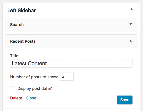
And if you want to add links to recent content on every page of your site, CampusPress comes with a ‘Recent Posts’ widget that you can add to your sidebar and/or footer, making it easy for people to find what’s new. If your theme includes a widget area below the page or post content, you can also add this list there, making it easy for people to navigate to new content after they’ve read whatever they came to your site for in the first place.
The trick is to find balance: don’t bombard your visitors with new content at the expense of the less glamorous stuff they’ve come for, but don’t pass up on the opportunity to draw their attention to what’s new either.
Structuring Your Site Well Will Help Visitors and Encourage them to Return
Thinking about your site’s structure at the early stages of planning is an important step towards enhancing user experience and making it as easy and enjoyable as possible for people to interact with your school website. And if visiting your site is an easy and enjoyable experience, then people are far more likely to return.
If your site is already up and running on CampusPress and you want to review its structure and navigation, you don’t need to worry. The Menus admin screen and the widgets you can use for navigation will enable you to tweak your site while it’s live and make sure it works for your new and existing users. And if you want to add some more advanced structure and navigation, give us a call, we’d be happy to help!