If you manage or administer a school website, you most likely work on it from a desktop computer. If you’re fortunate, you can do this during school hours using a computer at your desk, perhaps with a large monitor. If not, you might be updating your site in your spare time, working from a laptop at home.
Either way, it’s highly unlikely that you manage or edit your site on a mobile phone. That also means you may rarely, if ever, view your site on a smaller screen.
Before you continue reading, I’d like you to try something. Take out your mobile phone — from your pocket or off the charger — open your browser, and visit your school website.
How does it look?
Is it simply a scaled-down version of your desktop site, so small that the content is difficult to read?
Has it been optimized for mobile, with a layout that adapts to a smaller screen and text that’s easy to read?
Or, perhaps worse, has the smaller screen caused elements to shift out of place, leaving you with a cluttered and confusing layout?
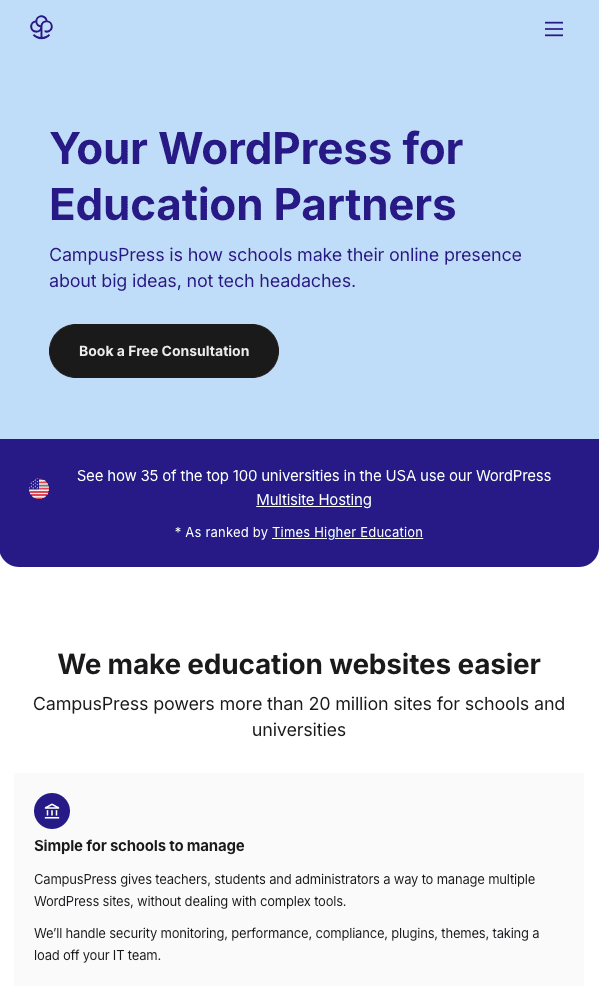
The CampusPress site is responsive. Here’s how it appears on a large screen:

And here it is on mobile:

You’ll notice that the layout is different, and the menu has moved, making it easier to interact with. I’ll come to that in more detail shortly.
If your site either looks the same on desktop and mobile or is a mess on mobile, you need to do something about it.
You may not realize it, but a huge number of the people visiting your site (or trying to), are doing so from mobile devices. You want them to get the best possible experience from your site, right?
I manage several school websites and find that approximately 40% of visitors are using mobile phones or tablets to access the sites. If your site isn’t mobile-friendly (also known as responsive), you may find that fewer people are visiting your site on mobile devices, purely because they know they’ll get a bad experience.
You might be tempted to think that this means there isn’t a demand for your site on mobile but you’ll be wrong. If your site isn’t mobile-friendly, then people won’t come back to it twice on a mobile device.
If they really need some information from it, they’ll turn on their desktop PC or laptop to continue, but if they aren’t that worried, then they’ll just leave the site. If your site does work great on mobile, they’ll continue browsing it, meaning you’ll have access to a wider set of visitors, and your site will be much more effective.
So how do you go about making your school website mobile-friendly, or responsive?
In this post, I’ll explain that. The good news is that there’s an easy answer – by signing up for a CampusPressor edublogssite, you’ll automatically get a mobile-friendly site, as all our sites are responsive.
But in case you want to know exactly how all that works, I’ll explain what responsiveness is and how it works.
What is a Responsive Website?
A responsive website adapts itself to smaller screens to make it easier for people to browse the site and interact with it.
Here’s an example. The University of Chicago Research site, which runs on CampusPress, looks like this on a desktop computer:

And here’s the site on a mobile phone:

You’ll notice some changes:
- The sidebar has moved to below the main content so it doesn’t steal space from the content.
- The masthead and logo have been centered on the screen and take up more of the screen width.
- The menu has been replaced with a tappable link to the menu, meaning it doesn’t take up lots of space on the main screen. When a user taps on that menu bar, the menu will appear.
- The text size has been tweaked to make it easy to read on a smaller screen.
The important thing is that all of the content on the desktop site is also there on a mobile device. It’s not a different site, just a different layout for the site.
In the early days of smartphones, lots of companies set up mobile versions of their websites, which were completely different versions of the site with different content. Usually, this meant less content.
If you only had a mobile device available to access that site, this could be very frustrating. So a responsive site doesn’t prevent people from accessing all of the content in your school site, it just makes it easier for them to access the content there.
The code that’s used to make a website responsive is straightforward. It’s contained in the site’s CSS, which is the styling that tells a browser how to display all of the content (text, graphics, media, etc) on your website.
It detects the size of the screen and then uses a set of rules that are defined in the CSS to display the site correctly. As all of your themes are responsive, this is already written into the stylesheet and something you don’t have to worry about.
Other features make a website or theme responsive, as well as the layout:
- Navigation is often placed at the top and bottom of the page so that when someone’s rolled to the bottom of a page on a mobile phone they don’t have to scroll back up again to go to another page.
- Images are optimized so that only the image size that’s needed for the screen size is sent to a device. This means that if you’ve uploaded a huge photo to your home page and someone views it on a small screen, they’ll only have to download a smaller version of it to their browser. This happens automatically with CampusPress and edublogs sites, as they’re based on WordPress, which includes this.
- Forms are coded to make them easy for people to fill out on small screens.
- Text is the right size for legibility on whatever screen size the site’s being viewed on.
- Buttons and links are designed so that if you tap them with a finger or thumb on a touchscreen, you don’t accidentally tap the wrong thing.
A responsive site will include many or all of these features, meaning that not only will people be able to access your site on mobile, but they’ll also get the best possible experience.
So now you know what a mobile-friendly or responsive website is, what are the benefits of making your site responsive?
Benefits of a Responsive Website
Making your site responsive so it works well on all screen sizes gives your users lots of benefits:
i) Accessibility for Parents and Students
Mobile-friendly websites ensure that parents and students can easily access important information on the go. Whether it’s checking the school calendar, reviewing assignments, filling out forms, or accessing contact details, a mobile-friendly website enables seamless access to vital resources anytime, anywhere. This accessibility fosters stronger parent-school communication and empowers students to stay informed and engaged with school activities.
ii) Enhanced User Experience
A mobile-friendly website provides an optimal user experience, regardless of the device being used. Responsive design ensures that the website layout and content adjusts to fit various screen sizes, making navigation and content consumption effortless for visitors accessing the site from smartphones or tablets.
A positive user experience can significantly impact the perception of the school and contribute to increased engagement and satisfaction among website visitors.
iii) Improved Search Engine Visibility
Mobile-friendliness is a key factor in search engine rankings. Search engines like Google prioritize mobile-friendly websites in their search results, especially for users conducting searches on mobile devices.
By having a mobile-friendly school website, you can improve your visibility in search engine results, making it easier for prospective parents and students to discover and learn about your school.
iv) Support for Digital Learning Initiatives
With the growing emphasis on digital learning, a mobile-friendly website plays a crucial role in supporting these initiatives. Students can conveniently access learning resources, assignments, and educational materials from their mobile devices, promoting seamless integration of technology into the learning process.
Teachers and administrators can also leverage the mobile-friendly platform to share educational content and communicate important updates with students and parents.
v) Community Engagement and Communication
A mobile-friendly school website facilitates effective communication with the school community. Whether it’s sharing news updates, sending out alerts, or providing access to important documents, a mobile-friendly platform ensures that vital information reaches parents, students, and staff members on time.
This fosters a sense of community and keeps stakeholders well-informed about school-related matters.
vi) Adaptation to Changing Consumer Behaviors
The prevalence of mobile devices in our daily lives has transformed consumer behaviors, including how individuals access information online. With a significant portion of web traffic coming from mobile devices, having a mobile-friendly school website aligns with the evolving preferences and habits of website visitors.
By adapting to these changing behaviors, schools can effectively engage their audience and remain relevant in a mobile-centric digital landscape.
All of which will make your site more successful as part of your school’s communications arsenal.
What Are You Waiting For?
As you can see, making your site mobile-friendly has become essential. As more and more people use smartphones and tablets, and fewer people rely on desktop PCs, you’ll find that the proportion of people wanting to access your site from mobile devices will only grow.
You don’t want to miss out on such a huge slice of your potential audience. If your site isn’t already responsive, or you have a separate mobile site that doesn’t give mobile users access to all your content, you need to redesign your site.
A CampusPress website will give you responsiveness as part of the package, without you having to worry about CSS or any other aspect of the code. So why not switch today?
