All websites should be accessible — that goes without saying. If your site can’t be used by the widest possible range of people, you’re effectively excluding a significant portion of your potential audience.
For schools, colleges, and universities, however, accessibility carries even greater weight. Educational institutions are a core part of their communities and provide an essential public service. Almost every school community includes people with disabilities, sensory impairments, or other challenges that can make accessing the web more difficult. Beyond that, schools play an important role in modelling inclusivity and diversity for their students, especially in a world where full participation isn’t equally available to everyone. Add to this the fact that, in many regions, accessibility is a legal requirement — often backed by substantial penalties for non-compliance — and its importance becomes even clearer.
Of course, this likely isn’t news to you. If you’re responsible for, or involved in, managing a school website, chances are you already understand how vital accessibility is and are genuinely committed to getting it right.
That doesn’t mean it’s easy. Building an accessible website isn’t a matter of ticking a few boxes, pressing a button, or running a single test and declaring the job done. Accessibility has multiple dimensions, and properly assessing how compliant your school website is means understanding and considering all of them.
In this post, I’ll walk through those key considerations, outline what your school website needs to do to be truly accessible, and share practical tips on how to check whether it meets those standards — in other words, how to carry out an accessibility audit.
What Makes a Website Accessible?
The W3C, which is the body responsible for deciding how websites should be coded, publishes a comprehensive set of accessibility guidelines on its website.
The things that will make your website accessible are:
- Your site should be coded in a way that makes it possible for screen readers to access it and read its contents to users with visual impairments. This includes the way you code media such as images as well as the structure of the markup, headings etc.
- Audio and video should be captioned or have a transcript available for users who aren’t able to access them.
- Your content should be adaptable so that if it’s presented in different ways (e.g. on different devices) it doesn’t lose its meaning. This means using standards-compliant code and not making meaning dependent on the visual structure of the page.
- Content should be distinguishable, which means it should be easy to see, read or hear. This means ensuring fonts are clear and sufficiently large, and that contrasting colours are used for text and backgrounds. You should also make links visually obvious.
- All functionality in your site should be available via a keyboard as well as a mouse.
- It should be possible to consume content at the user’s own pace, which means (for example) that video should have pause and rewind buttons and text shouldn’t disappear after a period of time.
- Pages shouldn’t contain anything that flashes more than three times in any one second, to reduce the risk of seizures. I’d advise against any flashing images anyway as it makes your site look very dated.
- Navigation should be accessible, with the option to skip repeated blocks of content (such as the navigation menu) and any links or navigation coded in the same structure as they’re presented.
- Your content should be easy to read, with language appropriate for a wide audience.
- Your site should behave in a way that’s predictable, with no sudden changes.
- Any forms should include help text to help people fill them out correctly.
- Your code and content should be robust so that a wide range of devices can access it.
One common misconception is that web accessibility is only for those with visual impairments. But as you see in the list, it also covers hearing difficulties (subtitles of videos), cognitive disabilities (ensuring the site is easy to use), and much more. One important piece of advice is that accessible design will improve your site for all visitors, not just those with disabilities, so it is always a win-win and worthwhile.
But as a website manager, how can you know whether your site meets these standards? This is where your accessibility audit comes in.
Carrying Out an Accessibility Audit
There are a number of tools you can use to test your site’s compliance with accessibility guidelines, as well as best practices you can adopt.
1. Validate Your Site
Running your site through the W3C’s validation tool will tell you if there are any common accessibility issues. This will also help you identify any issues with the code that could be causing performance or security issues.

This will answer some key technical questions about the way your site is coded, and tell you if it’s structured correctly and if (for example) images have all the required information to be accessible.
Note that the validation tool will only check the url you give it – so you’ll need to test multiple pages to do a thorough check. Identify different content types and sections of your site and run examples of them through the validation tool.
2. Run Your Site Through the WAVE Tool
The WAVE accessibility checker goes a step further than basic validation tools. Even when a site appears to pass with only a few minor issues elsewhere, opening it in WAVE’s interface can quickly reveal a much broader range of accessibility concerns — often highlighting problems that aren’t immediately obvious at first glance.

This tool does a thorough check of your page’s code and identifies any issues, categorizing them by type. Again you’ll have to run multiple pages through it to do a full check. I would suggest that you only use this tool if you’re familiar with HTML – some of the issues it throws up for my site are things that are in there deliberately for usability which means I can understand why they’re there and what I can do to make them more accessible without compromising usability.
There are other automated checkers out there, but WAVE is one that has been around for a long time and is universally well-known.
3. Run Your Site Through a Screen Reader Emulator
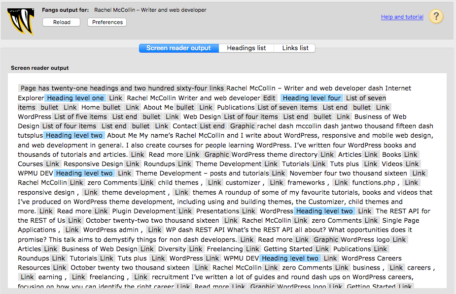
The best way to understand how your site might sound through a screen reader is to simulate one. You can do this by using the free Fangs extension to the Firefox browser.
Once you’ve installed it, load your site and right-click anywhere on the page. Then select View Fangs. This will give you a textual representation of your site. Here’s mine:

This doesn’t read the text out but it does show you exactly what would be read out by a screen reader. Try reading it out yourself, or have someone read it to you.
Similarly, there is also the Screen Reader extension for Chrome, which is actually a full screen reader for the web and will speak it out to you. But if you aren’t used to using a screen reader, it can be overwhelming and less useful to finding obvious errors.
4. Test Your Site’s Readability
There are a number of measures of the readability of text that you can check your site against. Running your site through a readability test tool will let you measure exactly how readable your content is and what level of education a visitor would need to read it.

If your site’s readability score indicates that people need a higher level of education than the youngest grade that will be using your site (and preferably a bit younger), then you need to edit the text. This doesn’t mean dumbing down: it just means making the language clearer.
5. Carry Out User Testing
User testing will help you spot any issues with your site that aren’t picked up by the validation tool. These will include things like the language used and whether the site behaves in the way you expect it to.
Set up user tests with as wide a cross-section of your audience as possible, including students with disabilities or challenges accessing online content as well as other students, staff and other stakeholders. Identify some key tasks you would expect users to carry out on your site, and some key pieces of information people would need to retrieve, and ask them to do this. Then ask them how easy it was and what obstacles there were. Watch as they do it – is it as easy for them as it is for you?
Ask questions about accessibility too – about the media used on the site and how easy they were to access, and about the language and how clear it is.
Your user testing will give you more qualitative information about the experience of using the site and is just as important as checking that your code is accessible. After all, accessibility is also about the experience of interacting with your site.
Taking Action Following Your Audit
Of course carrying out an accessibility audit isn’t the end of the process. You then need to make changes to your site to address any issues. Some of these will be things you can do yourself, while others may involve hiring a web developer or switching your content management system (or CMS).
What You Can Do Yourself
Your user testing may well have thrown up issues that can easily be remedied by staff responsible for the website and its content, and some of the code issues may be easy to deal with too.
- If your site uses video that isn’t accessible, switch to using a more accessible way of streaming video such as YouTube.
- If your text is hard for people to understand, rewrite it (or ask your students to).
- If navigation is unclear, review the way your site is structured and how your menus work.
- If your images don’t have alt attributes to tell screen readers what they are images of, add them. If you’re using a CMS like WordPress, you can do this yourself when uploading media.
- If your theme is introducing accessibility issues, consider switching to a new theme. For example, CampusPress offers these ‘accessibility ready’ themes out of the box.
What You’ll Need to Hire Someone For
If the accessibility problems are more fundamental, then you’ll need to change your CMS or hire a web developer to fix things. This will address issues like:
- the structure of the markup in your pages
- the use of headings
- ensuring your site is using up to date code
- the use of specific accessibility tags in the code.
Switching to a CMS like CampusPress will help you make your site more accessible because it’s based on WordPress, which has an accessibility team constantly working to ensure WordPress meets accessibility guidelines. It will never be perfect as these things are always evolving, but using a robust, modern CMS like CampusPress will put you a long way ahead when it comes to making your school website accessible.
Accessibility is Essential For School Websites
You can no longer get away with having a school website that’s not accessible. It will affect your site’s performance, its search engine rankings, and (most importantly) its effectiveness at engaging with the community you serve. Take the time to carry out an accessibility audit on your site and make any changes identified, and you’ll have a more effective, inclusive site.