Roughly speaking, we could say that about 99% of the themes available for use on Edublogs and CampusPress are designed to display your most recent blog posts on your home page. That is because historically blogs have been used as personal logs that get updated frequently, and bloggers wanted to display their most recent and most relevant logs first.
Today, more and more people — including educators — are using blogging platforms to set up more traditional websites. Because of that, more people want a traditional home page rather than a feed of their most recent blog posts on their front page. The good news is that setting up an inviting welcome page has become a lot easier.
In this post, we’ll give you a brief overview on how to set up your blog to use a static home page instead of the default blog feed, and we’ll explore two relatively new tools that you can use to create a stunning welcome page for your site.
Continue reading, or jump ahead using these links:
Creating A Static Home Page
You can find detailed instructions (with images) on how to set your blog to use a static home page in our Help Pages, but we’ll give you the quick version here:
- Go to Pages > Add New and create a new page.
- Title the page something like Home, Welcome, Front Page, etc.
- Publish the page. (Don’t worry about adding any content yet; we’ll come back to that.)
- Now, go to Settings > Reading.
- Select the option for Static Front Page and choose your newly created page.
- Save those changes.
That’s it. Now your blog will be set to use your newly created page as your home page instead of the default blog feed. Now, we just have to go back and make that page look amazing.
In order to do that, we’re going to introduce two tools that CampusPress (and Edublogs Pro) users can activate on their sites — the Live Shortcodes Plugin and Divi Builder Plugin.
Live Shortcodes Plugin
The Live Shortcodes plugin lets you add some really cool features to your page. You’ll find full instructions on activating and using the plugin in our Support Pages. The Support page also includes descriptions of each of the features that can be added with the Live Shortcodes plugin:
- Accordions
- Toggles
- Latest Posts
- Tabs
- Dividers
- Buttons
- Reader Content
- My Class Blog list
- My Class Recent Posts
Since all of the descriptions and instructions you need to start using the Live Shortcodes plugin are already on our Support page, we won’t include that here. We’ll simply demonstrate how to spice up an average-looking welcome page using this plugin.
Let’s begin by taking a look at a sample Welcome page we have set up. This is a very, very basic page that contains some class rules, parent information, and information about the class blog. You don’t have to read through the whole page, but we do want to call your attention to the mention of the contact form and the Parent Information PDF in the Parent Information section. Also, at the bottom, you can see we have asked the parents to visit the class blog page.
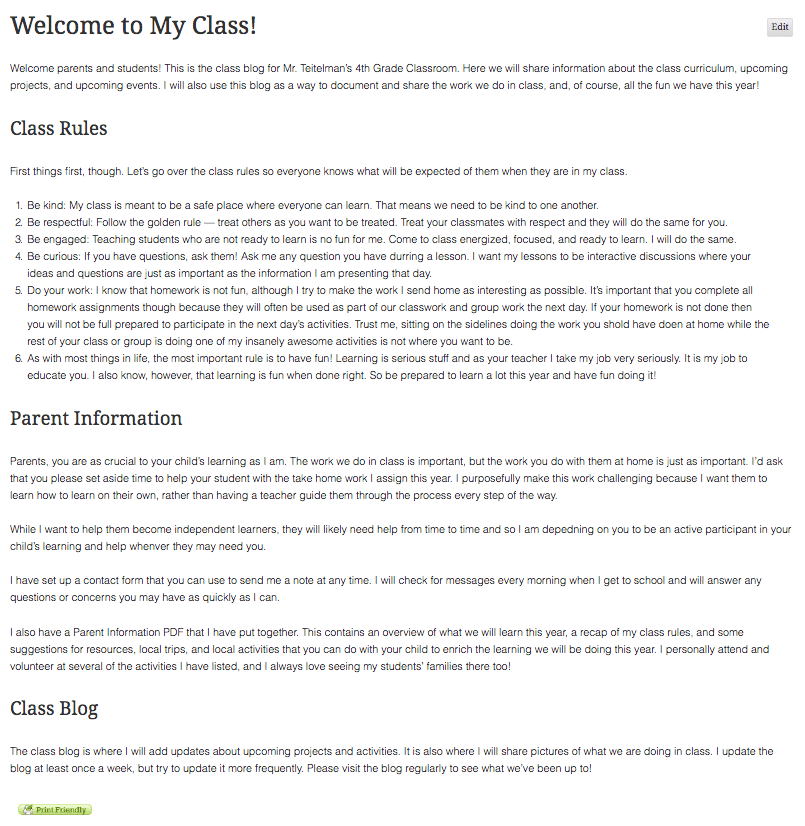
In the next screenshot, we’ll show you how we can use Live Shortcodes to make this information more inviting and interactive.
You’ll see below that we have added a few different dividers to break up the sections of text and give the page a little more visual interest. In most cases, you’d likely use the same style divider throughout the page, but we want to show you some of the different styles available.
Instead of the ordered list, we have used an accordion to display class rules. Each accordion box expands when clicked to display the full explanation of the rule. We have also added buttons that parents can use to access the contact form and the Parent Information PDF.
Finally, at the bottom, we have used the Latest Posts shortode to add the three most recent blog posts to the page. Adding the blog posts here gives you the best of both worlds. You can have a nice static welcome page, but still retain the ability to share your latest news on your front page too.
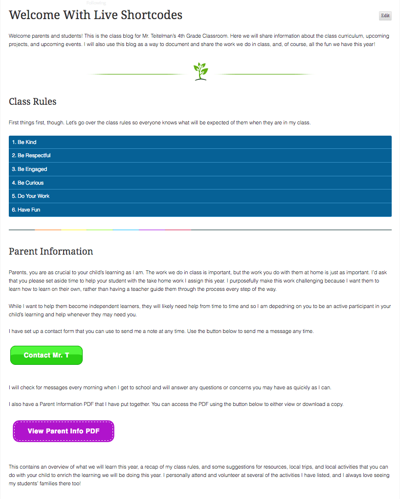

Overall, this page design is still pretty basic, but you can see how much more attractive and interactive your pages can become just by adding a few shortcodes. Breaking up large areas of text with visual elements like dividers, accordions, tabs, and toggles not only makes your page look nicer, but it also helps readers more easily digest and comprehend large amounts of text.
If you have a lot of information you want to share on your Welcome page, then using these shortcodes will definitely help your parents and students get through it without getting overwhelmed.
Divi Builder Plugin
The Live Shortcodes plugin is a great way to add some cool features to your page, but if you are looking for a truly awesome tool that will let you design a fully-customized welcome page, then what you want is the Divi Builder.
Just like the Live Shortcodes plugin, documentation for the Divi Builder Plugin can be found in our support pages so we won’t repeat that here. Instead, we’ll give you a quick overview of what the Divi builder is and what you can do with it.
The Divi builder allows you to build pages using a simple drag-and-drop style interface. You first add a section to your page. You then add rows to that section. You can choose a specific layout for each row, and then add specific modules to build your page. Here is a screenshot of the builder so you can visualize what all of that looks like.
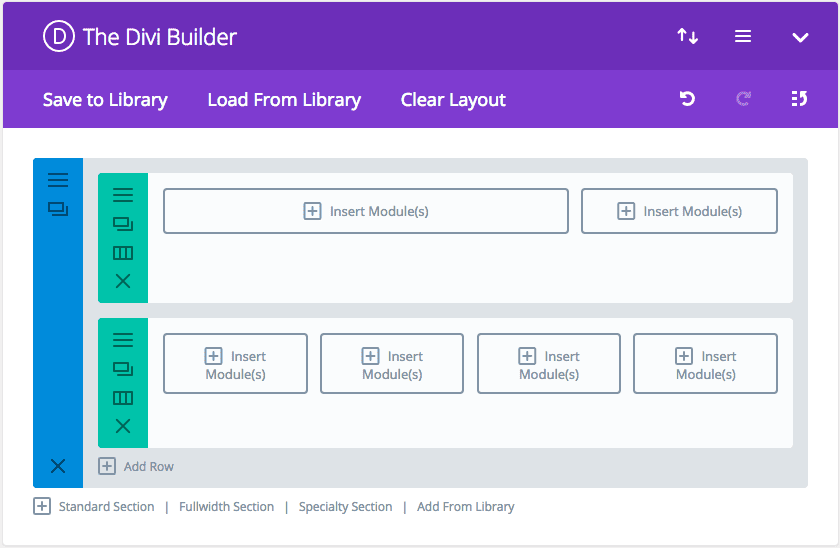
In the screenshot, you can see there is one Section added to our page. The Section is denoted by the blue menu bar on the left. The options in the Section menu allow you to (from top to bottom) edit the section settings, duplicate the section, and delete the section.
Within that Section, we have added two Rows. Both of these are noted by the green menu boxes. The icons in the green boxes allow you to (from top to bottom) edit the row settings, duplicate the row, change the column layout, and delete the row.
You’ll see that in the top row we chose to use a two-column layout, and the bottom row uses a four-column layout. All that’s left to do now is insert the modules we want to use. Clicking on any of the individual module boxes opens up the scrollable menu so we can choose which one to use.
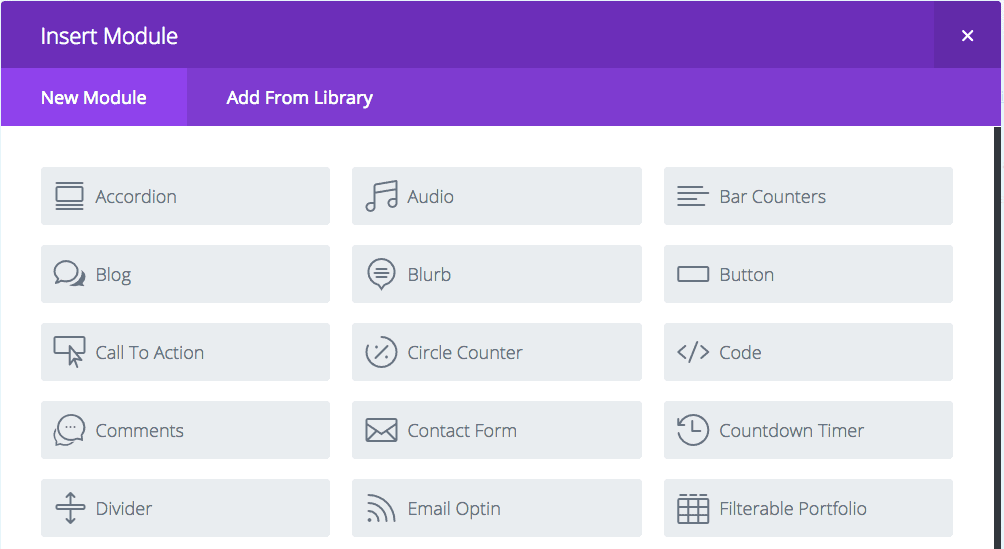
Each module has its own settings and options. For more detailed information on setting up your page layout and using specific modules, you can refer to the Divi plugin documentation.
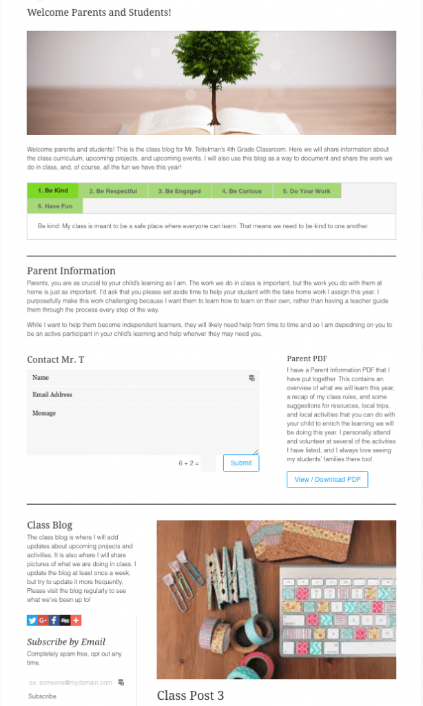
For the purposes of this post, we’ll now show you how we took the information from our basic Welcome page above and created a new custom layout for the page using a few Divi modules. We’ll go one section at a time showing you how each section is laid out and what the live version looks like.
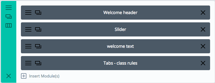
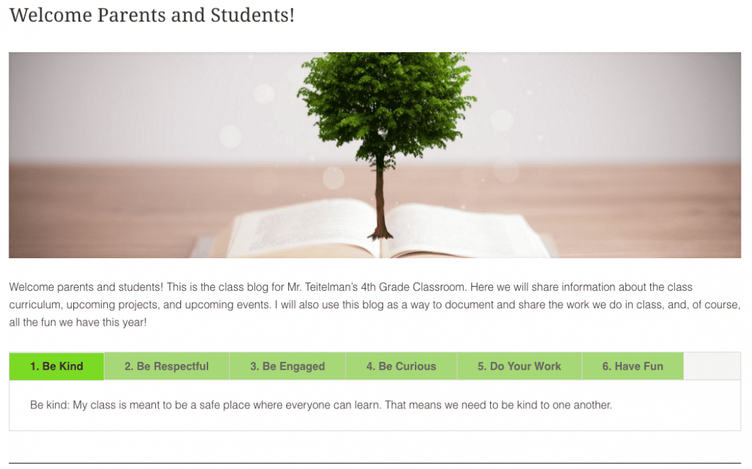
First, we added the welcome row. In this first row we added a text module for our header, a slider module to add an image, another text module for the welcome text, and a tabs module to display the class rules.
Here is how it looks on the live page.
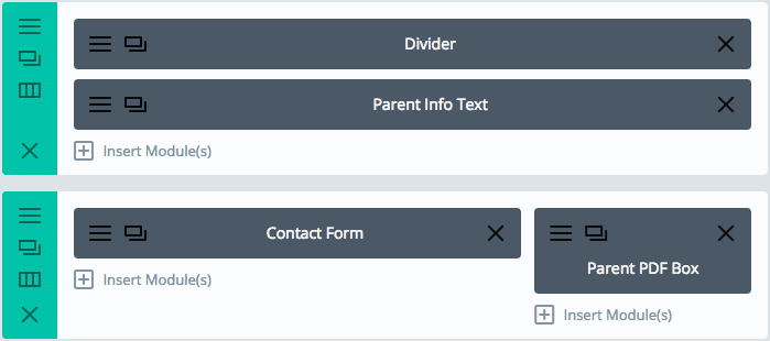
We then used two rows to add the Parent Information section. We used two rows so that we could have two single column modules followed by two modules that were placed in a 2/ 3 – 1/3 column layout.
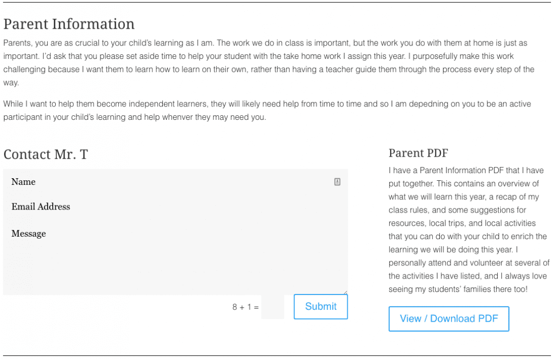
The single column modules were used to add a divider and the parent information text. The smaller modules were used to add a contact form directly to the welcome page and to add a call to action box that links to my Parent Info PDF.
Here’s the live view of that section.
Note: we chose to use most of the default settings for the modules added to our page, but everything in these modules is customizable — fonts, font size, font color, background colors, border colors, etc.
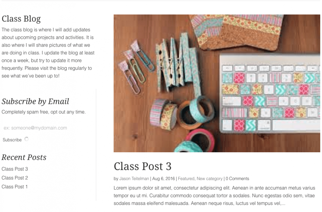
The final section of our page is set up using a 1/3 – 2/3 column layout. We added a text module with the class blog description to the 1/3 area along with a sidebar module.
The sidebar modules let you display whichever widgets you have added to a specific sidebar. We have our module set to display the main sidebar where we have added the Subscribe By Email widget and the Recent Posts widget.
You can modify which widgets show up in the sidebar module by either selecting to display a different sidebar area or by editing the widgets for your selected sidebar in Appearance > Widgets.
The 2/3 column is being used to display our recent blog posts.

Here is the live view.
And here’s a view of the page as a whole so you can see what it all looks like together.
Live Shortcodes vs Divi Builder: Which One Is Right For Me?
The answer really depends on how much customizing you want to do on your page. If you are happy using a single-column layout throughout the entire page and just want the ability to add a few custom elements to your page, then perhaps look at the Live Shortcode options first.
We’d suggest testing out the Divi Builder if you want to be able to use different layouts and be able to switch from a single column to multiple columns and back again.
Divi Builder also has a larger selection of modules you can use to build your page, and the advanced design settings for each module will give you a lot more control over how your finished page looks.
Overall, both tools are great for customizing your pages. we’d recommend the Live Shortcodes for someone looking to make some simple customizations to their page and Divi Builder for anyone looking to break free from the default page template and create a truly unique page design.
